In short
A school reading on the history of printing. Key terms are marked in green, dates in amber and people and places in blue, and a key on the first page tells the reader what each colour means.
What you'll build
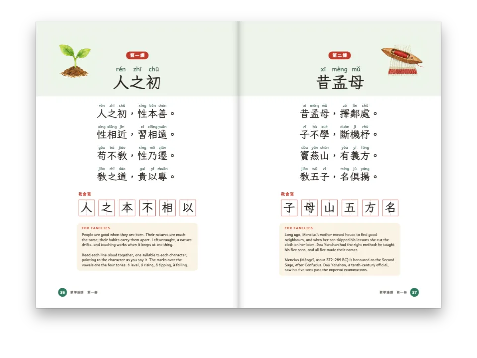
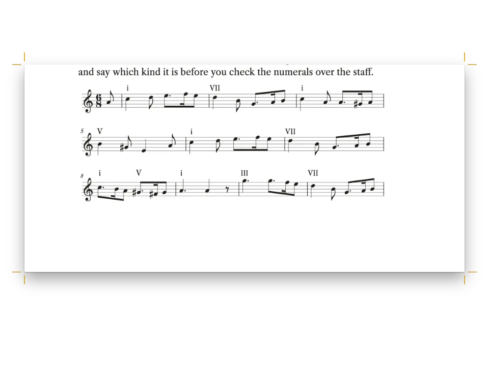
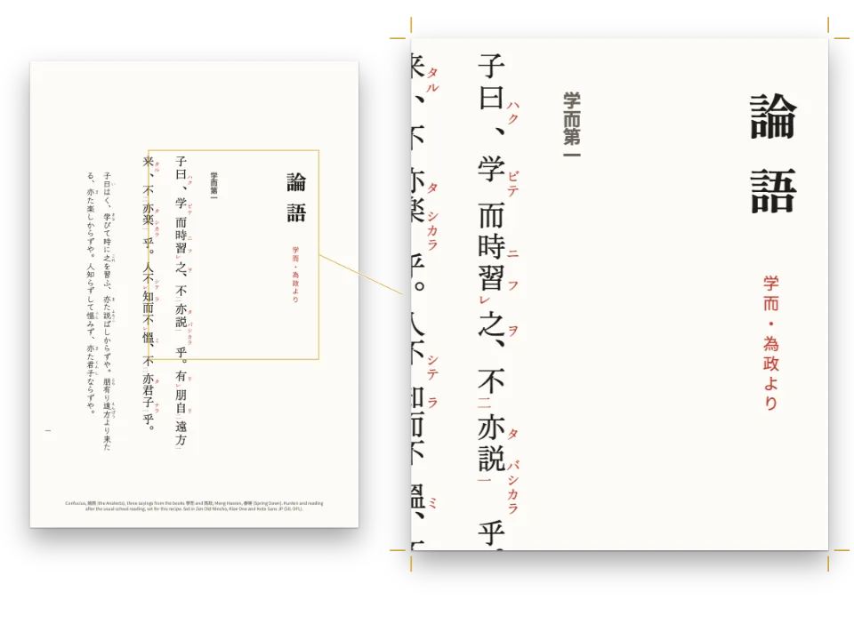
Reading 2 of a unit in a school history reader, Readings in Early Modern History: four pages on how printing spread from Mainz across Europe between 1450 and 1550, on a 170 × 240 mm page. The editors have marked the text the way a careful student would, with a code that stays the same through the whole book: key terms on a green band, dates on amber, people and places on pale blue. A key under the title explains the code with the three colours themselves, and the glossary on the last page opens each entry with its green term. The marks are bands under ordinary text, so the lines break, hyphenate and justify as if the bands were not there.
This recipe answers
- How do I highlight the key words of a study text in colours that each mean something (terms, dates, names)?
The short answer
// :mark[Mainz]{style="name"} in the text picks a style by id. The band is painted under
// words that stay ordinary text, so the lines break, hyphenate and justify as if the
// mark were not there, and a mark that runs over a line end gets a band on each line.
const band = (id, name) => ({
  id, name,
  background: col(id), // pale enough for ink at full contrast on top
  color: col('ink'), // the words keep the colour of the text
  // borderRadius: 0 is the default (square ends, as a highlighter pen leaves them)
  paddingX: em(0.12), // the band reaches a little past the first and the last letter
  paddingTop: em(0.04), paddingBottom: em(0.1), // and down past the descenders
});
const markStyles = [
  band('term', t({ en: 'Key term', es: 'Término clave' })),
  band('date', t({ en: 'Date', es: 'Fecha' })),
  band('name', t({ en: 'Name', es: 'Nombre' })),
];
Three highlight styles, one per kind of word, linked to the palette
Ingredients
- Features
- Highlight marksCallout boxesSemantic colour paletteDesigned openersPictures in page designsHeading attributesRunning heads and foliosHeads by page roleMirrored marginsParagraph stylesWidows, orphans and runts
- Also uses
- Bibliographies and glossariesFigure and Table in your languageCustom resource typesFigures and tables as resources
- Type
- Source Serif 4, Source Sans 3 (SIL OFL 1.1)
- Assets
press-1400.jpg- The printing workshop on the opening page, a painting (Generated With Diffusion Models, original)
Method
#1 · One style for each kind of word
The code is the short answer above. markStyles declares three named styles, and the text picks one per mark: :mark[Johann Fust]{style="name"}, :mark[1455]{style="date"}, :mark[colophon]{style="term"} (highlight marks). Each style names what it means (name is what an editor sees), so the Markdown records why a word is marked, not which colour it wears. Change the colour of a style and every date in the book changes with it. The ends are square, as since postext 1.52 by default (highlight styles): a highlighter pen leaves square ends, and a rounded band reads as a chip.
#2 · Three tints from the palette
const palette = {
  ink: '#1f1c19', // text: a warm near-black
  accent: '#8a3220', // kickers, rules, numbers: an iron-gall red
  tint: '#f5f0e7', // the key's background
  rule: '#d3cabc', // hairlines
  muted: '#6b645b', // running heads, colophon
  paper: '#ffffff',
  term: '#cce8c8', // key terms: a pale green
  date: '#fbe0a1', // dates: amber
  name: '#cfe0f4', // people and places: a pale blue
};
const col = (id) => ({ hex: palette[id], model: 'hex', paletteId: id });
const colorPalette = [
  ...Object.entries(palette).map(([id, hex]) => ({ id, name: id, value: { hex, model: 'hex' } })),
  { id: 'main-color', name: 'accent (defaults)', value: { hex: palette.accent, model: 'hex' } },
];
The three bands are palette entries like the ink and the accent, so a reader who opens the book in the Sandbox can retint the code from one swatch. They are pale, close to the lightness of the box tint, so the ink on them keeps a contrast of 12.6:1 or more, and the three stay apart when they meet in one line, as at "In 1517 Martin Luther" on page 3. A mark takes no room: paddingX reaches 0.12 em into the space beside the phrase, and paddingBottom takes the band under the descenders, both painted into space that is already there.
#3 · The opener: a painting over the title
const opener = {
  enabled: true,
  minHeight: mm(122), // the floor of the opener: the key starts on the same line
  marginBottom: pt(0),
  slot: {
    elements: [
      { kind: 'image', id: 'press', resourceId: 'press', fit: 'cover',
        placement: { anchor: { to: 'page', edge: 'top-left' },
          size: { width: mm(170), height: mm(96) } } },
      { kind: 'text', id: 'kicker', content: '{attr.kicker}', fontFamily: SANS,
        fontSize: pt(8.5), fontWeight: 700, letterSpacing: pt(1.6),
        textTransform: 'uppercase', color: col('accent'), align: 'left',
        placement: { anchor: { to: 'container', edge: 'top-left' },
          offset: { x: mm(0), y: mm(82) } } },
      { kind: 'text', id: 'title', content: '{titleText}', fontFamily: SERIF,
        fontSize: pt(26), lineHeight: 1.08, fontWeight: 700, color: col('ink'), align: 'left',
        placement: { anchor: { to: '#kicker', edge: 'below' }, offset: { x: mm(0), y: mm(2) },
          size: { width: mm(126), height: 'auto' } } },
      { kind: 'text', id: 'standfirst', content: '{attr.standfirst}', fontFamily: SERIF,
        italic: true, fontSize: pt(10.5), lineHeight: LEAD / 10.5, color: col('ink'),
        align: 'left',
        placement: { anchor: { to: '#title', edge: 'below' }, offset: { x: mm(0), y: mm(3) },
          size: { width: mm(118), height: 'auto' } } },
    ],
  },
};
The first-level heading prints a design. The painting is anchored to the page, so it bleeds off the top and both sides, 170 by 96 mm, with fit: 'cover'. The kicker and the standfirst come from attributes on the heading line (heading attributes), and the key follows as an ordinary :::callout whose list items open on the three marks. minHeight sets the depth: the key starts on the same line however long the title runs.
#4 · Running heads by parity
const head = (id, content, parity, edge, x, extra = {}) => ({
  kind: 'text', id, content, parity, pages: 'body',
  fontFamily: SANS, fontSize: pt(7.5), fontWeight: 600, letterSpacing: pt(1.2),
  textTransform: 'uppercase', color: col('muted'),
  placement: { anchor: { to: 'page', edge }, offset: { x: mm(x), y: mm(13) } },
  ...extra,
});
const folio = { fontWeight: 700, color: col('ink') };
const header = {
  elements: [
    head('verso-folio', '{pageNumber}', 'even', 'top-left', OUTER, folio),
    head('verso-title', '{title}', 'even', 'top-left', OUTER + 9),
    head('recto-title', '{chapterTitle}', 'odd', 'top-right', -(OUTER + 9)),
    head('recto-folio', '{pageNumber}', 'odd', 'top-right', -OUTER, folio),
  ],
};
const footer = {
  elements: [head('drop-folio', '{pageNumber}', 'all', 'top', 0, {
    ...folio, pages: 'opener',
    placement: { anchor: { to: 'container', edge: 'top' }, offset: { x: mm(0), y: mm(9) } },
  })],
};
The verso carries the title of the series and the recto the title of the reading, both filtered by parity and kept off the opener by pages: 'body' (text elements). The opener carries its folio at the foot.
The whole recipe
// ═══ Postext Cookbook · Nº 180 · Colour-coded highlights in a study reader ════════
// https://postext.dev/en/cookbook/colour-coded-study-highlights
// Code: MIT · Text: original (CC BY 4.0) · Picture: painting made for the recipe
// Fonts: Source Serif 4, Source Sans 3 (SIL OFL 1.1) · Needs postext ≥ 1.65.0
import {
  buildDocumentWithFonts, renderPageToCanvas, registerResourceImage, defaultResourceTypes,
} from 'https://esm.sh/postext';

const LANG = 'en'; // @lang: the language of the sample document ('en' | 'es')
const RECIPE = 'colour-coded-study-highlights';

// ─── 1 · Design ─────────────────────────────────────────────────────────────
// #region palette: semantic colours, three of them for the highlighter
const palette = {
  ink: '#1f1c19', // text: a warm near-black
  accent: '#8a3220', // kickers, rules, numbers: an iron-gall red
  tint: '#f5f0e7', // the key's background
  rule: '#d3cabc', // hairlines
  muted: '#6b645b', // running heads, colophon
  paper: '#ffffff',
  term: '#cce8c8', // key terms: a pale green
  date: '#fbe0a1', // dates: amber
  name: '#cfe0f4', // people and places: a pale blue
};
const col = (id) => ({ hex: palette[id], model: 'hex', paletteId: id });
const colorPalette = [
  ...Object.entries(palette).map(([id, hex]) => ({ id, name: id, value: { hex, model: 'hex' } })),
  { id: 'main-color', name: 'accent (defaults)', value: { hex: palette.accent, model: 'hex' } },
];
// #endregion
const OUTER = 20; // outer margin in mm: the running heads align to it
const LEAD = 14.5; // body leading in pt
const SANS = 'Source Sans 3';
const SERIF = 'Source Serif 4';

// #region answer: three highlight styles, one per kind of word, linked to the palette
// :mark[Mainz]{style="name"} in the text picks a style by id. The band is painted under
// words that stay ordinary text, so the lines break, hyphenate and justify as if the
// mark were not there, and a mark that runs over a line end gets a band on each line.
const band = (id, name) => ({
  id, name,
  background: col(id), // pale enough for ink at full contrast on top
  color: col('ink'), // the words keep the colour of the text
  // borderRadius: 0 is the default (square ends, as a highlighter pen leaves them)
  paddingX: em(0.12), // the band reaches a little past the first and the last letter
  paddingTop: em(0.04), paddingBottom: em(0.1), // and down past the descenders
});
const markStyles = [
The composed script.js runs as it is: paste it into any page’s module script, or open the recipe on CodePen. Recipe folder on GitHub ↗ (opens in a new tab)
Variations
#Round the ends of the bands
A radius of a fifth of the text size gives the soft ends of a felt-tip pen.
-  // borderRadius: 0 is the default (square ends, as a highlighter pen leaves them)
+ borderRadius: em(0.2), // soft ends, as a felt-tip pen leaves them#Give each line its own band
With decorationBreak: 'clone', a mark that runs over a line end gets the padding at both ends of each piece, as on page 3, where "pamphlets" breaks after "pam-".
   paddingX: em(0.12), // the band reaches a little past the first and the last letter
+ decorationBreak: 'clone', // each line piece gets a whole bandPitfalls
- Colour alone does not survive a black-and-white photocopy, which is how many readers reach a classroom. The glossary also sets the terms in bold; if your readers will copy the pages, give one of the three kinds a second sign of its own.
- A style id that
markStylesdoes not declare falls back to the first style, with no error on the page (the Sandbox flags it). Keep the ids short and check the spelling in the text.
Credits
- Recipe
- Ignacio Ferro
- Text
- The reading, its key, the review questions and the colophon · Ignacio Ferro · CC BY 4.0
- Images
- The printing workshop on the opening page, a painting · Generated With Diffusion Models · original
- Fonts
- Source Serif 4 (SIL OFL 1.1) · Source Sans 3 (SIL OFL 1.1)
Edit this write-up ↗ (opens in a new tab)Recipe folder on GitHub ↗ (opens in a new tab)