In short
A four-page Chinese government-style notice. It follows the national rules for such papers, with a red heading, numbered sections and page numbers in a set style.
What you'll build
A notice from an invented publishers’ association in an invented city, 示例市 (“Example City”), set as a mainland office sets its papers under GB/T 9704—2012, 《党政机关公文格式》. It runs to four A4 pages of 28 characters to the line and 22 lines to the page. Page 1 opens with the issuer’s name in red, the document number over a red rule, and a two-line title in 二号. The heads are numbered 一、(一)1.(1), each level in its own face. The signature and date sit to the right, and an annex on a page of its own carries the 版记 between rules at its foot. The folios read “— 1 —”, at the right on odd pages and at the left on even ones. Every sheet says in its head margin that it is a specimen. Business letter to DIN 5008 does the same job to a European standard.
This recipe answers
- How do I lay out a Chinese official document to GB/T 9704, with its red letterhead, grid and folios?
- How do I set the type area in characters, so many to the line and so many lines to the page?
- How do I number chapters 第一回, 第二回 in Chinese numerals?
The short answer
const cjk = {
  grid: { enabled: true, charsPerLine: CHARS, linesPerPage: LINES }, // 28 ems × 22 lines
  // Every mark takes a whole cell, as on the standard's grid, and never gives any of it up.
  punctuationWidth: 'fullwidth', compressAdjacent: false, trimLineStart: false,
  hangingPunctuation: 'allow', // a , that may not open a line hangs past the 28th cell
  latinSpacing: em(0), // 〔2026〕7号 and 2026年9月28日 set solid, as the standard prints them
};
const page = {
  width: mm(210), height: mm(297), dpi: 150, backgroundColor: col('paper'),
  // With the grid on, margins are minimums. These leave 28 × 22 cells and 0.02 mm to share,
  // so the type area sits 37 mm under the head and 28 mm from the binding edge.
  margins: { top: mm(TOP), bottom: mm(297 - TOP - AREA.h - 0.02), left: mm(INNER),
    right: mm(210 - INNER - AREA.w - 0.02), mirror: true },
};
const bodyText = {
  fontFamily: SONG, fontSize: pt(BODY), lineHeight: pt(LEAD), color: col('ink'),
  boldColor: col('ink'), italicColor: col('ink'), referenceColor: col('ink'),
  textAlign: 'justify', // a short line spreads between its characters, never between words
  firstLineIndent: em(2), indentAfterHeading: true, // 左空二字,回行顶格
};
A4, 28 characters × 22 lines of 三号, full-width marks on the grid
Ingredients
- Features
- Character gridChinese numeralsNumbered headingsChinese punctuation widthsChinese line breakingJustification between charactersSpace between Chinese and LatinChinese, Japanese and Korean fontsTrim sizeMirrored marginsDesigned openersText, rules and boxes in page designsAnchoring design elementsRunning heads and foliosHeading stylesHeading attributesLine breaks in titlesParagraph stylesTable stylePDF export
- Also uses
- Figures exactly hereFull-width chapter bandPaper colourFonts embedded in the PDFCustom resource typesTables from dataUnnumbered chapters
- Type
- Noto Serif SC, Noto Sans SC, LXGW WenKai TC (SIL OFL 1.1)
- Assets
- None: every picture is drawn in code
Method
#1 · A type area counted in cells
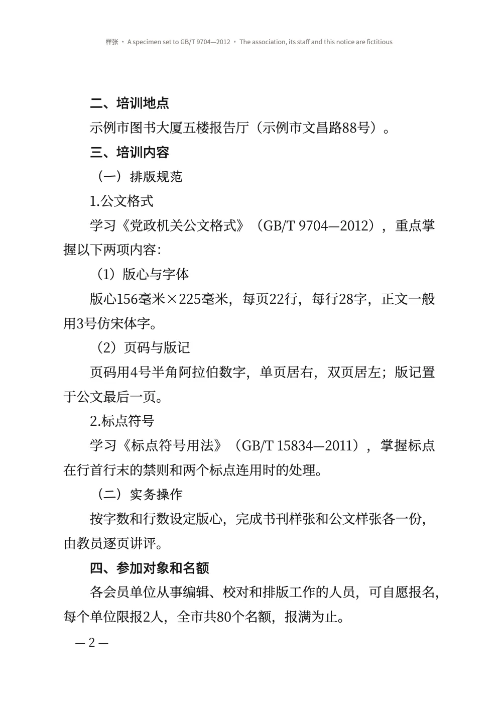
The code is the short answer above. GB/T 9704 fixes the head margin at 37 mm and the binding margin at 28 mm, and fills a 156 × 225 mm type area with 22 lines of 28 characters in 三号. cjk.grid takes the numbers as they are: 28 ems of 15.75 pt make 155.6 mm, and 22 lines of 29 pt make 225.1 mm (Character grid). Word’s 三号 is 16 pt, which would make the line 158 mm, wider than the standard’s type area; 15.75 pt is the value in typesetters’ tables. With the grid on, the margins are minimums. These leave 0.02 mm to share, so the type area stays where the standard puts it. The standard names 仿宋 for the text; Fontsource has no Fangsong face, so the text is set in the Song of Noto Serif SC (see Pitfalls).
Every mark takes a whole cell and gives none of it up, so in a line of Chinese the characters stand in the columns of the grid the standard draws. Arabic numerals are narrower than a cell, so in a line such as 版心156毫米×225毫米 the characters after the digits fall between the columns. When a comma falls on the 29th cell, hangingPunctuation: 'allow' hangs it in the margin instead of pushing a character onto the next line and spreading the rest (Hanging punctuation).
#2 · Four levels of heads, one line each
// One line each at the body size, nothing above or below: every head stays on the grid.
const level = (n, fontFamily, fontWeight, numberingTemplate) => ({ level: n, fontFamily,
  fontWeight, numberingTemplate, numberSeparator: '', fontSize: pt(BODY), lineHeight: pt(LEAD),
  marginTop: pt(0), marginBottom: pt(0), firstLineIndent: em(2) }); // 空二字,回行顶格
const levels = [
  level(2, HEI, 500, '{2:一}、'), // 一 is the informal numeral in the document's script
  level(3, KAI, 400, '({3:一})'),
  level(4, SONG, 400, '{4}.'),
  level(5, SONG, 400, '({5})'),
];
The standard sets 一、 in 黑体, (一) in 楷体, and 1. and (1) in the text face, all at the text size. {2:一} prints the informal Chinese numeral in the script of locale (Numbering). With the body’s size and leading and no margins, a head takes one line of the grid, and the text under it stays on the grid too. firstLineIndent: em(2) sets each head two cells in, counted in body ems, and a head that runs to a second line starts it at the margin, as the standard wants; the number follows the indent, so the contents and the PDF bookmarks read 一、 with no spaces in front (Per-level overrides).
#3 · The letterhead, line by line
const LINE = LEAD * MM; // 10.23 mm
const lineTop = (n) => (n - 1) * LINE; // mm from the top of the type area to grid line n
const face = (fontFamily, size, fontWeight, colour, lineHeight = LEAD / size) => ({
  fontFamily, fontSize: pt(size), fontWeight, color: col(colour), lineHeight });
// A text y mm down the type area, x mm in from its edge, as wide as the type area.
const text = (id, content, look, y, { edge = 'top-left', x = 0, width = AREA.w, ...more } = {},
) => ({ kind: 'text', id, content, ...look, align: 'center', overflow: 'wrap', ...more,
  placement: { anchor: { to: 'container', edge }, offset: { x: mm(x), y: mm(y) },
    size: { width: width === 'auto' ? 'auto' : mm(width) } } }); // wrap, not '…'
const rule = (id, y, thickness, colour = 'ink', reserve = false) => ({ kind: 'rule', id, reserve,
  direction: 'horizontal', thickness, color: col(colour), placement: { anchor: { to: 'container',
    edge: 'top-left' }, offset: { y: mm(y) }, size: { width: mm(AREA.w) } } });
const PAD = { left: pt(5), right: pt(5) }; // the specimen stamp's: not a GB/T 9704 element
const letterhead = { enabled: true, minHeight: pt(13 * LEAD), slot: { elements: [
  text('copy', '{attr.copy}', face(SONG, BODY, 400, 'ink'), lineTop(1), { align: 'left' }),
  text('stamp', '样 张', face(HEI, BODY, 500, 'red', 1.3), lineTop(1) + 1.5, { edge: 'top-right',
    width: 'auto', box: { borderColor: col('red'), borderWidth: pt(1), padding: PAD } }),
  // The name's ink starts 35 mm down, 0.07 em over its box; at 46 pt it ends in line 5.
  text('issuer', '{attr.issuer}文件', face(SONG, 46, 900, 'red', 1), 35 + 0.07 * 46 * MM),
  // The number two blank lines under the name; the red rule 4 mm under its characters.
  text('number', '{attr.number}', face(SONG, BODY, 400, 'ink'), lineTop(8)),
  rule('red-rule', lineTop(8) + ((LEAD + BODY) / 2) * MM + 4, mm(0.5), 'red', true),
  text('title', '{titleText}', face(SONG, 22, 900, 'ink'), lineTop(12)), // 二号, 2 lines under
] } };
const notice = { level: 1, span: 'page', advancedDesign: letterhead,
  marginTop: pt(0), marginBottom: pt(LEAD), // 空一行: a blank line, then the addressee
  breakBefore: { enabled: true, parity: 'any' } }; // a notice opens on the next page
The letterhead is the design of the H1, whose attributes carry the copy number, the issuer and the document number: the config holds the stationery, the Markdown the document. lineTop(n) gives the top of grid line n, so each element stands where the standard counts it: the number two blank lines under the issuer’s name, the title two blank lines under the red rule. At 46 pt the name’s ink runs from 35 mm under the top of the type area to the foot of line 5, which leaves lines 6 and 7 blank and puts the number on line 8; at 48 pt it would reach into line 6 and push the rest of the page a line down. The \\ in the heading breaks the title after 关于举办, a short line over a long one: a trapezoid, one of the two shapes the standard allows (the other is a diamond). minHeight reserves 13 lines and marginBottom one more, so the addressee starts on line 15 (Span and advanced design).
#4 · Folios under the type area
const FOLIO = 14; // pt: 四号
const folio = (id, parity, edge, x) => ({ kind: 'text', id, parity, content: '— {pageNumber} —',
  ...face(SONG, FOLIO, 400, 'ink', 1), align: edge.endsWith('left') ? 'left' : 'right',
  overflow: 'clip', placement: { anchor: { to: 'container', edge }, // the type area's foot
    offset: { x: pt(x), y: mm(7 - (FOLIO / 2) * MM) } } }); // the dashes 7 mm down
const footer = { elements: [folio('recto', 'odd', 'top-right', -FOLIO),
  folio('verso', 'even', 'top-left', FOLIO)] };
const header = { elements: [{ kind: 'text', id: 'specimen', content: '{subtitle}', // 样张 …
  ...face(HEI, 7.5, 400, 'muted', 1.2), align: 'center', overflow: 'wrap',
  placement: { anchor: { to: 'container', edge: 'top' }, offset: { y: mm(16) } } }] };
In the footer, the container’s top edge is the foot of the type area, so offset.y measures down from the text (Headers & footers). The dashes stand 7 mm under it, and one 四号 cell in from the outer edge: parity puts the odd folios at the right and the even ones at the left. The head margin prints {subtitle} from the frontmatter. That line and the colophon under the 版记 are all that changes between the English and the Spanish edition.
#5 · The annex and the 版记
const IMPRINT = AREA.h - 2 * LINE; // mm: two rows of the grid, ending on the type area's foot
const small = face(SONG, FOLIO, 400, 'ink', LEAD / FOLIO); // 四号
const inset = { x: FOLIO * MM, width: AREA.w - 2 * FOLIO * MM, reserve: false }; // 左右各空一字
const annex = {
  id: 'annex', numbered: false, toc: false, breakBefore: { enabled: true, parity: 'any' },
  span: 'page', marginTop: pt(0), marginBottom: pt(0), // line 4 is the table's float gap
  advancedDesign: { enabled: true, minHeight: pt(3 * LEAD), slot: { elements: [
    text('label', '{attr.label}', face(HEI, BODY, 500, 'ink'), lineTop(1), { align: 'left' }),
    text('title', '{titleText}', face(SONG, 22, 900, 'ink'), lineTop(3)),
    // reserve: false keeps the 版记 out of the room the heading takes: the table goes on.
    rule('imprint-top', IMPRINT, mm(0.35)),
    text('cc', '抄送:{attr.cc}', small, IMPRINT, { ...inset, align: 'left' }),
    rule('imprint-mid', IMPRINT + LINE, mm(0.25)),
    text('office', '{attr.office}', small, IMPRINT + LINE, { ...inset, align: 'left' }),
    text('printed', '{attr.printed}', small, IMPRINT + LINE, { ...inset, align: 'right' }),
    rule('imprint-foot', AREA.h - 0.35 / 2, mm(0.35)),
    text('colophon', '{attr.colophon}', face(HEI, 7, 400, 'muted'), AREA.h + 16, inset),
  ] } },
};
The annex heading takes a style of its own: a new page, 附件 on line 1, the title on line 3, and no margin under the three lines it reserves. The blank line 4 is the float gap every inline resource keeps above it (inlineResourceGap, under Layout), so the table’s top rule sits on line 5. The 版记 is part of the same design, drawn on the two grid lines that end on the type area’s foot. Its elements have reserve: false, so they add nothing to the room the heading takes and the table is not pushed down past them. The standard puts the 版记 on the last page, after the annexes; with a one-page annex that is the annex’s page. A longer annex would need the 版记 drawn by a heading on its last page.
#6 · The signature block
const paragraphStyles = [
  { id: 'flush', firstLineIndent: pt(0) }, // 主送机关:居左顶格
  { id: 'annexes', marginTop: pt(LEAD) }, // 附件说明:正文下空一行,左空二字
  // The date, 6.9 ems, starts two cells right of the name and ends two short: 右空二字.
  { id: 'signature', indent: em(17), firstLineIndent: pt(0), marginTop: pt(LEAD) },
  { id: 'date', indent: em(19), firstLineIndent: pt(0) },
];
A notice without a seal sets the issuer’s name two cells in from the right and the date under it, starting two cells further right. A date longer than the name ends two cells short of the right edge instead, and the name moves left to keep the two-cell step. Ours is 6.9 ems, a shade shorter than the name’s 7, so by the letter it would start two cells right of the name and end 0.14 em from the margin. We read the rule by what it is for, a date that never runs to the edge, and take the second case: the date ends just over two cells short. indent places both lines on whole cells, 17 and 19 ems from the margin (Paragraph styles).
The whole recipe
// ═══ Postext Cookbook · Nº 082 · A Chinese official document to GB/T 9704 ═════════
// https://postext.dev/en/cookbook/chinese-official-document
// Code: MIT · Text: a fictitious notice written for the recipe (CC BY 4.0) · Pictures: none
// Fonts: Noto Serif SC, Noto Sans SC, LXGW WenKai TC (SIL OFL 1.1) · Needs postext ≥ 1.25.0
import {
  buildDocument, withLoadedFonts, renderPageToCanvas, parseTSV, mergeCells,
} from 'https://esm.sh/postext';
import { renderToPdf, decompressWoff2 } from 'https://esm.sh/postext-pdf';

const LANG = 'en'; // @lang: the language of the sample document ('en' | 'es')
const RECIPE = 'chinese-official-document';

// ─── 1 · Design ─────────────────────────────────────────────────────────────
// GB/T 9704 prints everything black but the letterhead: the issuer's name and a rule in red.
const palette = { ink: '#161616', red: '#d2161e', muted: '#8a8580', paper: '#ffffff' };
const col = (id) => ({ hex: palette[id], model: 'hex', paletteId: id });
const colorPalette = Object.entries({ ...palette, 'main-color': palette.red })
  .map(([id, hex]) => ({ id, name: id, value: { hex, model: 'hex' } }));
const SONG = 'Noto Serif SC'; // 宋: the text (in place of 仿宋, see the write-up) and 小标宋
const HEI = 'Noto Sans SC'; // 黑: the 一、 heads, the annex label, the specimen stamp
const KAI = 'LXGW WenKai TC'; // 楷: the (一) heads
const MM = 25.4 / 72; // mm per pt
const [BODY, LEAD, CHARS, LINES] = [15.75, 29, 28, 22]; // 三号 on 29 pt lines, 28 × 22 of them
const AREA = { w: CHARS * BODY * MM, h: LINES * LEAD * MM }; // 155.6 × 225.1 mm: the 版心
const [TOP, INNER] = [37, 28]; // mm: 天头 and 订口, the head and binding margins

// #region answer: A4, 28 characters × 22 lines of 三号, full-width marks on the grid
const cjk = {
  grid: { enabled: true, charsPerLine: CHARS, linesPerPage: LINES }, // 28 ems × 22 lines
  // Every mark takes a whole cell, as on the standard's grid, and never gives any of it up.
  punctuationWidth: 'fullwidth', compressAdjacent: false, trimLineStart: false,
  hangingPunctuation: 'allow', // a , that may not open a line hangs past the 28th cell
  latinSpacing: em(0), // 〔2026〕7号 and 2026年9月28日 set solid, as the standard prints them
};
const page = {
  width: mm(210), height: mm(297), dpi: 150, backgroundColor: col('paper'),
  // With the grid on, margins are minimums. These leave 28 × 22 cells and 0.02 mm to share,
  // so the type area sits 37 mm under the head and 28 mm from the binding edge.
  margins: { top: mm(TOP), bottom: mm(297 - TOP - AREA.h - 0.02), left: mm(INNER),
    right: mm(210 - INNER - AREA.w - 0.02), mirror: true },
};
const bodyText = {
  fontFamily: SONG, fontSize: pt(BODY), lineHeight: pt(LEAD), color: col('ink'),
  boldColor: col('ink'), italicColor: col('ink'), referenceColor: col('ink'),
  textAlign: 'justify', // a short line spreads between its characters, never between words
  firstLineIndent: em(2), indentAfterHeading: true, // 左空二字,回行顶格
};
// #endregion
The composed script.js runs as it is: paste it into any page’s module script, or open the recipe on CodePen. Recipe folder on GitHub ↗ (opens in a new tab)
Variations
#Compress marks that meet
Pairs like ),and 》( take a cell and a half instead of two, as in most books; the characters after them leave the columns of the grid.
-  punctuationWidth: 'fullwidth', compressAdjacent: false, trimLineStart: false,
+ punctuationWidth: 'fullwidth', compressAdjacent: true, trimLineStart: true,#Show the grid while you set the page
The canvas draws a grey square for every cell of the 28 × 22 grid, and the PDF leaves it out unless renderToPdf gets characterGrid: true.
-  grid: { enabled: true, charsPerLine: CHARS, linesPerPage: LINES },
+ grid: { enabled: true, charsPerLine: CHARS, linesPerPage: LINES, show: true },Pitfalls
Pitfall
Fontsource has no Fangsong (仿宋) face
GB/T 9704 and most mainland forms set their text in 仿宋, a Song face drawn with the thin, slightly rising strokes of the brush. None of the Chinese families on Fontsource is a Fangsong, so a recipe sets the text in the Song face it has, Noto Serif SC, and says so. A Fangsong you hold a licence for goes in as your own font: register its file with FontFace, name the family in bodyText.fontFamily and give renderToPdf a fontProvider that returns its bytes. Chinese, Japanese and Korean fonts →
Pitfall
Chinese faces load by slices, through the cjk block
Fontsource serves a Chinese, Japanese or Korean family as about a hundred files per weight, each covering a range of characters. loadFonts fetches only the latin file, so on screen the Han characters come from a system face and measure wrong, and fontsourceProvider hands the PDF that latin file, which prints them as empty boxes. List the cjk kit block, call loadCjkFonts(FONTS, markdown) after loadFonts (once per voice, with the text it sets, when the book uses several CJK faces) and give renderToPdf fontProvider: cjkPdfProvider: both take the files that hold the text's characters. Chinese, Japanese and Korean fonts →
Pitfall
Tag the document zh-Hans or zh-Hant, not with LANG
A recipe's editions are en and es, but a Chinese sample is Chinese in both: `locale: LANG` would tag it English or Spanish, hyphenate its Latin words, label its figures Figure or Figura and give the PDF the wrong language. From postext 1.30 the tag is also the language the text is shaped in (measured, painted and embedded), so under an English or Spanish tag a Chinese face sets its digits and the punctuation it shares with Latin text in other forms, and the lines break elsewhere. Write the tag yourself: 'zh-Hans' (mainland conventions: GB line breaking, Kaiming punctuation) or 'zh-Hant' (Taiwan: full-width centred punctuation); 'zh-HK' for Hong Kong. A bare 'zh' reads as Simplified, mainland. A Japanese sample takes 'ja' (gotcha ja-locale-tag). Chinese line breaking →
Layout warning · cjkGridClamped
Character grid too large
Why. `cjk.grid` asks for more characters per line or lines per page than the page margins leave room for at the body size and line height, so the grid is set with the most that fit.
Fix. Lower `charsPerLine` or `linesPerPage`, narrow the margins (they are minimums), or set a smaller `bodyText.fontSize` or `lineHeight`. Docs →
- A justified line shares its slack between the Chinese characters and any space it holds, and the space takes more than its share: on page 2 the one in GB/T 15834 opened to nearly twice the width of the one in GB/T 9704 above it. The content writes both numbers with a no-break space (U+00A0), which keeps each number in one piece, so the slack goes between the characters.
Credits
- Recipe
- Ignacio Ferro
- Text
- A notice from a fictitious publishers’ association, written for the recipe in the form GB/T 9704—2012 sets out · Postext Cookbook · CC BY 4.0
- Fonts
- Noto Serif SC (SIL OFL 1.1) · Noto Sans SC (SIL OFL 1.1) · LXGW WenKai TC (SIL OFL 1.1)
Edit this write-up ↗ (opens in a new tab)Recipe folder on GitHub ↗ (opens in a new tab)