What you'll build
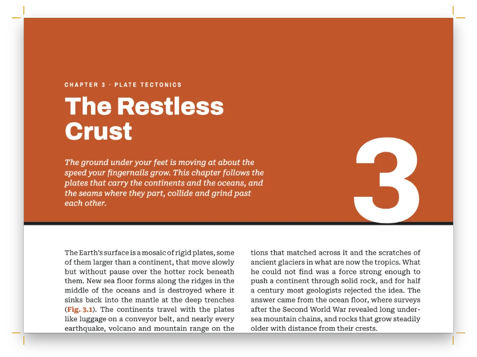
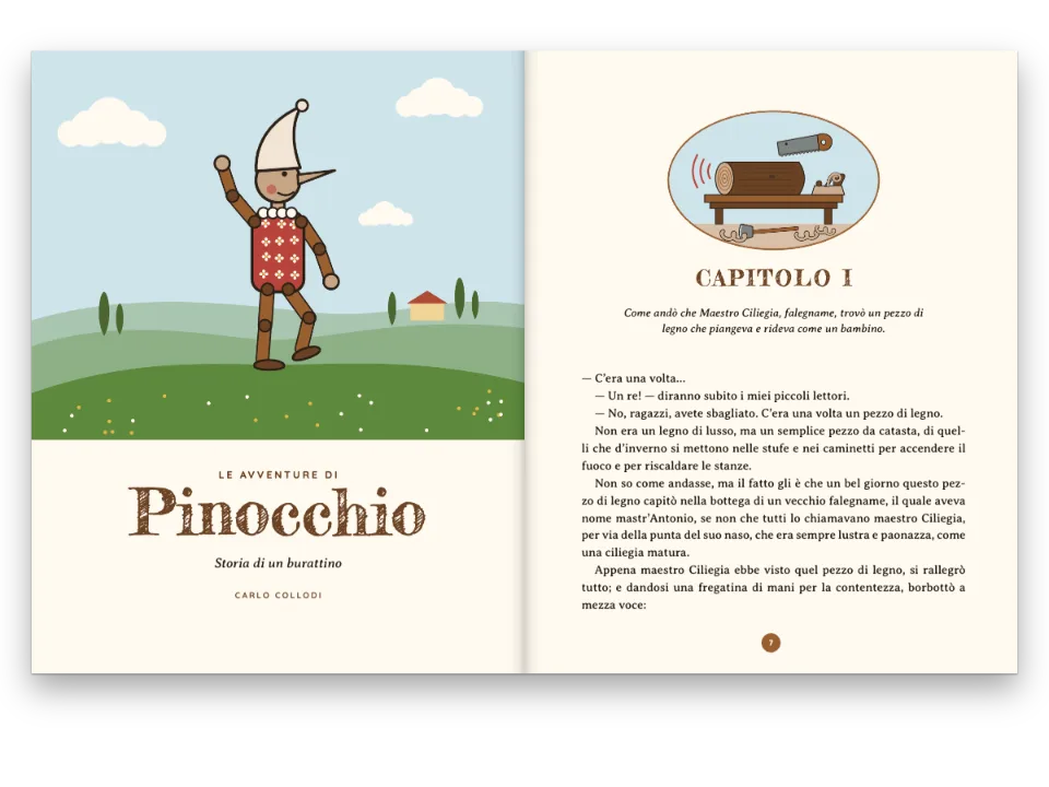
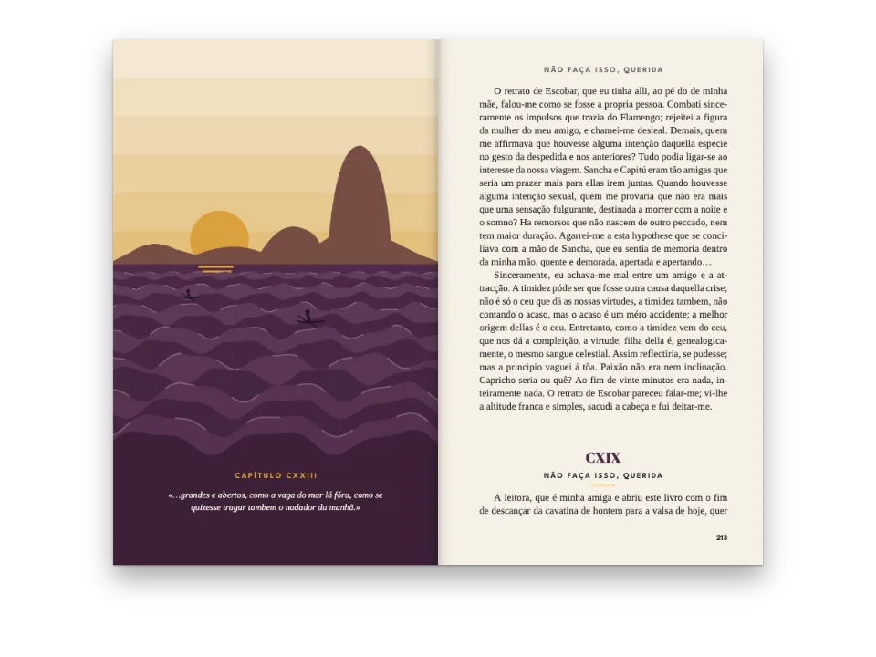
Five Ways to Begin is a seven-page book about chapter openers, 180 × 240 mm, and each chapter is set in the opener it describes. Chapter one is a novel's: a tracked kicker, a light italic title and a five-line red initial, with running heads on the pages that follow. Chapter two puts its title and a printer's flower inside a cream cartouche drawn with two blue rules. Chapter three stacks its title in white Fraunces Black on a magenta field that bleeds off the page, over a mono initial reversed out of a box. Chapter four, the manual, has mono running heads, an orange number badge beside its title and two columns of Geist. The coda sets its title halfway down an empty page, above a raised initial. Chapter one uses level 1's own opener; the other four name a heading style on their heading line.
This recipe answers
- How do I give every chapter its own photo, colour or opener variant?
- How do I add an author line, a standfirst or a lead with a drop cap to an opener?
- How do I set a chapter title across the page while the body runs in two columns below?
- How do I build a number badge beside the title that widens when the number grows (9 → 10)?
The short answer
// A heading line picks a style by id, and its attributes feed the opener's {attr.…} texts:
//   # The Frame {style="framed" kicker="Chapter the Second" lead="Long before there…"}
// A style overrides the level fields it names (here the opener) and, until the next level-1
// heading, the section fields it names; what it leaves out comes from the level and document.
const level1 = () => ({ level: 1,
  // span 'page' opens each chapter at the head of a new page and runs its opener across
  // every column (chapter four has two). Any headings object drops the default break to a
  // recto (gotcha: headings-drop-h1-break): restate the side, 'any' for short chapters.
  span: 'page',
  breakBefore: { enabled: true, parity: 'any' },
  marginBottom: pt(LEAD), // one line of air between the opener and the text
  advancedDesign: literary }); // chapter one, unstyled: the book's own opener
const headingStyles = () => [ // factories, called by config() once every design exists
  // Each style brings its opener and swaps 'accent' for a colour of its own, on its pages.
  { id: 'framed', advancedDesign: framed, palette: { accent: palette.lapis },
    margins: { left: mm(EVEN), right: mm(EVEN) } }, // a centred text block
  { id: 'stacked', advancedDesign: stacked, palette: { accent: palette.magenta } },
  { id: 'spec', advancedDesign: spec, palette: { accent: palette.signal },
    marginBottom: pt(0), // the hairline under the title is the separator
    margins: { left: mm(SPEC), right: mm(SPEC) }, // a 144 mm text block
    layout: { layoutType: 'double', gutterWidth: mm(7) },
    bodyStyle: { fontFamily: 'Geist', fontSize: pt(9.8), textAlign: 'left' }, // on the grid
    header: { elements: [...specHead('even'), ...specHead('odd')] },
    footer: { elements: [] } }, // no folio at the foot: the head gives the page
  { id: 'quiet', numbered: false, // a coda: it advances no chapter counter
    advancedDesign: quiet, palette: { accent: palette.graphite }, footer: tinyFolio,
    margins: { left: mm(QUIET.inner), right: mm(QUIET.outer) }, // a 106 mm measure
    bodyStyle: { fontSize: pt(QUIET.size), lineHeight: pt(QUIET.lead), textAlign: 'left' } },
]; // hook-up in config(): headings: { levels: [level1(), …] }, headingStyles()
One opener per chapter: the level's own, then heading styles by name
Ingredients
- Features
- Heading stylesSection geometryDrop caps in openersRunning heads per sectionDesigned openersColours per partUnnumbered chaptersFull-width chapter bandText, rules and boxes in page designsPictures in page designsHeading attributesBleed bands and thumb tabsLine breaks in titlesAnchoring design elementsRunning heads and foliosHeads by page roleSemantic colour paletteNumbered headingsParagraph stylesFigures and tables as resources
- Type
- Lora, Fraunces, Geist, Geist Mono (SIL OFL 1.1)
- Assets
- None: every picture is drawn in code
Method
#1 · Set the book's own opener on the level
// The opening paragraph comes from lead="…" on the heading line: drop caps exist only in
// design text, so the lead is part of the opener (gap: body-drop-cap).
const lead = (placement, dropCap, extra = {}) => text('lead', '{attr.lead}', 'Lora',
  LEADIN.size, placement, { lineHeight: LEADIN.lead / LEADIN.size, dropCap, ...extra });
const CAPS = 0.7; // the height of a capital in Lora and in Fraunces, em
// A drop cap's foot stands on the last baseline it spans. Its default size makes the capital
// as tall as all those line boxes, so it rises above the first line (2.2 mm for five lines
// here); this size puts its top on the first line's capitals instead.
const dropSize = (lines) => pt(((lines - 1) * LEADIN.lead + CAPS * LEADIN.size) / CAPS);
const literary = design([
  text('kicker', '{attr.kicker}', 'Geist', 8, centred(22), { ...caps(1.7), align: 'center' }),
  text('title', '{titleText}', 'Fraunces', 32, at('#kicker', 'below', 0, 4, 'fill'),
    { fontWeight: 300, italic: true, lineHeight: 1.05, align: 'center' }),
  { kind: 'rule', id: 'rule', direction: 'horizontal', thickness: pt(0.8), color: col('accent'),
    placement: at('#title', 'below', (MEASURE - 18) / 2, 6, 18) }, // an 18 mm rule, centred
  lead(at('#title', 'below', 0, 17, 'fill'), {
    lines: 5, fontSize: dropSize(5), fontFamily: 'Fraunces', fontWeight: 400,
    color: col('accent'), gap: mm(2.5) }),
]);
Chapter one has no style, so it takes level 1's own design, which every style starts from (the short answer shows the level and the styles). Drop caps exist only in design text, so the chapter's first paragraph comes from lead="…" on the heading line and lead() sets it in the opener; the body text flows on below. The engine stands the letter on the fifth baseline, but at its default size the capital is as tall as all five line boxes and rises 2.2 mm above the first line's capitals. dropSize() sizes it from the capital height of Lora and Fraunces (0.7 em), so the top of the M lines up with them.
#2 · Frame the title in two boxes
const FRAME = 62; // mm: the outer box's height
const INSET = 3; // mm: the hairline box runs this far inside it
const FLEURON = 44; // mm: the ornament's width, centred under the title
const framed = design([ // array order is paint order: the boxes first, the type on top
  { kind: 'box', id: 'frame', placement: { ...at('container', 'top-left', 0, 0),
    size: { width: 'fill', height: mm(FRAME) } },
  style: { backgroundColor: col('tint'), borderColor: col('accent'), borderWidth: pt(1.6) } },
  { kind: 'box', id: 'hairline', placement: { ...at('#frame', 'align-top', INSET, INSET),
    size: { width: mm(MEASURE - 2 * INSET), height: mm(FRAME - 2 * INSET) } },
  style: { borderColor: col('accent'), borderWidth: pt(0.5) } },
  text('kicker', '{attr.kicker}', 'Geist', 7.5, centred(14), { ...caps(1.6), align: 'center' }),
  text('title', '{titleText}', 'Fraunces', 34, at('#kicker', 'below', 0, 3.5, 'fill'),
    { fontWeight: 600, lineHeight: 1.05, align: 'center' }),
  // An image element draws a registered resource, never numbered or captioned. Its resourceId
  // is a fixed id: a style that names a photo here gives its chapters that photo.
  { kind: 'image', id: 'fleuron', resourceId: 'fleuron',
    placement: at('#title', 'below', (MEASURE - FLEURON) / 2, 4.5, FLEURON) },
  // The section's palette does not reach dropCap.color: name the blue (gotcha: drop-cap-palette).
  lead(at('container', 'top-left', 0, FRAME + 9, 'fill'), { lines: 3, fontSize: dropSize(3),
    fontFamily: 'Fraunces', fontWeight: 600, color: col('lapis'), gap: mm(2) }),
]);
Array order is paint order, so the boxes come first and the type on top; the ornament is an image element, which draws a registered SVG resource that is never numbered or cited. An image element is also how a chapter gets a photo of its own, but its resourceId is a fixed id, not an {attr.…} template: each chapter needs a style whose image element names its bitmap, as in the magazine feature. The framed style in the short answer sets palette to turn accent blue on this chapter's pages, so the rules, the kicker and the drop folio print blue, and its margins centre the text block under the frame. In 1.4.1 a drop cap's color ignores the section palette, so the initial names the blue with col('lapis').
#3 · Stack the title, box the initial
const FIELD = 130; // mm from the trim: the foot of the colour field
const S_BEARING = 1.2; // mm: the white left of the title's S (0.0365 em at 94 pt)
// The boxed initial: the engine sets the letter, a drop cap on the third baseline; the box
// behind it is fitted by hand, in pt from the top of the lead's first line box.
const BASE = 0.8; // 1.4.1 sets a design text's baseline 0.8 down its line box; no option
// Geist Mono, em: cap height, the advance every capital shares, the white either side of an M
const MONO = { caps: 0.71, advance: 0.6, side: 0.044 };
const BOXED = 3; // lines the initial spans
const capsTop = BASE * LEADIN.lead - CAPS * LEADIN.size; // the first line's capitals: box top
const foot = (BOXED - 1 + BASE) * LEADIN.lead; // the third baseline: the letter's foot
// The M's top sits as far under the box's top as its sides sit in, and the box runs as far
// under its foot, so the colour is as wide on all four sides.
const letter = (foot - capsTop) / (MONO.caps + MONO.side), pad = MONO.side * letter;
const stacked = design([
  { kind: 'box', id: 'field', style: { backgroundColor: col('accent') },
    placement: { anchor: { to: 'bleed', edge: 'top-left' }, size: { height: mm(FIELD) } } },
  text('kicker', '{attr.kicker}', 'Geist', 8, at('container', 'top-left', 0, 4),
    { ...caps(1.8), color: col('paper') }),
  // {titleText} keeps the \\ breaks from the Markdown, so each line ends at the writer's \\.
  // Moved left by the S's side bearing, so its curve meets the text edge.
  text('title', '{titleText}', 'Fraunces', 94,
    at('container', 'top-left', -S_BEARING, 15, 'fill'),
    { fontWeight: 900, lineHeight: 0.84, color: col('paper') }),
  { kind: 'box', id: 'initial', style: { backgroundColor: col('accent') }, // behind the lead
    placement: { anchor: { to: '#lead', edge: 'align-top' }, offset: { y: pt(capsTop) },
      size: { width: pt(MONO.advance * letter), height: pt(foot + pad - capsTop) } } },
  // The lead: 8 mm under the field (FIELD is from the trim). Its drop cap's line box
  // counts in the opener's height, 3.5 mm under the lead: FIELD is set so it costs no line.
  lead(at('container', 'top-left', 0, FIELD - TOP + 8, 'fill'), { lines: BOXED,
    fontSize: pt(letter), fontFamily: 'Geist Mono', fontWeight: 700, color: col('paper'),
    gap: mm(2.2) }),
]);
The stack is written in the Markdown: # Say it \\ out \\ loud. breaks {titleText} at each \\, while running heads and the PDF outline read the title on one line (line breaks in titles). The field hangs from the top of the bleed, full width and 130 mm deep, and the lead starts 8 mm under it. The boxed initial is two elements. The lead's drop cap sets the M over three lines, and the magenta box painted before it is sized from the lead's line box and Geist Mono's metrics, so the colour above and below the M is as wide as its side bearings.
#4 · Give the manual a badge, two columns and its own heads
const SPEC = 18; // mm: both side margins, for a 144 mm text block in two columns
const PAD = 1.6; // mm of colour over the badge's figures
const spec = design([
  { kind: 'rule', id: 'top-rule', direction: 'horizontal', thickness: pt(2.4), color: col('ink'),
    placement: at('container', 'top-left', 0, 0, 'fill') },
  text('kicker', '{attr.kicker}', 'Geist Mono', 7.5, at('container', 'top-left', 0, 3.2),
    { ...caps(1.2, 500), color: col('graphite') }),
  // The badge's width follows its text, with padding on both sides, so 9 → 10 widens it. Its
  // line box holds 1 mm more under the figures than over them, so the foot pads 1 mm less.
  text('badge', '{chapterNumber}', 'Geist Mono', 26, at('container', 'top-left', 0, 12),
    { fontWeight: 700, lineHeight: 1, box: { backgroundColor: col('accent'), padding: {
      top: mm(PAD), right: mm(2.4), bottom: mm(PAD - 1), left: mm(2.4) } } }),
  // Same size and line height as the badge, dropped by its top padding, so the baselines meet.
  text('title', '{titleText}', 'Geist', 26, at('#badge', 'right-of', 4, PAD),
    { fontWeight: 700, lineHeight: 1 }),
  { kind: 'rule', id: 'hairline', direction: 'horizontal', thickness: pt(0.5), color: col('ink'),
    placement: at('container', 'top-left', 0, 31, 'fill') }, // room for a one-line title
]);
const specHead = (parity) => { // mono labels over the opener's rule, on every page of the section
  const [edge, s] = parity === 'even' ? ['top-left', 1] : ['top-right', -1];
  const mono = { ...caps(1.1, 500), color: col('graphite'), parity, pages: 'all' };
  return [
    text(`sp-page-${parity}`, '{pageNumber} / {totalPages}', 'Geist Mono', 7,
      at('container', edge, 0, HEAD_Y), mono),
    text(`sp-chap-${parity}`, '§ {chapterNumber} · {chapterTitle}', 'Geist Mono', 7,
      at('container', edge, s * 16, HEAD_Y), mono),
  ];
};
The badge is a text element with a fill and padding but no width, so its width follows {chapterNumber}, and the title is placed right-of it: at chapter 10 the badge grows by one figure, 5.5 mm, and the title moves with it. Its bottom padding is 1 mm less than the top because the line box holds that much more under the figures, so the 4 sits centred. In the spec style, layout sets the section in two columns and the level's span: 'page' runs the opener across both. Its margins widen the text block to 144 mm, bodyStyle sets ragged Geist on the book's 14.5 pt grid, header replaces the book's running heads and an empty footer drops the folio.
#5 · Leave the coda room
const quiet = design([ // the kicker is in the accent, which this style turns graphite
  text('kicker', '{attr.kicker}', 'Geist', 7.5, at('container', 'top-left', 0, 92),
    caps(1.6, 500)),
  text('title', '{titleText}', 'Fraunces', 26, at('#kicker', 'below', 0, 3),
    { fontWeight: 300, lineHeight: 1.1 }),
  // One line: the letter stands on the first baseline and rises into the white above it.
  lead(at('#title', 'below', 0, 16, 'fill'), { lines: 1, fontFamily: 'Fraunces',
    fontWeight: 300, fontSize: pt(46), color: col('graphite'), gap: mm(1.2) },
  { fontSize: pt(QUIET.size), lineHeight: QUIET.lead / QUIET.size }),
]);
const tiny = (parity, edge) => text(`tiny-${parity}`, '{pageNumber}', 'Geist', 6.5,
  at('container', edge, 0, -12), { fontWeight: 500, color: col('muted'), parity });
const tinyFolio = { elements: [tiny('even', 'bottom-left'), tiny('odd', 'bottom-right')] };
The kicker hangs 92 mm below the top of the text block, and the raised initial is a one-line drop cap: its foot stands on the first baseline and, at 46 pt, it rises into the white above instead of sinking into the paragraph. In the quiet style, margins narrow the measure to 106 mm, bodyStyle sets the text ragged at 12.5/17.5 pt, footer swaps the drop folio for a small one at the outer corner and palette turns the kicker grey. Nothing on this page prints a chapter number, so numbered: false would show only in a chapter added after the coda, which would still be the fifth.
The whole recipe
// ═══ Postext Cookbook · Nº 017 · Five chapter openers in one book ═════════════════ // https://postext.dev/en/cookbook/five-chapter-openers // Code: MIT · Text: original (CC BY 4.0) · Ornament: generated in code (CC BY 4.0) // Fonts: Lora, Fraunces, Geist, Geist Mono (SIL OFL 1.1) · Needs postext ≥ 1.4.1 // A small book about openers, each chapter set in the one it describes. Every heading style // brings its opener and palette; three move the margins, two bring their own type and folios. import { buildDocument, renderPageToCanvas, clearMeasurementCache, registerResourceImage, } from 'https://esm.sh/postext'; const LANG = 'en'; // @lang: the language of the sample document ('en' | 'es') const RECIPE = 'five-chapter-openers'; // ─── 1 · Design ───────────────────────────────────────────────────────────── // #region answer: one opener per chapter: the level's own, then heading styles by name // A heading line picks a style by id, and its attributes feed the opener's {attr.…} texts: // # The Frame {style="framed" kicker="Chapter the Second" lead="Long before there…"} // A style overrides the level fields it names (here the opener) and, until the next level-1 // heading, the section fields it names; what it leaves out comes from the level and document. const level1 = () => ({ level: 1, // span 'page' opens each chapter at the head of a new page and runs its opener across // every column (chapter four has two). Any headings object drops the default break to a // recto (gotcha: headings-drop-h1-break): restate the side, 'any' for short chapters. span: 'page', breakBefore: { enabled: true, parity: 'any' }, marginBottom: pt(LEAD), // one line of air between the opener and the text advancedDesign: literary }); // chapter one, unstyled: the book's own opener const headingStyles = () => [ // factories, called by config() once every design exists // Each style brings its opener and swaps 'accent' for a colour of its own, on its pages. { id: 'framed', advancedDesign: framed, palette: { accent: palette.lapis }, margins: { left: mm(EVEN), right: mm(EVEN) } }, // a centred text block { id: 'stacked', advancedDesign: stacked, palette: { accent: palette.magenta } }, { id: 'spec', advancedDesign: spec, palette: { accent: palette.signal }, marginBottom: pt(0), // the hairline under the title is the separator margins: { left: mm(SPEC), right: mm(SPEC) }, // a 144 mm text block layout: { layoutType: 'double', gutterWidth: mm(7) }, bodyStyle: { fontFamily: 'Geist', fontSize: pt(9.8), textAlign: 'left' }, // on the grid header: { elements: [...specHead('even'), ...specHead('odd')] }, footer: { elements: [] } }, // no folio at the foot: the head gives the page { id: 'quiet', numbered: false, // a coda: it advances no chapter counter advancedDesign: quiet, palette: { accent: palette.graphite }, footer: tinyFolio, margins: { left: mm(QUIET.inner), right: mm(QUIET.outer) }, // a 106 mm measure bodyStyle: { fontSize: pt(QUIET.size), lineHeight: pt(QUIET.lead), textAlign: 'left' } }, ]; // hook-up in config(): headings: { levels: [level1(), …] }, headingStyles() // #endregion const palette = { // every colour in the config links to one of these by id ink: '#16181c', // text: a cool near-black accent: '#8c1c13', // the one accent of a section; the book's own is a rubric red tint: '#f6f0e3', // the frame's cream muted: '#6b6760', // running heads and the colophon paper: '#ffffff', // type on colour lapis: '#24427a', magenta: '#a3155e', signal: '#ff5a1f', graphite: '#4a4f57', }; // col(id): a palette-linked colour. It carries the hex too, because 1.4.1 paints design // elements from the hex (gotcha: palette-skips-designs). const col = (id) => ({ hex: palette[id], model: 'hex', paletteId: id }); const colorPalette = [ ...Object.entries(palette).map(([id, hex]) => ({ id, name: id, value: { hex, model: 'hex' } })), // The engine's defaults link to 'main-color': point it at the accent, so nothing prints blue. { id: 'main-color', name: 'accent (defaults)', value: { hex: palette.accent, model: 'hex' } }, ]; const TRIM = { w: 180, h: 240 }; // mm const TOP = 22, INNER = 20, OUTER = 36; // margins, mm: a wide outer margin keeps 124 mm lines const MEASURE = TRIM.w - INNER - OUTER; // mm const EVEN = (TRIM.w - MEASURE) / 2; // mm: equal side margins, for the framed chapter const LEAD = 14.5; // body leading, pt: the baseline grid const LEADIN = { size: 12, lead: 17 }; // pt: the opening paragraph each opener sets itself const QUIET = { size: 12.5, lead: 17.5, inner: 30, outer: 44 }; // the coda: pt, and mm margins // Design-slot shorthands. at(): a placement from an anchor's edge, x and y in mm. const at = (to, edge, x, y, width) => ({ anchor: { to, edge }, offset: { x: mm(x), y: mm(y) }, ...(width !== undefined && { size: { width: width === 'fill' ? 'fill' : mm(width) } }) }); // Design text wraps; left alone it ends in '…' (gotcha: overflow-ellipsis-default). A number // lineHeight multiplies the size, never pt() (gotcha: design-lineheight-multiple). const text = (id, content, fontFamily, size, placement, extra = {}) => ({ kind: 'text', id, content, fontFamily, fontSize: pt(size), color: col('ink'), align: 'left', overflow: 'wrap', placement, ...extra }); const caps = (tracking, weight = 600) => ({ fontWeight: weight, letterSpacing: pt(tracking), textTransform: 'uppercase', color: col('accent') }); const centred = (y) => at('container', 'top', 0, y, 'fill'); // a full-width line, centred // No minHeight: the text starts under the lowest element of each opener. const design = (elements) => ({ enabled: true, slot: { elements } }); // #region literary: chapter one, the level's own opener: a five-line drop in rubric red // The opening paragraph comes from lead="…" on the heading line: drop caps exist only in // design text, so the lead is part of the opener (gap: body-drop-cap). const lead = (placement, dropCap, extra = {}) => text('lead', '{attr.lead}', 'Lora', LEADIN.size, placement, { lineHeight: LEADIN.lead / LEADIN.size, dropCap, ...extra }); const CAPS = 0.7; // the height of a capital in Lora and in Fraunces, em // A drop cap's foot stands on the last baseline it spans. Its default size makes the capital // as tall as all those line boxes, so it rises above the first line (2.2 mm for five lines // here); this size puts its top on the first line's capitals instead. const dropSize = (lines) => pt(((lines - 1) * LEADIN.lead + CAPS * LEADIN.size) / CAPS); const literary = design([ text('kicker', '{attr.kicker}', 'Geist', 8, centred(22), { ...caps(1.7), align: 'center' }), text('title', '{titleText}', 'Fraunces', 32, at('#kicker', 'below', 0, 4, 'fill'), { fontWeight: 300, italic: true, lineHeight: 1.05, align: 'center' }), { kind: 'rule', id: 'rule', direction: 'horizontal', thickness: pt(0.8), color: col('accent'), placement: at('#title', 'below', (MEASURE - 18) / 2, 6, 18) }, // an 18 mm rule, centred lead(at('#title', 'below', 0, 17, 'fill'), { lines: 5, fontSize: dropSize(5), fontFamily: 'Fraunces', fontWeight: 400, color: col('accent'), gap: mm(2.5) }), ]); // #endregion // #region framed: a cartouche of two boxes around the title, an ornament, a three-line initial const FRAME = 62; // mm: the outer box's height const INSET = 3; // mm: the hairline box runs this far inside it const FLEURON = 44; // mm: the ornament's width, centred under the title const framed = design([ // array order is paint order: the boxes first, the type on top { kind: 'box', id: 'frame', placement: { ...at('container', 'top-left', 0, 0), size: { width: 'fill', height: mm(FRAME) } }, style: { backgroundColor: col('tint'), borderColor: col('accent'), borderWidth: pt(1.6) } }, { kind: 'box', id: 'hairline', placement: { ...at('#frame', 'align-top', INSET, INSET), size: { width: mm(MEASURE - 2 * INSET), height: mm(FRAME - 2 * INSET) } }, style: { borderColor: col('accent'), borderWidth: pt(0.5) } }, text('kicker', '{attr.kicker}', 'Geist', 7.5, centred(14), { ...caps(1.6), align: 'center' }), text('title', '{titleText}', 'Fraunces', 34, at('#kicker', 'below', 0, 3.5, 'fill'), { fontWeight: 600, lineHeight: 1.05, align: 'center' }), // An image element draws a registered resource, never numbered or captioned. Its resourceId // is a fixed id: a style that names a photo here gives its chapters that photo. { kind: 'image', id: 'fleuron', resourceId: 'fleuron', placement: at('#title', 'below', (MEASURE - FLEURON) / 2, 4.5, FLEURON) }, // The section's palette does not reach dropCap.color: name the blue (gotcha: drop-cap-palette). lead(at('container', 'top-left', 0, FRAME + 9, 'fill'), { lines: 3, fontSize: dropSize(3), fontFamily: 'Fraunces', fontWeight: 600, color: col('lapis'), gap: mm(2) }), ]); // #endregion // #region stacked: a colour field, the title's words stacked, a boxed initial const FIELD = 130; // mm from the trim: the foot of the colour field const S_BEARING = 1.2; // mm: the white left of the title's S (0.0365 em at 94 pt) // The boxed initial: the engine sets the letter, a drop cap on the third baseline; the box // behind it is fitted by hand, in pt from the top of the lead's first line box. const BASE = 0.8; // 1.4.1 sets a design text's baseline 0.8 down its line box; no option // Geist Mono, em: cap height, the advance every capital shares, the white either side of an M const MONO = { caps: 0.71, advance: 0.6, side: 0.044 }; const BOXED = 3; // lines the initial spans const capsTop = BASE * LEADIN.lead - CAPS * LEADIN.size; // the first line's capitals: box top const foot = (BOXED - 1 + BASE) * LEADIN.lead; // the third baseline: the letter's foot // The M's top sits as far under the box's top as its sides sit in, and the box runs as far // under its foot, so the colour is as wide on all four sides. const letter = (foot - capsTop) / (MONO.caps + MONO.side), pad = MONO.side * letter; const stacked = design([ { kind: 'box', id: 'field', style: { backgroundColor: col('accent') }, placement: { anchor: { to: 'bleed', edge: 'top-left' }, size: { height: mm(FIELD) } } }, text('kicker', '{attr.kicker}', 'Geist', 8, at('container', 'top-left', 0, 4), { ...caps(1.8), color: col('paper') }), // {titleText} keeps the \\ breaks from the Markdown, so each line ends at the writer's \\. // Moved left by the S's side bearing, so its curve meets the text edge. text('title', '{titleText}', 'Fraunces', 94, at('container', 'top-left', -S_BEARING, 15, 'fill'), { fontWeight: 900, lineHeight: 0.84, color: col('paper') }), { kind: 'box', id: 'initial', style: { backgroundColor: col('accent') }, // behind the lead placement: { anchor: { to: '#lead', edge: 'align-top' }, offset: { y: pt(capsTop) }, size: { width: pt(MONO.advance * letter), height: pt(foot + pad - capsTop) } } }, // The lead: 8 mm under the field (FIELD is from the trim). Its drop cap's line box // counts in the opener's height, 3.5 mm under the lead: FIELD is set so it costs no line. lead(at('container', 'top-left', 0, FIELD - TOP + 8, 'fill'), { lines: BOXED, fontSize: pt(letter), fontFamily: 'Geist Mono', fontWeight: 700, color: col('paper'), gap: mm(2.2) }), ]); // #endregion // The book's running heads and folios, anchored to the text block, whatever its margins. const HEAD_Y = 14; // mm from the trim to the running heads const label = (id, content, parity, edge, x, extra = {}) => text(id, content, 'Geist', 7.5, at('container', edge, x, HEAD_Y), { ...caps(1.4, 500), color: col('muted'), parity, pages: 'body', ...extra }); const folio = { fontWeight: 700, color: col('ink'), letterSpacing: pt(0.4) }; // Title on the verso, chapter on the recto, folios at the outer corners. const header = { elements: [ label('verso-folio', '{pageNumber}', 'even', 'top-left', 0, folio), label('verso-title', '{title}', 'even', 'top-left', 9), label('recto-title', '{chapterTitle}', 'odd', 'top-right', -9), label('recto-folio', '{pageNumber}', 'odd', 'top-right', 0, folio), ] }; // Openers carry a drop folio instead, centred under the text block, in the section's accent. const footer = { elements: [text('drop-folio', '{pageNumber}', 'Geist', 7.5, at('container', 'top', 0, 9), { ...folio, color: col('accent'), pages: 'opener' })] }; // #region spec: a ruled title, a number badge that widens with the number, two columns const SPEC = 18; // mm: both side margins, for a 144 mm text block in two columns const PAD = 1.6; // mm of colour over the badge's figures const spec = design([ { kind: 'rule', id: 'top-rule', direction: 'horizontal', thickness: pt(2.4), color: col('ink'), placement: at('container', 'top-left', 0, 0, 'fill') }, text('kicker', '{attr.kicker}', 'Geist Mono', 7.5, at('container', 'top-left', 0, 3.2), { ...caps(1.2, 500), color: col('graphite') }), // The badge's width follows its text, with padding on both sides, so 9 → 10 widens it. Its // line box holds 1 mm more under the figures than over them, so the foot pads 1 mm less. text('badge', '{chapterNumber}', 'Geist Mono', 26, at('container', 'top-left', 0, 12), { fontWeight: 700, lineHeight: 1, box: { backgroundColor: col('accent'), padding: { top: mm(PAD), right: mm(2.4), bottom: mm(PAD - 1), left: mm(2.4) } } }), // Same size and line height as the badge, dropped by its top padding, so the baselines meet. text('title', '{titleText}', 'Geist', 26, at('#badge', 'right-of', 4, PAD), { fontWeight: 700, lineHeight: 1 }), { kind: 'rule', id: 'hairline', direction: 'horizontal', thickness: pt(0.5), color: col('ink'), placement: at('container', 'top-left', 0, 31, 'fill') }, // room for a one-line title ]); const specHead = (parity) => { // mono labels over the opener's rule, on every page of the section const [edge, s] = parity === 'even' ? ['top-left', 1] : ['top-right', -1]; const mono = { ...caps(1.1, 500), color: col('graphite'), parity, pages: 'all' }; return [ text(`sp-page-${parity}`, '{pageNumber} / {totalPages}', 'Geist Mono', 7, at('container', edge, 0, HEAD_Y), mono), text(`sp-chap-${parity}`, '§ {chapterNumber} · {chapterTitle}', 'Geist Mono', 7, at('container', edge, s * 16, HEAD_Y), mono), ]; }; // #endregion // #region quiet: the coda: a title far down the page, a raised initial, a folio at the side const quiet = design([ // the kicker is in the accent, which this style turns graphite text('kicker', '{attr.kicker}', 'Geist', 7.5, at('container', 'top-left', 0, 92), caps(1.6, 500)), text('title', '{titleText}', 'Fraunces', 26, at('#kicker', 'below', 0, 3), { fontWeight: 300, lineHeight: 1.1 }), // One line: the letter stands on the first baseline and rises into the white above it. lead(at('#title', 'below', 0, 16, 'fill'), { lines: 1, fontFamily: 'Fraunces', fontWeight: 300, fontSize: pt(46), color: col('graphite'), gap: mm(1.2) }, { fontSize: pt(QUIET.size), lineHeight: QUIET.lead / QUIET.size }), ]); const tiny = (parity, edge) => text(`tiny-${parity}`, '{pageNumber}', 'Geist', 6.5, at('container', edge, 0, -12), { fontWeight: 500, color: col('muted'), parity }); const tinyFolio = { elements: [tiny('even', 'bottom-left'), tiny('odd', 'bottom-right')] }; // #endregion const config = () => ({ // a factory: configs are cached by identity (gotcha: config-cache-identity) colorPalette, locale: t({ en: 'en-us', es: 'es' }), // hyphenation, by exact code (gotcha: hyphenation-locales) page: { width: mm(TRIM.w), height: mm(TRIM.h), dpi: 150, // 150 dpi: a screen edition margins: { top: mm(TOP), bottom: mm(22), left: mm(INNER), right: mm(OUTER), mirror: true } }, layout: { layoutType: 'single' }, bodyText: { fontFamily: 'Lora', fontSize: pt(10.8), lineHeight: pt(LEAD), color: col('ink'), boldColor: col('ink'), italicColor: col('ink'), referenceColor: col('ink'), textAlign: 'justify', firstLineIndent: mm(4.5), indentAfterHeading: false, minWordSpacing: 0.8, maxWordSpacing: 1.6 }, // an even texture on 124 mm lines headings: { fontFamily: 'Geist', color: col('ink'), levels: [level1(), { level: 2, fontSize: pt(11.5), lineHeight: pt(LEAD), fontWeight: 700, // the manual's numberingTemplate: '{1}.{2}', marginTop: pt(LEAD), marginBottom: pt(0) }] }, headingStyles: headingStyles(), paragraphStyles: [{ id: 'colophon', fontFamily: 'Geist', fontSize: pt(7), lineHeight: pt(10), color: col('muted'), textAlign: 'left', firstLineIndent: pt(0), marginTop: pt(2 * LEAD) }], header, footer, }); // ─── 2 · Content ──────────────────────────────────────────────────────────── const markdown = String.raw`---Markdown sample · 69 lines · content.en.md
title: "Five Ways to Begin" subtitle: "Notes on the chapter opener" --- # The Voice {kicker="Chapter One" lead="Most books begin quietly. A novel opens each chapter with a number, sometimes a title, some white space and then the first sentence, set in the same face as the rest of the text. The arrangement is meant to go unnoticed. It tells a reader who has finished one chapter that the next one has started, and lets them go on reading without stopping to look at the page."} The one ornament the novel has kept is the initial. It goes back to the rubricator, the scribe who went through a finished manuscript adding the headings and the capital letters in red ink; the word *rubric* comes from *rubrica*, the Latin for red ochre. The custom survived into print. Many early printed books leave a blank square where a chapter begins, sometimes with a small guide letter printed in it, so that a rubricator could paint the initial by hand once the sheets came off the press. Some copies were finished in gold and colour and others never were; in those the squares are still empty but for the guide letter. A drop cap is positioned from the lines beside it. Its top aligns with the capitals of the first line, and its foot stands on the baseline of the last line it spans, so the letter sits inside the text block. The lines it displaces all start the same distance from its right edge. Set above the capitals, the letter looks pasted on; set below them, it seems to sink into the paragraph. Five lines is a deep drop, usually kept for the first chapter of a long book. Two or three lines are more common, and many novels have no initial at all and mark the start of a chapter with the white space above the first line. A plain opener still follows exact measurements. The white space above the title, which printers call the sinkage, is the same depth on every opener, so the titles sit at one height as the pages turn, whether a title is one word long or eight. The first line of text falls on the same grid line as in the rest of the book, so that the lines on facing pages align when the book lies open. A sinkage that changes by a few millimetres from one chapter to the next shows as soon as you flick through the book. The chapter number can be spelled out, as it is here, printed in figures or, for an older look, set in roman numerals, and a book keeps to the form it chooses. Some novels leave out the word *Chapter* and print the number alone above the text, which suits a book of many short chapters. Others give each chapter a title and no number. The title is then the only element of the opener, so it is set a size larger, with more space above it. After the initial, many books set the rest of the first line, or the first phrase, in small capitals, which eases the step down from the large letter to the size of the text; others continue in roman. The first paragraph is not indented. An indent separates a paragraph from the one before it, and the first paragraph of a chapter has none before it. Chapters of a novel usually start on a new page, and in a long book often on a right-hand page, even when that leaves the page before it blank. In a novel of twenty chapters this can add about ten blank pages. Publishers accept them because every opener then falls on the same side of the book, and a reader looking for a chapter can find it by riffling the pages. The opener has no running head. The chapter title is already on the page and a head above it would repeat it, so the page number moves to the foot of the page instead, centred under the text. Printers call this a drop folio. Many books leave it out as well, and the opener is then counted but carries no printed number, a blind folio. On the chapter’s second page the running heads come back, the book’s title on the left-hand page and the chapter’s on the right, and the folios return to the outer corners. From there to the end of the chapter the text keeps to the same grid. A chapter that ends on its first page never shows the running heads at all. This book sets each chapter in the opener it describes, and so far it has followed the conventions of the novel. The next four chapters depart from them: a framed title for a gift edition, a title stacked on a colour field for a magazine, a numbered and ruled opener for a manual, and a title set low on an empty page for a coda. # The Frame {style="framed" kicker="Chapter the Second" lead="Long before books had title pages, the start of a text was marked in the manuscript itself, with a painted border round the first leaf and a large coloured initial, often under a band of leaves or knotwork."} The first printers took the practice over from the manuscripts they imitated and made it mechanical. They kept cases of cast ornaments in the shape of flowers, leaves and knots, which the trade calls fleurons, and built borders of any size from them, piece by piece, as a mason builds a wall. Initials were woodcuts, each letter cut into a block of foliage. A thrifty shop kept a few blocks with an empty centre, into which any capital from the case could be set; printers called such a block a factotum, from the Latin for “do everything”. A frame now appears mostly on reissued classics and anniversary editions, books bought to be given. Here a heavy rule outside and a hairline 3 mm inside it hold the title the way a mount holds a print. The type inside the frame is centred, with a single ornament below it. Colour goes on the frame, the kicker and the initial, and the text stays black. Below the frame the text has the face, size and measure of the rest of the book. Only the margins change, so that the text block is centred under the frame. # Say it \\ out \\ loud. {style="stacked" kicker="Chapter Three · Magazines, posters, manifestos" lead="Magazines, posters and manifestos give their first page to the title, set as large as the page allows and often with no picture at all."} A stacked title has few words, one phrase to each line, and the writer decides where the lines break. Left to wrap wherever the measure runs out, a title can split an article from its noun and end a line on *the*; broken where a speaker would pause, it reads as a headline. It needs a heavy face and empty space around it. Here the colour field gives it a background that bleeds off the top and sides of the page. Below the field the text returns to reading size, and only its first letter, reversed out in white from a magenta square, repeats the colour. # Number Everything {style="spec" kicker="Manuals · Standards · Datasheets"} Few people read a manual from the first page to the last. They open it at the section they need, often with the machine it describes in the other hand, and close it once the question is answered. The chapter number is what they write in a margin or quote in an email, so the opener sets it large, in figures of equal width, at the top left, where the eye starts. ## Numbers before names Readers cite a section by its number. A reference to section 4.2 still works after the section’s title has been reworded, which a reference to “the section on columns” may not. Headings are numbered down to the second level, and the number of a withdrawn section is never given to a new one, so an old reference cannot lead to different text. The badge that carries the chapter number widens with it. One- and two-figure numbers get the same padding on either side, and the title moves along to make room, so chapter 10 has the same gap between badge and title as chapter 9. At this size each extra figure adds 5.5 mm. ## Two columns, short lines Technical text is often set in two columns because a short line is easier to scan. Here each column is 68.5 mm wide, about forty characters of this text. A reader looking for one value can run down a narrow column, and at the end of each line the eye finds the start of the next without losing its place. The text is ragged right, so every word space keeps its natural width, and a long string such as a part number never stretches the spaces of the line before it. The title runs across both columns. It has to be read before anything else on the page, and in the first column alone it would look like one more paragraph. ## Rules and colour The rules divide the page. A heavy rule across the top of the text block marks the start of the chapter, and a hairline separates the title from the text. Both run the full width of the text block, across the two columns. The running head above them gives the chapter and the page number over the total, so a reader can see how far into the document they are without turning to the contents. The only colour is the orange of the badge, and the figure printed on it is black. Everything else a reader has to read is black or dark grey, so a black-and-white photocopy of the page loses no information. # Leave Room {style="quiet" kicker="Coda" lead="Some books need no signal at all. A collection of poems or a memoir can use its openers to slow the reader down."} This coda does it with white space: its title starts more than 90 mm down the text block, and its initial rises above the first line into the empty page. :::paragraphs{style="colophon"} *Five Ways to Begin* is set in Lora, Fraunces, Geist and Geist Mono (SIL Open Font License). Text and ornament: CC BY 4.0. :::`; // content.<lang>.md, inlined by the Cookbook // #region art: the fleuron, a printer's flower drawn in paths in the frame's blue function fleuron(ink) { // two scrolls with a leaf above and below, a rosette between them const scroll = 'M51 14.2C42 9.5 31 8.6 22 11.4C16 13.2 11.6 13 9.6 10.2C8.2 7.8 10.2 5.3 13 5.8' + 'C11 6.8 10.6 8.8 12 9.9C14.6 11.4 18 10.2 21.6 9.1C30.6 6.4 42 7.6 51 12.4Z' + 'M36 11.4C33.4 15.6 28.6 18.4 23.4 18.8C26.4 15 31 12.4 36 11.4Z' // the leaf below + 'M31 8.3C29.6 5.2 26.4 3.4 23 3.5C25.2 5.8 27.8 7.6 31 8.3Z'; // the leaf above const petal = 'M60 13.4C58.2 10.6 58.2 7.2 60 4.4C61.8 7.2 61.8 10.6 60 13.4Z'; const turn = (a) => `transform="rotate(${a} 60 13.4)"`; const rosette = [0, 90, 180, 270].map((a) => `<path d="${petal}" ${turn(a)}/>`).join('') + [45, 135, 225, 315].map((a) => `<circle cx="60" cy="9.6" r="1.1" ${turn(a)}/>`).join(''); return '<svg xmlns="http://www.w3.org/2000/svg" width="720" height="162" viewBox="0 0 120 27">' + `<g fill="${ink}"><path d="${scroll}"/>` // the right half is the left one mirrored + `<path d="${scroll}" transform="translate(120 0) scale(-1 1)"/>${rosette}` + '<circle cx="4.5" cy="10.5" r="1.5"/><circle cx="115.5" cy="10.5" r="1.5"/></g></svg>'; } // #endregion const resources = [{ id: 'fleuron', typeId: 'figure', kind: 'svg', createdAt: 0, updatedAt: 0, svg: { fileId: 'fleuron.svg', width: 720, height: 162 }, altText: t({ en: 'A printer’s flower: a four-petalled rosette between two leafy scrolls.', es: 'Un florón de imprenta: una roseta de cuatro pétalos entre dos volutas con hojas.' }) }]; // ─── 3 · Fonts ────────────────────────────────────────────────────────────── const FONTS = { // text, display, label and figure faces (gotcha: fonts-first) Lora: ['400', '400i'], Fraunces: ['300', '300i', '400', '600', '900'], Geist: ['400', '400i', '500', '600', '700'], 'Geist Mono': ['500', '700'] }; // ─── 4 · Build & show ─────────────────────────────────────────────────────── await loadFonts(FONTS, markdown); await loadSvg('fleuron.svg', fleuron(palette.lapis)); // a picture's colours are fixed when drawn const doc = await buildWithFonts(() => buildDocument({ markdown, resources }, config()), markdown); showPages(doc, { title: t({ en: 'Five chapter openers', es: 'Cinco aperturas de capítulo' }) });Kit · core, fonts, viewer, images: the same in every recipe · 270 lines
// ─── Kit ── helpers shared by every Cookbook recipe · postext.dev/cookbook ───── // ─── Kit · core v1 ── the same in every recipe · postext.dev/cookbook ───────── function mm(value) { return { value, unit: 'mm' }; } function pt(value) { return { value, unit: 'pt' }; } function em(value) { return { value, unit: 'em' }; } /** The sample language's string: t({ en: 'Figure', es: 'Figura' }). */ function t(strings) { return strings[LANG] ?? Object.values(strings)[0]; } /** A file in this recipe's assets folder, served from the Postext repo by jsDelivr. */ function asset(file) { return `https://cdn.jsdelivr.net/gh/drnachio/postext@main/cookbook/${RECIPE}/assets/${file}`; } // ─── Kit · fonts v1 ── the same in every recipe · postext.dev/cookbook ──────── // Postext measures text with the faces the browser has loaded, and caches the // widths, so every face must be ready before the first build. Faces come from // Fontsource: the same static files the PDF embeds, so screen and PDF agree. /** faces = { 'Family Name': ['400', '400i', '700'] }. `text` is the sample: * letters beyond Latin-1 (č, ł, ő…) also load the latin-ext files. With * `optional`, a face Fontsource does not ship is skipped instead of failing. * Resolves to the number of faces added. */ async function loadFonts(faces, text = '', { optional = false } = {}) { kitStatus('Loading fonts…'); const ranges = { latin: 'U+0000-00FF,U+0131,U+0152-0153,U+02BB-02BC,U+02C6,U+02DA,U+02DC,U+0304,U+0308,U+0329,' + 'U+2000-206F,U+20AC,U+2122,U+2191,U+2193,U+2212,U+2215,U+FEFF,U+FFFD', 'latin-ext': 'U+0100-02BA,U+02BD-02C5,U+02C7-02CC,U+02CE-02D7,U+02DD-02FF,U+0304,U+0308,U+0329,' + 'U+1D00-1DBF,U+1E00-1E9F,U+1EF2-1EFF,U+2020,U+20A0-20AB,U+20AD-20C0,U+2113,U+2C60-2C7F,U+A720-A7FF', }; const subsets = /[Ā-˿Ḁ-ỿ]/.test(text) ? ['latin', 'latin-ext'] : ['latin']; const jobs = []; let added = 0; for (const [family, specs] of Object.entries(faces)) { const id = fontsourceId(family); const meta = optional ? await fontsourceMeta(family) : null; for (const spec of new Set(specs)) { const weight = parseInt(spec, 10); const style = spec.endsWith('i') ? 'italic' : 'normal'; if (hasFace(family, weight, style)) continue; if (optional && !(meta?.weights.includes(weight) && meta.styles.includes(style))) continue; for (const subset of subsets) { const url = `https://cdn.jsdelivr.net/npm/@fontsource/${id}@5/files/${id}-${subset}-${weight}-${style}.woff2`; const face = new FontFace(family, `url(${url}) format('woff2')`, { weight: String(weight), style, unicodeRange: ranges[subset] }); jobs.push(face.load().then((ready) => { document.fonts.add(ready); added++; }, () => { if (subset === 'latin' && !optional) throw new Error(`Fontsource has no ${family} ${weight} ${style}`); })); } } } await Promise.all(jobs).catch((error) => { kitFail(error); throw error; }); return added; } /** Runs `build` (a buildDocument or buildBundle call) and checks the faces * the pages use. A regular face missing from FONTS is loaded with a warning; * bold and italic variants are loaded when the family ships them. Then the * measurement caches are cleared and the build runs again. */ async function buildWithFonts(build, text = '') { const tried = new Set(); for (let round = 0; round < 3; round++) { kitStatus('Laying out…'); await new Promise(requestAnimationFrame); // let the status paint first const result = await Promise.resolve().then(build).catch((error) => { kitFail(error); throw error; }); const wanted = { base: {}, variants: {} }; for (const { font, base } of [result].flat().flatMap(fontStringsOf)) { const { family, weight, style } = parseFont(font); const key = `${family}|${weight}|${style}`; if (tried.has(key) || hasFace(family, weight, style)) continue; tried.add(key); (wanted[base ? 'base' : 'variants'][family] ??= []).push(`${weight}${style === 'italic' ? 'i' : ''}`); } if (Object.keys(wanted.base).length) { console.warn(`[cookbook] FONTS does not list ${JSON.stringify(wanted.base)}: loading them.`); } const added = await loadFonts(wanted.base, text) + await loadFonts(wanted.variants, text, { optional: true }); if (added === 0) return result; clearMeasurementCache(); } throw new Error('The fonts did not settle after three builds.'); } /** Every font string of the layout. `base` marks a block's own face; its * bold, italic and bold-italic variants are listed whether or not used. */ function fontStringsOf(doc) { const found = new Map(); const walk = (node) => { if (!node || typeof node !== 'object') return; if (Array.isArray(node)) { node.forEach(walk); return; } for (const [key, value] of Object.entries(node)) { if (typeof value === 'string' && /fontString$/i.test(key)) { found.set(value, found.get(value) || key === 'fontString'); } else if (value && typeof value === 'object') walk(value); } }; walk(doc.pages); walk(doc.blocks); return [...found].map(([font, base]) => ({ font, base })); } /** '700 37.5px Open Sans' / 'italic 400 13px "Source Serif 4"' → { family, weight, style }. * A string with no weight ('95.8px Young Serif', from a design text) is 400. */ function parseFont(font) { const m = /^(?:(italic|oblique)\s+)?(?:small-caps\s+)?(?:(\d+|bold|normal)\s+)?[\d.]+px\s+(.+)$/.exec(font.trim()); if (!m) throw new Error(`Unexpected font string: ${font}`); const weight = m[2] === 'bold' ? 700 : !m[2] || m[2] === 'normal' ? 400 : Number(m[2]); return { family: m[3].replace(/^["']|["']$/g, ''), weight, style: m[1] ? 'italic' : 'normal' }; } /** True when a loaded FontFace covers exactly this family, weight and style * (document.fonts.check() is also true for families nobody declared). */ function hasFace(family, weight, style) { for (const face of document.fonts) { if (face.status !== 'loaded' || face.style !== style) continue; if (face.family.replace(/^["']|["']$/g, '') !== family) continue; const [low, high = low] = face.weight.split(' ').map(Number); if (weight >= low && weight <= high) return true; } return false; } /** Fontsource's id for a family: 'Source Serif 4' → 'source-serif-4'. */ function fontsourceId(family) { return family.toLowerCase().replace(/\s+/g, '-'); } /** The weights and styles a family ships ({ weights: [400, 700], styles: ['normal', 'italic'] }), or null. */ function fontsourceMeta(family) { fontsourceMeta.cache ??= new Map(); const id = fontsourceId(family); if (!fontsourceMeta.cache.has(id)) { fontsourceMeta.cache.set(id, fetch(`https://api.fontsource.org/v1/fonts/${id}`) .then((res) => (res.ok ? res.json() : null), () => null)); } return fontsourceMeta.cache.get(id); } // ─── Kit · viewer v1 ── the same in every recipe · postext.dev/cookbook ─────── /** Shows the pages as facing spreads on a dark desk: the first page is a * recto on its own, then verso | recto pairs, as in a bound book. Pages * are painted when they scroll near the screen. */ function showPages(docs, { title, width = 460 } = {}) { const root = viewer(title); const pages = [docs].flat().flatMap((doc) => doc.pages.map((page) => ({ doc, page, n: (doc.pageIndexOffset ?? 0) + page.index }))); const spreads = []; let verso = null; for (const p of pages) { if (p.n % 2 === 1) { if (verso) spreads.push([verso, null]); verso = p; } else { spreads.push([verso, p]); verso = null; } } if (verso) spreads.push([verso, null]); const density = Math.min(window.devicePixelRatio || 1, 2); showPages.painter?.disconnect(); const painter = new IntersectionObserver((entries) => { for (const { isIntersecting, target } of entries) { if (!isIntersecting) continue; painter.unobserve(target); const { doc, page } = target.postext; renderPageToCanvas(page, doc, target, { scale: (width * density) / page.width }); } }, { rootMargin: '800px' }); showPages.painter = painter; root.replaceChildren(...spreads.map((pair) => { const spread = document.createElement('div'); spread.className = 'pt-spread'; for (const p of pair) { const figure = document.createElement('figure'); if (p) { const label = p.page.pageLabel || String(p.n + 1); const canvas = document.createElement('canvas'); canvas.postext = p; canvas.style.aspectRatio = `${p.page.width} / ${p.page.height}`; canvas.setAttribute('role', 'img'); canvas.setAttribute('aria-label', `Page ${label}`); const folio = document.createElement('figcaption'); folio.textContent = label; figure.append(canvas, folio); painter.observe(canvas); } else figure.className = 'pt-blank'; spread.append(figure); } return spread; })); kitStatus(`${pages.length} ${pages.length === 1 ? 'page' : 'pages'}`); document.documentElement.dataset.postext = 'ready'; return pages.length; } /** The desk, the bar and the error reporting, created once. */ function viewer(title) { if (!document.getElementById('pt-kit')) { document.head.insertAdjacentHTML('beforeend', `<style id="pt-kit"> :root { color-scheme: dark; } body { margin: 0; background: #0e1014; color: #b9bcc4; font: 13px/1.45 system-ui, sans-serif; } #pt-bar { position: sticky; top: 0; z-index: 1; display: flex; flex-wrap: wrap; align-items: center; gap: 6px 16px; padding: 10px 16px; background: rgb(14 16 20 / .92); backdrop-filter: blur(6px); border-bottom: 1px solid #23262d; } #pt-bar strong { color: #f4f1ea; font-weight: 600; } #pt-actions { display: flex; gap: 12px; margin-left: auto; } #pt-actions a, #pt-actions button { color: #d8a21a; font: inherit; background: none; border: 0; padding: 0; cursor: pointer; } #pages { display: grid; justify-items: center; gap: 48px; padding: 32px 16px 72px; } .pt-spread { display: flex; } .pt-spread figure { margin: 0; width: min(460px, 44vw); } .pt-spread canvas { display: block; width: 100%; background: #fff; box-shadow: 0 1px 2px rgb(0 0 0 / .5), 0 22px 44px -16px rgb(0 0 0 / .8); } .pt-spread figure:first-child canvas { box-shadow: inset -14px 0 14px -14px rgb(0 0 0 / .18), 0 1px 2px rgb(0 0 0 / .5), 0 22px 44px -16px rgb(0 0 0 / .8); } .pt-spread figcaption { margin-top: 10px; text-align: center; font: 600 10px/1 system-ui, sans-serif; letter-spacing: .18em; text-transform: uppercase; color: #6c7079; } .pt-blank { visibility: hidden; } @media (max-width: 760px) { .pt-spread { flex-direction: column; gap: 32px; } .pt-spread figure { width: min(460px, 92vw); } .pt-blank { display: none; } } </style>`); document.body.insertAdjacentHTML('afterbegin', '<header id="pt-bar"><strong id="pt-title"></strong><span id="pt-status" role="status"></span><span id="pt-actions"></span></header>'); document.getElementById('pt-title').textContent = document.title || 'Postext'; addEventListener('error', (event) => kitFail(event.error ?? event.message)); addEventListener('unhandledrejection', (event) => kitFail(event.reason)); } if (title) document.getElementById('pt-title').textContent = title; return document.getElementById('pages') ?? document.body.appendChild(Object.assign(document.createElement('main'), { id: 'pages' })); } function kitStatus(text) { viewer(); document.getElementById('pt-status').textContent = text; } function kitFail(error) { document.documentElement.dataset.postext = 'error'; kitStatus(`Error: ${error?.message ?? error}`); } // ─── Kit · images v1 ── recipes with pictures · postext.dev/cookbook ────────── /** Registers a photo or PNG for the canvas and keeps its bytes for the PDF. * fetch → ImageBitmap never taints the canvas (a plain cross-origin <img> would). */ async function loadImage(fileId, url) { const res = await fetch(url); if (!res.ok) throw new Error(`Image not found (${res.status}): ${url}`); const bytes = new Uint8Array(await res.arrayBuffer()); registerResourceImage(fileId, await createImageBitmap(new Blob([bytes]))); (loadImage.bytes ??= new Map()).set(fileId, bytes); } /** Registers SVG markup (drawn in code, or fetched) as a vector image. */ async function loadSvg(fileId, svg) { const img = new Image(); img.src = `data:image/svg+xml;charset=utf-8,${encodeURIComponent(svg)}`; await img.decode(); registerResourceImage(fileId, img); (loadImage.bytes ??= new Map()).set(fileId, new TextEncoder().encode(svg)); } /** renderToPdf({ resourceBytes: imageBytes }) */ function imageBytes(fileId) { return loadImage.bytes?.get(fileId); } /** renderToHtml({ resourceImageUrl: imageUrl }) */ function imageUrl(fileId) { const bytes = imageBytes(fileId); if (!bytes) return undefined; imageUrl.urls ??= new Map(); if (!imageUrl.urls.has(fileId)) { const type = /\.svg$/i.test(fileId) ? 'image/svg+xml' : /\.png$/i.test(fileId) ? 'image/png' : 'image/jpeg'; imageUrl.urls.set(fileId, URL.createObjectURL(new Blob([bytes], { type }))); } return imageUrl.urls.get(fileId); } // ─── /Kit ───────────────────────────────────────────────────────────────────────
The composed script.js runs as it is: paste it into any page’s module script, or open the recipe on CodePen. Recipe folder on GitHub ↗
Variations
#Send every chapter to a recto
With 'odd', every chapter opens on a right-hand page and chapters two to five each get a blank verso before them, so the book grows from 7 to 11 pages.
-  breakBefore: { enabled: true, parity: 'any' },
+ breakBefore: { enabled: true, parity: 'odd' },#Drop the initial three lines
dropSize() takes the number of lines, so a three-line initial still lines up with the first line's capitals.
-    lines: 5, fontSize: dropSize(5), fontFamily: 'Fraunces', fontWeight: 400,
+ lines: 3, fontSize: dropSize(3), fontFamily: 'Fraunces', fontWeight: 400,Pitfalls
Pitfall
Attribute values: no { or }; single-quote a value with "
An attribute value ends at the closing brace, so it cannot hold { or }. A value that contains a double quote goes in single quotes; a dollar sign is fine. Heading attributes →
Pitfall
A section or part palette does not recolour a drop cap
In postext 1.4.1 a heading style's palette, like a part's, recolours the palette-linked colours of the design elements on its pages (texts, rules, boxes, box backgrounds and borders) but not dropCap.color: the initial keeps the hex written in the config. Give the drop cap the section's own colour, or leave dropCap.color unset so that it takes the colour of its text element. Drop caps in openers →
Pitfall
A swapped palette misses design elements and the reference colour
postext 1.4.1 reads colorPalette into the text styles (body, headings, lists, captions, tables, boxes) but not into the elements of headers, footers, openers and part pages, nor into bodyText.referenceColor: they keep the hex written beside their paletteId. When you swap the palette, for a dark screen edition or a retint, rewrite every linked colour from colorPalette before the build. Semantic colour palette →
Pitfall
Any headings object switches off the H1 page break
By default an H1 breaks to a recto (always-odd), but passing any headings object resets that default, so chapters run on and span: 'page' does nothing. Restate headings.levels[0].breakBefore: { enabled: true, parity } in every config. Chapters that open on a recto →
Pitfall
Design text overflow defaults to 'ellipsis-end'
A design text element that does not fit its width ends in an ellipsis by default. Set overflow: 'wrap' for titles that should break onto more lines. Text, rules and boxes in page designs →
Pitfall
A design text's lineHeight is a multiple, never a dimension
In a design slot, a text element's lineHeight multiplies its font size (lineHeight: 1.05). In postext 1.4.1 a dimension such as pt(15) is not rejected: the opener's height measures as NaN, the room it reserves, minHeight included, is dropped without a warning and the text runs under the title. Text, rules and boxes in page designs →
Pitfall
A config is cached by identity: build a fresh object
The engine caches resolved configs by object identity, so changing a config in place and building again reuses the old result. Build a fresh object for every build, which is why a recipe's config is a factory: config(). Pages on a canvas →
Pitfall
Load every face before layout
Layout measures text with the faces the browser has loaded and caches the widths, so a face that arrives after the first build leaves wrong line breaks and a PDF that no longer matches the screen. Load every weight and style first, and call clearMeasurementCache() before rebuilding when one arrives late. Fonts before layout →
Pitfall
Only 8 locales hyphenate, by exact code
Hyphenation ships for en-us, es, fr, de, it, pt, ca and nl, matched exactly: 'es-ES' or any other language silently falls back to American English. Hyphenation and document language →
- Design text is never justified, so a lead in the opener is set ragged even in a justified book. Give it a size of its own (here 12/17 pt against the text's 10.8/14.5) so the ragged edge looks intended.
- The boxed initial is fitted by hand to Lora 12/17, to Geist Mono's M and to the design baseline, which 1.4.1 places 0.8 down the line box (
BASE) and does not expose. If you change the lead's face, size or leading, the letter, the number of lines or the engine version, check the box against the first line's capitals again. - A drop cap that spans every line of its paragraph still reserves its whole line box: in 1.4.1 the opener's height runs 3.5 mm past chapter three's lead, which can push the text down one line of the grid. With the field 130 mm deep, the overhang adds no grid line; if you change the depth, check the white under the lead.
- Titles never rotate or run vertically: design text is always horizontal. Stack the words with
\\instead, as chapter three does.
Credits
- Recipe
- Ignacio Ferro
- Text
- Original prose, CC BY 4.0
- Fonts
- Lora (SIL OFL 1.1) · Fraunces (SIL OFL 1.1) · Geist (SIL OFL 1.1) · Geist Mono (SIL OFL 1.1)