باختصار
فصل من كتاب علمي عن تاريخ حروف الطباعة. يبيّن كيف تبني قائمتين في آخر الكتاب، واحدة للأشخاص وأخرى للموضوعات، مع الصفحة التي يرد فيها كل منها.
ما الذي ستنضده
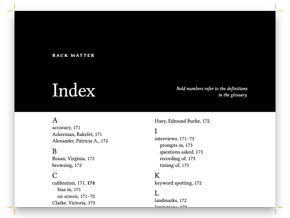
الفصل الرابع من Letters of Metal، دراسة علمية عن حروف الطباعة منضّدة بمقاس 155 × 235 mm: عمود واحد بخط Crimson Pro، وBodoni المائل للعناوين، ولون تمييز أحمر آجري. تمتد المقالة من حروف textura عند Gutenberg، مرورًا بـ Jenson، وAldus وGriffo، وGaramond وPlantin، وCaslon وBaskerville، ونقاط Fournier، والحروف الإسبانية التي حفرها Pradell وGil وطبع بها Ibarra، حتى حروف Bodoni الحديثة. وتنتهي كما تنتهي هذه الكتب، بفهرسين على صفحتين متقابلتين: الطابعون وحفّارو القوالب والرعاة على الصفحة الزوجية، والحروف والأدوات والكتب على الصفحة الفردية. كلاهما يأتي من النص المعلَّم نفسه، وكل رقم صفحة فيهما هو الصفحة التي وقعت فيها العلامة.
تجيب هذه الوصفة عن
- كيف أطبع فهرسين، أحدهما للأعلام والآخر للموضوعات، من النص المعلَّم نفسه؟
- كيف أبني فهرسًا أبجديًّا في آخر الكتاب تتغير أرقام صفحاته من تلقاء نفسها حين يتحرك النص؟
الجواب المختصر
// Marks in the Markdown. A person goes to the names index, inverted:
//   :index[Aldus Manutius]{term="Manutius, Aldus" index="names" main}
// A subject goes to the main index, with levels split by "!" and a sort key when the
// printed form would file in the wrong place:
//   :index[textura]{term="Blackletter!textura" main}
//   :index{term="42-line Bible" sort="Forty-two-line Bible"}
//   :index{term="Cursive" see="Italic"}
// Printed at the end, each under its own heading:
//   # Index of Names {style="index"}    then    :::index{index="names"}
//   # Index of Subjects {style="index"} then    :::index
const indexHeading = {
  id: 'index',
  numbered: false, // no chapter number, and the next chapter is still chapter 5
  breakBefore: { enabled: true, parity: 'any' },
  layout: { layoutType: 'double', gutterWidth: mm(7) }, // the section after the heading
};
const index = {
  fontSize: pt(8.6), lineHeight: pt(11.2), // one leading for entries and letter heads
  indent: em(1), turnoverIndent: em(2),
  rangeFormat: 'chicago', // 212–14, as a monograph prints it
  main: { bold: true }, // the page of the principal discussion
  groups: { fontFamily: 'Bodoni Moda', fontSize: pt(11), fontWeight: 600, color: col('brick') },
};
المكونات
- الميزات
- الفهرس الأبجدي في آخر الكتابأنماط العناوينفصول بلا أرقامصفحات افتتاح مصمَّمةسمات العنوانالترويسات وأرقام الصفحاتهوامش متناظرةالترويسات بحسب دور الصفحةأنماط الفقراتلوحة ألوان دلاليةلون الورقالأسطر الأرامل والأسطر اليتيمة والكلمات المعزولةالتصدير إلى PDF
- تستخدم أيضًا
- الخطوط المضمَّنة في PDFهندسة القسم
- الخطوط
- Crimson Pro, Bodoni Moda, Libre Franklin (SIL OFL 1.1)
- الأصول
- لا شيء: كل صورة مرسومة بالكود
طريقة التحضير
#1 · علّم كل شخص لفهرس الأعلام، وكل موضوع للفهرس الرئيسي
الشيفرة هي الجواب المختصر أعلاه؛ والباقي في Markdown. العلامة التي فيها index="names" تذهب إلى الفهرس الذي يطبعه :::index{index="names"}، وكل علامة أخرى تذهب إلى الفهرس الرئيسي الذي يطبعه :::index المجرّد. فالعلامة :index[Aldus Manutius]{term="Manutius, Aldus" index="names" main} تطبع الاسم في النص وتسجّل صفحة بالأسود العريض تحت Manutius في فهرس الأعلام، بينما تسجّل :index[italic]{term="Italic" main} بعد سطرين الصفحةَ نفسها تحت Italic في الموضوعات. والشخص الذي هو موضوع من موضوعات الفصل يمكن أن يحمل العلامتين.
#2 · اقلب الأسماء، ورتّب حسب الحروف التي سيبحث تحتها القارئ
تُرتَّب الأسماء باسم العائلة أولًا: term="Garamond, Claude"، term="Dall’Aglio, Margherita". الفاصلة جزء من المصطلح، فيرتّب المُرتِّب Didot, Firmin قبل Didot, François-Ambroise كما يفعل المفهرِس. وحين تقع الصيغة المطبوعة تحت حرف خاطئ، يعطي sort مفتاح الترتيب: تعلّم الطبعة الإنجليزية term="42-line Bible" sort="Forty-two-line Bible"، فيقف الكتاب المقدس تحت F بدلًا من أن يفتتح مجموعة 0–9. والمداخل الفرعية (term="Foundries!Plantin-Moretus")، والصفحات الرئيسية بالأسود العريض (main)، وrange="start" وrange="end" حول قسم Bodoni، والإحالات (see="Italic"، seealso="Matrices") تتكفّل بالباقي؛ وهدف see الذي له مستويات يُطبع بنقطتين، كما في Humanist type. See Roman type: Venetian.
#3 · ابنِ مرة واحدة؛ والمستند يثبّت أرقامه بنفسه
// A pass finds the page of every mark and prints both indexes with those numbers. When the
// printed index moves a mark (an index set before the text would), the layout runs again,
// until no page number changes (in a buildBundle book, the chapter with :::index gets them all).
const doc = await buildWithFonts(() => buildDocument({ markdown }, config()), markdown);
يطبع الفهرس أرقام صفحات لا توجد إلا بعد الإخراج، وطباعته تأخذ صفحات خاصة بها. تتولى buildDocument() ذلك: تُخرج الفصل، وتقرأ صفحة كل علامة، وتطبع الفهرسين، وتعيد الإخراج كلما تغيّر رقم. هنا يأتي الفهرسان بعد النص، فتؤكد الجولة الثانية الأولى؛ أما فهرس يوضع قبل النص فيزيح كل صفحة بعده، وتستمر الجولات حتى تتفق. أضف فقرة إلى قسم Bodoni فيعطي فهرس الأعلام Whittingham صفحته الجديدة من تلقاء نفسه.
#4 · أعطِ كل فهرس صفحة افتتاح على عمودين
const opener = (sink, size) => ({
  enabled: true,
  minHeight: pt(LEAD * sink), // the text starts on the same grid line in every chapter
  slot: { elements: [
    { kind: 'text', id: 'kicker', content: '{attr.kicker}', ...label, fontSize: pt(7.8),
      letterSpacing: pt(1.6), color: col('brick'), align: 'left',
      placement: at('container', 'top-left', 0, 10) },
    { kind: 'text', id: 'title', content: '{titleText}', fontFamily: 'Bodoni Moda', italic: true,
      fontSize: pt(size), lineHeight: 1.08, color: col('ink'), align: 'left',
      overflow: 'wrap', // design text ends in an ellipsis by default
      placement: { ...at('#kicker', 'below', 0, 3), size: { width: 'fill', height: 'auto' } } },
    { kind: 'rule', id: 'rule', direction: 'horizontal', thickness: pt(0.75), color: col('brick'),
      placement: { ...at('#title', 'below', 0, 4.5), size: { width: mm(16) } } },
  ] },
});
يفعل نمط العنوان في الجواب المختصر ثلاثة أشياء لـ # Index of Names {style="index"}: يبدأ صفحة (parity: 'any'، فيتتابع الفهرسان من غير صفحة فارغة)، ويضع القسم الذي بعده في عمودين بينهما 7 mm، ومع numbered: false لا يمسّ عدّ الفصول. يعيد النمط استعمال صفحة افتتاح الفصل مع نزول بمقدار ستة أسطر وعنوان بقياس 20 pt، وتكرر عناوين الحروف خط Bodoni الخاص به بلون التمييز، بارتفاع سطر واحد من الفهرس فتحافظ الأعمدة على إيقاع أسطرها.
#5 · سمِّ الفهرس على الصفحة الفردية
const head = (id, content, parity, edge, x, extra = {}) => ({
  kind: 'text', id, content, parity, pages: 'body', // never on openers
  ...label, fontSize: pt(7.2), letterSpacing: pt(1.3), color: col('muted'),
  placement: at('page', edge, x, 12.5), ...extra,
});
const folio = { color: col('brick'), fontWeight: 700 };
const header = { elements: [
  head('verso-folio', '{pageNumber}', 'even', 'top-left', MARGIN.outer,
    { ...folio, align: 'left' }),
  head('verso-title', '{title}', 'even', 'top-left', MARGIN.outer + 8, { align: 'left' }),
  head('recto-title', '{chapterTitle}', 'odd', 'top-right', -(MARGIN.outer + 8),
    { align: 'right' }),
  head('recto-folio', '{pageNumber}', 'odd', 'top-right', -MARGIN.outer,
    { ...folio, align: 'right' }),
] };
// Openers carry a drop folio instead, centred under the text block.
const footer = { elements: [{ ...head('drop-folio', '{pageNumber}', 'all', 'bottom', 0,
  { ...folio, align: 'center', placement: at('page', 'bottom', 0, -12) }), pages: 'opener' }] };
ترويسة الصفحة الفردية تطبع {chapterTitle}، وعنوان الفهرس عنوان من المستوى الأول كأي فصل، فتحمل الصفحات بعده Index of Subjects في أعلاها. ويُبعد pages: 'body' الترويسات عن صفحتَي افتتاح الفهرسين، اللتين تحملان رقم صفحة سفليًا بدلًا منها.
الوصفة كاملة
// ═══ Postext Cookbook · Nº 073 · An index of names and an index of subjects ═══════ // https://postext.dev/en/cookbook/names-and-subjects-indexes // Code: MIT · Text: original (CC BY 4.0) · Pictures: none // Fonts: Crimson Pro, Bodoni Moda, Libre Franklin (SIL OFL 1.1) · Needs postext ≥ 1.7.0 import { buildDocument, renderPageToCanvas, clearMeasurementCache } from 'https://esm.sh/postext'; import { renderToPdf, decompressWoff2 } from 'https://esm.sh/postext-pdf'; const LANG = 'en'; // @lang: the language of the sample document ('en' | 'es') const RECIPE = 'names-and-subjects-indexes'; // ─── 1 · Design ───────────────────────────────────────────────────────────── // #region palette: a warm black, one brick red for kickers, letter heads and folios const palette = { ink: '#211d19', // text: a warm near-black brick: '#8e3b24', // the one accent muted: '#6d645a', // running heads, colophon rule: '#c8bba9', // hairlines paper: '#fcfaf5', }; // A design element paints the hex written beside its paletteId (gotcha: palette-skips-designs). const col = (id) => ({ hex: palette[id], model: 'hex', paletteId: id }); const colorPalette = [ ...Object.entries(palette).map(([id, hex]) => ({ id, name: id, value: { hex, model: 'hex' } })), // The engine's defaults link to main-color: point it at the accent, never the default blue. { id: 'main-color', name: 'accent (defaults)', value: { hex: palette.brick, model: 'hex' } }, ]; // #endregion const TRIM = { width: 155, height: 235 }; // a scholarly monograph const MARGIN = { top: 22, bottom: 24, inner: 19, outer: 22 }; // mirrored: 114 mm measure const LEAD = 13.6; // body leading in pt const at = (to, edge, x = 0, y = 0) => ({ anchor: { to, edge }, offset: { x: mm(x), y: mm(y) } }); const label = { fontFamily: 'Libre Franklin', fontWeight: 600, textTransform: 'uppercase' }; // #region answer: two indexes from one text, each under a two-column heading style // Marks in the Markdown. A person goes to the names index, inverted: // :index[Aldus Manutius]{term="Manutius, Aldus" index="names" main} // A subject goes to the main index, with levels split by "!" and a sort key when the // printed form would file in the wrong place: // :index[textura]{term="Blackletter!textura" main} // :index{term="42-line Bible" sort="Forty-two-line Bible"} // :index{term="Cursive" see="Italic"} // Printed at the end, each under its own heading: // # Index of Names {style="index"} then :::index{index="names"} // # Index of Subjects {style="index"} then :::index const indexHeading = { id: 'index', numbered: false, // no chapter number, and the next chapter is still chapter 5 breakBefore: { enabled: true, parity: 'any' }, layout: { layoutType: 'double', gutterWidth: mm(7) }, // the section after the heading }; const index = { fontSize: pt(8.6), lineHeight: pt(11.2), // one leading for entries and letter heads indent: em(1), turnoverIndent: em(2), rangeFormat: 'chicago', // 212–14, as a monograph prints it main: { bold: true }, // the page of the principal discussion groups: { fontFamily: 'Bodoni Moda', fontSize: pt(11), fontWeight: 600, color: col('brick') }, }; // #endregion // #region opener: kicker, a Bodoni italic title and a short rule, sunk to the same line const opener = (sink, size) => ({ enabled: true, minHeight: pt(LEAD * sink), // the text starts on the same grid line in every chapter slot: { elements: [ { kind: 'text', id: 'kicker', content: '{attr.kicker}', ...label, fontSize: pt(7.8), letterSpacing: pt(1.6), color: col('brick'), align: 'left', placement: at('container', 'top-left', 0, 10) }, { kind: 'text', id: 'title', content: '{titleText}', fontFamily: 'Bodoni Moda', italic: true, fontSize: pt(size), lineHeight: 1.08, color: col('ink'), align: 'left', overflow: 'wrap', // design text ends in an ellipsis by default placement: { ...at('#kicker', 'below', 0, 3), size: { width: 'fill', height: 'auto' } } }, { kind: 'rule', id: 'rule', direction: 'horizontal', thickness: pt(0.75), color: col('brick'), placement: { ...at('#title', 'below', 0, 4.5), size: { width: mm(16) } } }, ] }, }); // #endregion // #region running-heads: book title on the verso, chapter or index on the recto const head = (id, content, parity, edge, x, extra = {}) => ({ kind: 'text', id, content, parity, pages: 'body', // never on openers ...label, fontSize: pt(7.2), letterSpacing: pt(1.3), color: col('muted'), placement: at('page', edge, x, 12.5), ...extra, }); const folio = { color: col('brick'), fontWeight: 700 }; const header = { elements: [ head('verso-folio', '{pageNumber}', 'even', 'top-left', MARGIN.outer, { ...folio, align: 'left' }), head('verso-title', '{title}', 'even', 'top-left', MARGIN.outer + 8, { align: 'left' }), head('recto-title', '{chapterTitle}', 'odd', 'top-right', -(MARGIN.outer + 8), { align: 'right' }), head('recto-folio', '{pageNumber}', 'odd', 'top-right', -MARGIN.outer, { ...folio, align: 'right' }), ] }; // Openers carry a drop folio instead, centred under the text block. const footer = { elements: [{ ...head('drop-folio', '{pageNumber}', 'all', 'bottom', 0, { ...folio, align: 'center', placement: at('page', 'bottom', 0, -12) }), pages: 'opener' }] }; // #endregion const config = () => ({ // a factory: the engine caches resolved configs per object locale: t({ en: 'en-us', es: 'es' }), // exact codes (gotcha: hyphenation-locales) colorPalette, page: { sizePreset: 'custom', width: mm(TRIM.width), height: mm(TRIM.height), dpi: 150, backgroundColor: col('paper'), margins: { top: mm(MARGIN.top), bottom: mm(MARGIN.bottom), left: mm(MARGIN.inner), right: mm(MARGIN.outer), mirror: true } }, // left = inner layout: { layoutType: 'single' }, bodyText: { fontFamily: 'Crimson Pro', fontSize: pt(10.6), lineHeight: pt(LEAD), color: col('ink'), boldColor: col('ink'), italicColor: col('ink'), referenceColor: col('ink'), textAlign: 'justify', firstLineIndent: mm(4.5), indentAfterHeading: false, hyphenation: { enabled: true }, optimalLineBreaking: true, avoidWidows: true, avoidOrphans: true, avoidRunts: true }, headings: { fontFamily: 'Bodoni Moda', fontWeight: 400, color: col('ink'), levels: [ // Restated on purpose: any headings object drops the H1 break // (gotcha: headings-drop-h1-break). { level: 1, advancedDesign: opener(9, 26), marginBottom: pt(0), breakBefore: { enabled: true, parity: 'odd' } }, { level: 2, fontSize: pt(12), lineHeight: pt(LEAD), italic: true, fontWeight: 400, color: col('brick'), marginTop: pt(LEAD), marginBottom: pt(LEAD * 0.5) }, ] }, // The index heading: a shallower opener over the two columns of entries. headingStyles: [{ ...indexHeading, span: 'page', advancedDesign: opener(6, 20), marginBottom: pt(0) }], index, paragraphStyles: [ { id: 'colophon', ...label, textTransform: 'none', fontWeight: 400, fontSize: pt(7), lineHeight: pt(10), color: col('muted'), textAlign: 'left', firstLineIndent: pt(0), marginTop: pt(LEAD * 2) }, ], header, footer, }); // ─── 2 · Content ──────────────────────────────────────────────────────────── const markdown = String.raw`---نموذج Markdown · أسطر: 70 · content.en.md
title: "Letters of Metal" subtitle: "A Short History of Printing Types" --- # From Textura to Bodoni {kicker="Chapter four"} The first European types imitated the hand that readers trusted most. When :index[Johannes Gutenberg]{term="Gutenberg, Johannes" index="names" main} printed his Bible in Mainz, finished by 1455,:index{term="42-line Bible" sort="Forty-two-line Bible" main} he set it in :index[textura]{term="Blackletter!textura" main}, the tall, narrow letter of German choir books, with its broken strokes and diamond feet. The page was meant to pass for a manuscript, and it did: rubricators added the red initials by hand, and some copies were printed on vellum. What was new lay out of sight. Each letter had been cut in steel as a :index[punch]{term="Punchcutting" main}:index{term="Punchcutting" seealso="Matrices"}, struck into a bar of softer copper to make a :index[matrix]{term="Matrices"}, and cast in the :index[hand mould]{term="Hand mould"} from an alloy of lead, tin and antimony.:index{term="Type metal"} A single punch could yield thousands of identical sorts, and the whole chain, from punch to page, would stay in use with few changes for nearly four hundred years. Gutenberg’s partners saw the business before he did. :index[Johann Fust]{term="Fust, Johann" index="names"} took over the shop after a lawsuit in 1455, and with :index[Peter Schoeffer]{term="Schoeffer, Peter" index="names"} he printed the Mainz Psalter of 1457, the first book to carry a printer’s colophon and a date. When Mainz was sacked in 1462 its journeymen scattered, and within twenty years there were presses in more than a hundred towns. ## The Venetian roman Italian readers did not want German letters. The humanists of Florence had revived the Carolingian minuscule for their copies of the classics, a round, open hand they believed ancient, and the printers who came south followed them. The best of the early romans was cut in Venice by :index[Nicolas Jenson]{term="Jenson, Nicolas" index="names" main}, a Frenchman trained at the mint of Tours. His Eusebius of 1470 is set in a :index[roman]{term="Roman type!Venetian" main} of even colour and wide, well-fitted capitals, and it has been the model for revivals ever since. Twenty-five years later :index[Aldus Manutius]{term="Manutius, Aldus" index="names" main} opened his press in the same city, with a scholar’s programme: Greek texts first, then the Latin authors in editions a student could carry. His punchcutter was :index[Francesco Griffo]{term="Griffo, Francesco" index="names" main} of Bologna. For the short dialogue *De Aetna* by the young :index[Pietro Bembo]{term="Bembo, Pietro" index="names"}, printed in 1496,:index{term="*De Aetna*"} Griffo cut a roman lighter and more regular than Jenson’s, with capitals shorter than the ascenders, the proportion book faces have kept to this day. :index{term="Roman type!Aldine"} In 1501 Aldus issued a :index[Virgil]{term="Virgil" index="names"} in octavo, set entirely in a new letter: Griffo’s :index[italic]{term="Italic" main}, based on the sloped script of the papal chancery. It saved space, which suited a pocket book, and it looked learned. The Venetian Senate granted Aldus a privilege over it,:index{term="Privileges"} counterfeiters in Lyon copied it within a year, and Aldus and Griffo quarrelled over the credit until Griffo left Venice. For a century the italic was a text face in its own right. Only later did printers pair it with a roman and use it for emphasis, titles and foreign words, the role it still has. :index{term="Cursive" see="Italic"} ## Paris and Antwerp The roman became French in the 1530s. The Paris printer :index[Robert Estienne]{term="Estienne, Robert" index="names"} and his circle wanted Aldine letters, and the man who cut them best was :index[Claude Garamond]{term="Garamond, Claude" index="names" main}, a punchcutter who worked mostly for other men’s presses. His romans refine Griffo’s model: the thin strokes are finer, the serifs sharper, the capitals lighter against the lower case. Between 1540 and 1550 he also cut the *grecs du roi*,:index{term="Greek type"} three sizes of Greek for François I, closely modelled on the hand of the Cretan scribe Angelos Vergikios. When Garamond died in 1561 his punches were sold, and many went to Antwerp. :index[Christophe Plantin]{term="Plantin, Christophe" index="names" main}, a bookbinder from Touraine, had built there the largest printing house in Europe, and he bought type as a banker buys bonds. His shop kept the punches and matrices of Garamond, of :index[Robert Granjon]{term="Granjon, Robert" index="names" main} and of Guillaume Le Bé, and for the great Polyglot Bible of 1568–1572, in Latin, Greek, Hebrew, Aramaic and Syriac, he needed all of them. Granjon was the finest italic cutter of the century; he also cut, in Lyon in 1557, the *civilité*, a French secretary hand he hoped would become a national type. It did not, but his italics did. The house stayed with the Moretus family until the city of Antwerp bought it in 1876, and its punches, matrices and account books are still there, the most complete type foundry of its age to survive.:index{term="Foundries!Plantin-Moretus"} ## The English century England printed with Dutch type until the eighteenth century, when an engraver of gun locks set up a foundry in London. :index[William Caslon]{term="Caslon, William" index="names" main} issued his specimen sheet in 1734,:index{term="Specimens!Caslon, 1734"} and his roman, sturdy and a little irregular, became the ordinary type of the English-speaking world. It needed no explanation and drew no attention to itself, which is why printers still reach for it. :index[John Baskerville]{term="Baskerville, John" index="names" main}, a Birmingham writing master who had made his money in japanned ware, came to printing late and changed more than the letters. For his Virgil of 1757 he had his own type cut by John Handy, with a more vertical stress and a sharper contrast than Caslon’s, and he printed it on smooth wove paper,:index{term="Paper, wove"} with a blacker ink of his own recipe, and pressed the sheets between hot copper plates to give them a gloss. English printers found the pages too bright to read. Readers on the Continent admired them, and a :index[transitional]{term="Transitional type"} letter, between the old style and the modern, was born. ## Measuring type Until the middle of the eighteenth century every foundry named its sizes as it pleased: *pica*, *cicero*, *long primer*, *petit-romain*. A size was a habit of the house, not a measurement, and a printer who bought type from two foundries could not set it side by side. :index[Pierre-Simon Fournier]{term="Fournier, Pierre-Simon" index="names" main}, the younger son of a Paris family of typefounders, published in 1737 a table of proportions that divided an inch into seventy-two :index[points]{term="Point system" main range="start"} and gave every body a number of points. He set it out in full in his *Manuel typographique* of 1764–1766.:index{term="*Manuel typographique*"} :index[François-Ambroise Didot]{term="Didot, François-Ambroise" index="names"} tied the point to the royal foot about 1783, which made it slightly larger; the Didot point spread across the Continent, while American and British founders settled on a pica point of their own only in 1886 and 1898. :index{term="Point system" range="end"} ## Spanish types Spanish printers of the early eighteenth century bought their type in Holland and France, and the Crown thought this a disgrace for a kingdom that had printed the Complutensian Polyglot. :index[Charles III]{term="Charles III, king of Spain" index="names"} and his ministers set out to change it. The Royal Library in Madrid opened a foundry of its own,:index{term="Foundries!Royal Library, Madrid" main} and the Crown paid pensions to punchcutters who would work in Spain. Two of them came from very different trades. :index[Eudald Pradell]{term="Pradell, Eudald" index="names" main}, the son of a gunsmith from Ripoll, had learned to cut steel in his father’s forge and cut his first punches in Barcelona. Called to Madrid in 1764 with a royal pension, he cut romans and italics of an open, generous design that the Madrid printers took up at once. :index[Jerónimo Antonio Gil]{term="Gil, Jerónimo Antonio" index="names" main} came from the other end of the trade: he was an engraver of the Royal Mint, a medallist, and he cut for the Royal Library a series of romans, italics and Greek that the Library showed in its specimen of 1787.:index{term="Specimens!Royal Library, 1787"} Gil did not stay to see it. In 1778 he left for Mexico as chief engraver of the mint, and there he founded the school that became the Academy of San Carlos. The printer who made these types famous was :index[Joaquín Ibarra]{term="Ibarra, Joaquín" index="names" main}, born in Zaragoza in 1725 and printer to the King from 1779. His Sallust of 1772, translated by the Infante Gabriel,:index{term="Gabriel of Bourbon, Infante" index="names"} was praised in Paris and Parma for its presswork. For the Real Academia Española he printed in 1780 the *Quixote* in four quarto volumes,:index{term="*Quixote*, Academy edition" main}:index{term="Cervantes, Miguel de" index="names"} set in Gil’s types, illustrated by the best engravers of the court and printed on paper made for it in Catalonia. The ink, dark and even, was Ibarra’s own; the page, with generous margins and no ornament besides the plates, is the Spanish counterpart of Baskerville’s. ## Bodoni’s moderns The last step belonged to a printer at a small court.:index{term="Modern face" range="start"} :index[Giambattista Bodoni]{term="Bodoni, Giambattista" index="names" main}, born in Saluzzo in 1740, learned to cut punches at the press of the Propaganda Fide in Rome, where he cleaned and set in order its oriental types. In 1768 Duke Ferdinand called him to Parma to run the ducal press, and he stayed there for the rest of his life. His early types follow Fournier; by the 1790s he was cutting letters of a new kind, with hairline serifs, strictly vertical stress and a contrast between thick and thin that only smooth paper and careful printing could hold. These are the :index[modern]{term="Modern face" main} faces. In Paris, :index[Firmin Didot]{term="Didot, Firmin" index="names"} was drawing the same conclusions at the same time, and the two houses watched each other closely.:index{term="Didone" see="Modern face"} Bodoni printed few books that anyone read, and many that everyone admired: Homer in Greek, Horace, Tasso, folio after folio for collectors and kings. His life’s work was the :index[*Manuale tipografico*]{term="*Manuale tipografico*" main}, which his widow, :index[Margherita Dall’Aglio]{term="Dall’Aglio, Margherita" index="names"}, published in 1818, five years after his death: two volumes of romans and italics in more than a hundred sizes and cuts, with Greek, Hebrew and other alphabets, and a preface that says what a letter ought to be. The modern face swept the Continent and then England, where by 1820 hardly a printer still set books in old-style type.:index{term="Modern face" range="end"} ## Names for the families The words this chapter has used, :index[old style]{term="Old style" main}, transitional and modern, come from the printers of the nineteenth century, who needed a way to order their specimen books, and they are not precise. An old style in 1860 meant any letter cut on the model of Caslon; a modern meant anything after Bodoni, however clumsy. The old style came back in the 1840s, when :index[Charles Whittingham]{term="Whittingham, Charles" index="names"} of the Chiswick Press reissued Caslon’s type for a book set in the manner of the seventeenth century, and from then on the two lived side by side in every specimen. In 1921 the French typefounder :index[Francis Thibaudeau]{term="Thibaudeau, Francis" index="names"} proposed to sort types by their serifs alone: triangular, hairline, square or none.:index{term="Classification of types!Thibaudeau, 1921"} It was easy to apply and blind to history. :index[Maximilien Vox]{term="Vox, Maximilien" index="names"}, an illustrator and publisher, went further in 1954 with nine families whose names join the masters of each style: *humanes* for the Venetians after Jenson, *garaldes* for Garamond and Aldus, *réales* for the letters of Fournier and Baskerville, *didones* for Didot and Bodoni.:index{term="Classification of types!Vox, 1954" main} The Association Typographique Internationale adopted a version of it in 1962, and the British Standards Institution followed in 1967. :index{term="Garalde" see="Old style"} :index{term="Humanist type" see="Roman type!Venetian"} These labels leave out as much as they sort. Gil’s romans for the Royal Library are *réales* by the book and Spanish by every other measure; Pradell’s italics owe as much to Granjon as to anything cut in their own century. The quarrel between the two ideas of the letter, the one written with a pen and the one drawn with compasses and rule, is older than any of these names and has not been settled. :::paragraphs{style="colophon"} *Letters of Metal*, chapter four. Set in Crimson Pro, with Bodoni Moda for display and Libre Franklin for labels (SIL Open Font License). Text written for the Postext Cookbook, CC BY 4.0. ::: # Index of Names {style="index" kicker="Printers, punchcutters, patrons"} :::index{index="names"} # Index of Subjects {style="index" kicker="Types, tools and books"} :::index`; // content.<lang>.md, inlined by the Cookbook // ─── 3 · Fonts ────────────────────────────────────────────────────────────── // Every face the design uses (gotcha: fonts-first). const FONTS = { 'Crimson Pro': ['400', '400i', '600', '700'], 'Bodoni Moda': ['400', '400i', '600'], 'Libre Franklin': ['400', '400i', '600', '700'], }; // ─── 4 · Build & show ─────────────────────────────────────────────────────── await loadFonts(FONTS, markdown); // #region build: one buildDocument, laid out again until the index's page numbers settle // A pass finds the page of every mark and prints both indexes with those numbers. When the // printed index moves a mark (an index set before the text would), the layout runs again, // until no page number changes (in a buildBundle book, the chapter with :::index gets them all). const doc = await buildWithFonts(() => buildDocument({ markdown }, config()), markdown); // #endregion showPages(doc, { title: t({ en: 'Two indexes', es: 'Dos índices' }) }); offerPdf(() => renderToPdf(doc, { fontProvider: fontsourceProvider }), `${RECIPE}.pdf`);العُدّة · core, fonts, viewer, pdf: نفسها في كل وصفة · أسطر: 275
// ─── Kit ── helpers shared by every Cookbook recipe · postext.dev/cookbook ───── // ─── Kit · core v1 ── the same in every recipe · postext.dev/cookbook ───────── function mm(value) { return { value, unit: 'mm' }; } function pt(value) { return { value, unit: 'pt' }; } function em(value) { return { value, unit: 'em' }; } /** The sample language's string: t({ en: 'Figure', es: 'Figura' }). */ function t(strings) { return strings[LANG] ?? Object.values(strings)[0]; } /** A file in this recipe's assets folder, served from the Postext repo by jsDelivr. */ function asset(file) { return `https://cdn.jsdelivr.net/gh/drnachio/postext@main/cookbook/${RECIPE}/assets/${file}`; } // ─── Kit · fonts v1 ── the same in every recipe · postext.dev/cookbook ──────── // Postext measures text with the faces the browser has loaded, and caches the // widths, so every face must be ready before the first build. Faces come from // Fontsource: the same static files the PDF embeds, so screen and PDF agree. /** faces = { 'Family Name': ['400', '400i', '700'] }. `text` is the sample: * letters beyond Latin-1 (č, ł, ő…) also load the latin-ext files. With * `optional`, a face Fontsource does not ship is skipped instead of failing. * Resolves to the number of faces added. */ async function loadFonts(faces, text = '', { optional = false } = {}) { kitStatus('Loading fonts…'); const ranges = { latin: 'U+0000-00FF,U+0131,U+0152-0153,U+02BB-02BC,U+02C6,U+02DA,U+02DC,U+0304,U+0308,U+0329,' + 'U+2000-206F,U+20AC,U+2122,U+2191,U+2193,U+2212,U+2215,U+FEFF,U+FFFD', 'latin-ext': 'U+0100-02BA,U+02BD-02C5,U+02C7-02CC,U+02CE-02D7,U+02DD-02FF,U+0304,U+0308,U+0329,' + 'U+1D00-1DBF,U+1E00-1E9F,U+1EF2-1EFF,U+2020,U+20A0-20AB,U+20AD-20C0,U+2113,U+2C60-2C7F,U+A720-A7FF', }; const subsets = /[Ā-˿Ḁ-ỿ]/.test(text) ? ['latin', 'latin-ext'] : ['latin']; const jobs = []; let added = 0; for (const [family, specs] of Object.entries(faces)) { const id = fontsourceId(family); const meta = optional ? await fontsourceMeta(family) : null; for (const spec of new Set(specs)) { const weight = parseInt(spec, 10); const style = spec.endsWith('i') ? 'italic' : 'normal'; if (hasFace(family, weight, style)) continue; if (optional && !(meta?.weights.includes(weight) && meta.styles.includes(style))) continue; for (const subset of subsets) { const url = `https://cdn.jsdelivr.net/npm/@fontsource/${id}@5/files/${id}-${subset}-${weight}-${style}.woff2`; const face = new FontFace(family, `url(${url}) format('woff2')`, { weight: String(weight), style, unicodeRange: ranges[subset] }); jobs.push(face.load().then((ready) => { document.fonts.add(ready); added++; }, () => { if (subset === 'latin' && !optional) throw new Error(`Fontsource has no ${family} ${weight} ${style}`); })); } } } await Promise.all(jobs).catch((error) => { kitFail(error); throw error; }); return added; } /** Runs `build` (a buildDocument or buildBundle call) and checks the faces * the pages use. A regular face missing from FONTS is loaded with a warning; * bold and italic variants are loaded when the family ships them. Then the * measurement caches are cleared and the build runs again. */ async function buildWithFonts(build, text = '') { const tried = new Set(); for (let round = 0; round < 3; round++) { kitStatus('Laying out…'); await new Promise(requestAnimationFrame); // let the status paint first const result = await Promise.resolve().then(build).catch((error) => { kitFail(error); throw error; }); const wanted = { base: {}, variants: {} }; for (const { font, base } of [result].flat().flatMap(fontStringsOf)) { const { family, weight, style } = parseFont(font); const key = `${family}|${weight}|${style}`; if (tried.has(key) || hasFace(family, weight, style)) continue; tried.add(key); (wanted[base ? 'base' : 'variants'][family] ??= []).push(`${weight}${style === 'italic' ? 'i' : ''}`); } if (Object.keys(wanted.base).length) { console.warn(`[cookbook] FONTS does not list ${JSON.stringify(wanted.base)}: loading them.`); } const added = await loadFonts(wanted.base, text) + await loadFonts(wanted.variants, text, { optional: true }); if (added === 0) return result; clearMeasurementCache(); } throw new Error('The fonts did not settle after three builds.'); } /** Every font string of the layout. `base` marks a block's own face; its * bold, italic and bold-italic variants are listed whether or not used. */ function fontStringsOf(doc) { const found = new Map(); const walk = (node) => { if (!node || typeof node !== 'object') return; if (Array.isArray(node)) { node.forEach(walk); return; } for (const [key, value] of Object.entries(node)) { if (typeof value === 'string' && /fontString$/i.test(key)) { found.set(value, found.get(value) || key === 'fontString'); } else if (value && typeof value === 'object') walk(value); } }; walk(doc.pages); walk(doc.blocks); return [...found].map(([font, base]) => ({ font, base })); } /** '700 37.5px Open Sans' / 'italic 400 13px "Source Serif 4"' → { family, weight, style }. * A string with no weight ('95.8px Young Serif', from a design text) is 400. */ function parseFont(font) { const m = /^(?:(italic|oblique)\s+)?(?:small-caps\s+)?(?:(\d+|bold|normal)\s+)?[\d.]+px\s+(.+)$/.exec(font.trim()); if (!m) throw new Error(`Unexpected font string: ${font}`); const weight = m[2] === 'bold' ? 700 : !m[2] || m[2] === 'normal' ? 400 : Number(m[2]); return { family: m[3].replace(/^["']|["']$/g, ''), weight, style: m[1] ? 'italic' : 'normal' }; } /** True when a loaded FontFace covers exactly this family, weight and style * (document.fonts.check() is also true for families nobody declared). */ function hasFace(family, weight, style) { for (const face of document.fonts) { if (face.status !== 'loaded' || face.style !== style) continue; if (face.family.replace(/^["']|["']$/g, '') !== family) continue; const [low, high = low] = face.weight.split(' ').map(Number); if (weight >= low && weight <= high) return true; } return false; } /** Fontsource's id for a family: 'Source Serif 4' → 'source-serif-4'. */ function fontsourceId(family) { return family.toLowerCase().replace(/\s+/g, '-'); } /** The weights and styles a family ships ({ weights: [400, 700], styles: ['normal', 'italic'] }), or null. */ function fontsourceMeta(family) { fontsourceMeta.cache ??= new Map(); const id = fontsourceId(family); if (!fontsourceMeta.cache.has(id)) { fontsourceMeta.cache.set(id, fetch(`https://api.fontsource.org/v1/fonts/${id}`) .then((res) => (res.ok ? res.json() : null), () => null)); } return fontsourceMeta.cache.get(id); } // ─── Kit · viewer v1 ── the same in every recipe · postext.dev/cookbook ─────── /** Shows the pages as facing spreads on a dark desk: the first page is a * recto on its own, then verso | recto pairs, as in a bound book. Pages * are painted when they scroll near the screen. */ function showPages(docs, { title, width = 460 } = {}) { const root = viewer(title); const pages = [docs].flat().flatMap((doc) => doc.pages.map((page) => ({ doc, page, n: (doc.pageIndexOffset ?? 0) + page.index }))); const spreads = []; let verso = null; for (const p of pages) { if (p.n % 2 === 1) { if (verso) spreads.push([verso, null]); verso = p; } else { spreads.push([verso, p]); verso = null; } } if (verso) spreads.push([verso, null]); const density = Math.min(window.devicePixelRatio || 1, 2); showPages.painter?.disconnect(); const painter = new IntersectionObserver((entries) => { for (const { isIntersecting, target } of entries) { if (!isIntersecting) continue; painter.unobserve(target); const { doc, page } = target.postext; renderPageToCanvas(page, doc, target, { scale: (width * density) / page.width }); } }, { rootMargin: '800px' }); showPages.painter = painter; root.replaceChildren(...spreads.map((pair) => { const spread = document.createElement('div'); spread.className = 'pt-spread'; for (const p of pair) { const figure = document.createElement('figure'); if (p) { const label = p.page.pageLabel || String(p.n + 1); const canvas = document.createElement('canvas'); canvas.postext = p; canvas.style.aspectRatio = `${p.page.width} / ${p.page.height}`; canvas.setAttribute('role', 'img'); canvas.setAttribute('aria-label', `Page ${label}`); const folio = document.createElement('figcaption'); folio.textContent = label; figure.append(canvas, folio); painter.observe(canvas); } else figure.className = 'pt-blank'; spread.append(figure); } return spread; })); kitStatus(`${pages.length} ${pages.length === 1 ? 'page' : 'pages'}`); document.documentElement.dataset.postext = 'ready'; return pages.length; } /** The desk, the bar and the error reporting, created once. */ function viewer(title) { if (!document.getElementById('pt-kit')) { document.head.insertAdjacentHTML('beforeend', `<style id="pt-kit"> :root { color-scheme: dark; } body { margin: 0; background: #0e1014; color: #b9bcc4; font: 13px/1.45 system-ui, sans-serif; } #pt-bar { position: sticky; top: 0; z-index: 1; display: flex; flex-wrap: wrap; align-items: center; gap: 6px 16px; padding: 10px 16px; background: rgb(14 16 20 / .92); backdrop-filter: blur(6px); border-bottom: 1px solid #23262d; } #pt-bar strong { color: #f4f1ea; font-weight: 600; } #pt-actions { display: flex; gap: 12px; margin-left: auto; } #pt-actions a, #pt-actions button { color: #d8a21a; font: inherit; background: none; border: 0; padding: 0; cursor: pointer; } #pages { display: grid; justify-items: center; gap: 48px; padding: 32px 16px 72px; } .pt-spread { display: flex; } .pt-spread figure { margin: 0; width: min(460px, 44vw); } .pt-spread canvas { display: block; width: 100%; background: #fff; box-shadow: 0 1px 2px rgb(0 0 0 / .5), 0 22px 44px -16px rgb(0 0 0 / .8); } .pt-spread figure:first-child canvas { box-shadow: inset -14px 0 14px -14px rgb(0 0 0 / .18), 0 1px 2px rgb(0 0 0 / .5), 0 22px 44px -16px rgb(0 0 0 / .8); } .pt-spread figcaption { margin-top: 10px; text-align: center; font: 600 10px/1 system-ui, sans-serif; letter-spacing: .18em; text-transform: uppercase; color: #6c7079; } .pt-blank { visibility: hidden; } @media (max-width: 760px) { .pt-spread { flex-direction: column; gap: 32px; } .pt-spread figure { width: min(460px, 92vw); } .pt-blank { display: none; } } </style>`); document.body.insertAdjacentHTML('afterbegin', '<header id="pt-bar"><strong id="pt-title"></strong><span id="pt-status" role="status"></span><span id="pt-actions"></span></header>'); document.getElementById('pt-title').textContent = document.title || 'Postext'; addEventListener('error', (event) => kitFail(event.error ?? event.message)); addEventListener('unhandledrejection', (event) => kitFail(event.reason)); } if (title) document.getElementById('pt-title').textContent = title; return document.getElementById('pages') ?? document.body.appendChild(Object.assign(document.createElement('main'), { id: 'pages' })); } function kitStatus(text) { viewer(); document.getElementById('pt-status').textContent = text; } function kitFail(error) { document.documentElement.dataset.postext = 'error'; kitStatus(`Error: ${error?.message ?? error}`); } // ─── Kit · pdf v1 ── the same in every recipe that exports a PDF ────────────── /** postext-pdf embeds TrueType bytes. Fetch the Fontsource file the screen * used, snapping to a weight the family ships and falling back to upright * when it has no italic: the PDF asks for every face a block could use. */ async function fontsourceProvider(family, weight, style) { const id = fontsourceId(family); const meta = await fontsourceMeta(family); const weights = meta?.weights?.length ? meta.weights : [400, 700]; const w = weights.reduce((a, b) => (Math.abs(b - weight) < Math.abs(a - weight) ? b : a)); const s = style === 'italic' && meta && !meta.styles.includes('italic') ? 'normal' : style; const res = await fetch(`https://cdn.jsdelivr.net/npm/@fontsource/${id}@5/files/${id}-latin-${w}-${s}.woff2`); if (!res.ok) throw new Error(`Fontsource has no ${family} ${w} ${s} (${res.status})`); return decompressWoff2(new Uint8Array(await res.arrayBuffer())); } /** A "Build the PDF" button in the bar. Once built: "Open the PDF" (a new * tab, since CodePen's preview frame cannot show PDFs) and a download link. */ function offerPdf(makePdf, filename) { viewer(); const button = Object.assign(document.createElement('button'), { type: 'button', textContent: 'Build the PDF' }); button.dataset.postextPdf = filename; button.addEventListener('click', async () => { button.disabled = true; button.textContent = 'Building the PDF…'; try { const bytes = await makePdf(); const url = URL.createObjectURL(new Blob([bytes], { type: 'application/pdf' })); const size = `${Math.max(1, Math.round(bytes.length / 1024))} KB`; button.replaceWith( Object.assign(document.createElement('a'), { href: url, target: '_blank', rel: 'noopener', textContent: 'Open the PDF ↗' }), Object.assign(document.createElement('a'), { href: url, download: filename, textContent: `Download ${filename} · ${size}` })); } catch (error) { button.disabled = false; button.textContent = 'Build the PDF'; kitFail(error); } }); document.getElementById('pt-actions').append(button); } // ─── /Kit ───────────────────────────────────────────────────────────────────────
يعمل ملف script.js المجمّع كما هو: الصقه في سكربت الوحدة (module) لأي صفحة، أو افتح الوصفة على CodePen. مجلد الوصفة على GitHub ↗ (يفتح في تبويب جديد)
تنويعات
#اطبع فهرسًا واحدًا جامعًا
احذف index="names" من علامات الأشخاص ومن العنوان الثاني: عندئذ تقع كل علامة في الفهرس الرئيسي، الأعلام والموضوعات في ترتيب أبجدي واحد.
-:index[Aldus Manutius]{term="Manutius, Aldus" index="names" main}
+:index[Aldus Manutius]{term="Manutius, Aldus" main}#احذف عناوين الحروف
فهرس أعلام بهذا القِصر يُقرأ جيدًا من دونها. يزيل groups.enabled: false العناوين ويبقي سطرًا واحدًا من الفراغ بين الحروف؛ والإعداد يسري على الفهرسين.
-  groups: { fontFamily: 'Bodoni Moda', fontSize: pt(11), fontWeight: 600, color: col('brick') },
+ groups: { enabled: false },أخطاء شائعة
خطأ شائع
أي كائن headings يُلغي فاصل الصفحة قبل H1
ينتقل H1 افتراضيًا إلى صفحة فردية (always-odd)، لكن تمرير أي كائن headings يعيد ضبط هذا الافتراض، فتتوالى الفصول دون فاصل ولا يفعل span: 'page' شيئًا. أعد كتابة headings.levels[0].breakBefore: { enabled: true, parity } في كل إعداد. فصول تبدأ في صفحة فردية →
خطأ شائع
حمّل كل أوجه الخط قبل الإخراج
يقيس الإخراج النص بأوجه الخط التي حمّلها المتصفح ويخزّن العروض مؤقتًا، فالوجه الذي يصل بعد البناء الأول يترك فواصل أسطر خاطئة وملف PDF لم يعد يطابق الشاشة. حمّل كل وزن وكل نمط أولًا، واستدعِ clearMeasurementCache() قبل إعادة البناء إذا تأخر وصول أحدها. الخطوط قبل الإخراج →
خطأ شائع
لوحة الألوان المستبدلة لا تصل إلى عناصر التصميم ولا إلى لون الإحالة
يقرأ postext 1.4.1 الإعداد colorPalette في أنماط النص (المتن والعناوين والقوائم والتعليقات والجداول والإطارات) لكن لا في عناصر الترويسات والتذييلات والافتتاحيات وصفحات الأجزاء، ولا في bodyText.referenceColor: تحتفظ بالقيمة الست عشرية المكتوبة بجانب paletteId الخاص بها. حين تستبدل لوحة الألوان، لنسخة شاشة داكنة أو لإعادة تلوين، أعِد كتابة كل لون مرتبط من colorPalette قبل البناء. لوحة ألوان دلالية →
خطأ شائع
فيض نص التصميم افتراضيًا 'ellipsis-end'
عنصر نص التصميم الذي لا يتسع له عرضه ينتهي افتراضيًا بعلامة الحذف. اضبط overflow: 'wrap' للعناوين التي يجب أن تنكسر على أسطر أكثر. النصوص والخطوط والمربعات في تصاميم الصفحة →
خطأ شائع
8 لغات فقط تُقسَّم بالواصلة، بالرمز المطابق تمامًا
يتوفر تقسيم الكلمات بالواصلة للغات en-us وes وfr وde وit وpt وca وnl، بمطابقة تامة للرمز: 'es-ES' أو أي لغة أخرى تعود دون تنبيه إلى الإنجليزية الأمريكية. تقسيم الكلمات ولغة المستند →
خطأ شائع
يُخزَّن الإعداد مؤقتًا بحسب هويته: ابنِ كائنًا جديدًا
يخزّن المحرّك الإعدادات المحسوبة مؤقتًا بحسب هوية الكائن، فتعديل الإعداد في مكانه ثم البناء مجددًا يعيد استخدام النتيجة القديمة. ابنِ كائنًا جديدًا في كل بناء، ولهذا يكون إعداد الوصفة دالة مصنِّعة: config(). صفحات على اللوحة (Canvas) →
- إعداد
indexمشترك: يأخذ الفهرسان الخط نفسه وتباعد الأسطر نفسه وعناوين الحروف نفسها. - العلامة الموضوعة في تعليق أو في خلية جدول تُطبع كما كُتبت. علّم الشخص في الفقرة التي تحيل إلى الشكل.
الحقوق
- الوصفة
- Ignacio Ferro
- النص
- “From Textura to Bodoni”, an essay on the history of printing types written for this recipe, in English and Spanish · Ignacio Ferro · CC BY 4.0
- الخطوط
- Crimson Pro (SIL OFL 1.1) · Bodoni Moda (SIL OFL 1.1) · Libre Franklin (SIL OFL 1.1)
- الكود
- MIT، مثل Postext
حرّر هذا الشرح ↗ (يفتح في تبويب جديد)مجلد الوصفة على GitHub ↗ (يفتح في تبويب جديد)