Kurz gesagt
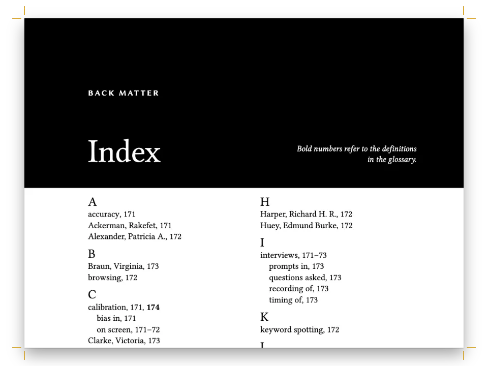
Ein Kapitel aus einem wissenschaftlichen Buch über die Geschichte der Druckschriften. Es zeigt, wie hinten zwei Listen entstehen, eine der Personen und eine der Themen, mit der Seite, auf der jeder Eintrag vorkommt.
Was Sie setzen
Kapitel vier von Letters of Metal, einer wissenschaftlichen Monografie über Druckschriften, gesetzt auf 155 × 235 mm: eine Spalte Crimson Pro, Bodoni kursiv für die Titel, ein ziegelroter Akzent. Der Essay reicht von Gutenbergs Textura über Jenson, Aldus und Griffo, Garamond und Plantin, Caslon und Baskerville, Fourniers Punkte und die spanischen Schriften, die Pradell und Gil schnitten und Ibarra druckte, bis zu Bodonis klassizistischen Antiquas. Er endet, wie solche Bücher enden, mit zwei Registern auf gegenüberliegenden Seiten: Drucker, Stempelschneider und Mäzene auf der linken Seite, Schriften, Werkzeuge und Bücher auf der rechten. Beide stammen aus demselben ausgezeichneten Text, und jede Seitenzahl darin ist die Seite, auf der die Marke gelandet ist.
Dieses Rezept beantwortet
- Wie drucke ich aus demselben ausgezeichneten Text zwei Register, eines für Namen und eines für Sachbegriffe?
- Wie erstelle ich ein Register, dessen Seitenzahlen sich von selbst ändern, wenn sich der Text verschiebt?
Die kurze Antwort
// Marks in the Markdown. A person goes to the names index, inverted:
//   :index[Aldus Manutius]{term="Manutius, Aldus" index="names" main}
// A subject goes to the main index, with levels split by "!" and a sort key when the
// printed form would file in the wrong place:
//   :index[textura]{term="Blackletter!textura" main}
//   :index{term="42-line Bible" sort="Forty-two-line Bible"}
//   :index{term="Cursive" see="Italic"}
// Printed at the end, each under its own heading:
//   # Index of Names {style="index"}    then    :::index{index="names"}
//   # Index of Subjects {style="index"} then    :::index
const indexHeading = {
  id: 'index',
  numbered: false, // no chapter number, and the next chapter is still chapter 5
  breakBefore: { enabled: true, parity: 'any' },
  layout: { layoutType: 'double', gutterWidth: mm(7) }, // the section after the heading
};
const index = {
  fontSize: pt(8.6), lineHeight: pt(11.2), // one leading for entries and letter heads
  indent: em(1), turnoverIndent: em(2),
  rangeFormat: 'chicago', // 212–14, as a monograph prints it
  main: { bold: true }, // the page of the principal discussion
  groups: { fontFamily: 'Bodoni Moda', fontSize: pt(11), fontWeight: 600, color: col('brick') },
};
Zutaten
- Funktionen
- RegisterÜberschriftenformateKapitel ohne NummerGestaltete AuftakteÜberschriftenattributeKolumnentitel und SeitenzahlenGespiegelte RänderKopfzeilen nach SeitenrolleAbsatzformateSemantische FarbpalettePapierfarbeWitwen, Waisen und kurze AusgangszeilenPDF-Export
- Nutzt außerdem
- Im PDF eingebettete SchriftenAbschnittsgeometrie
- Schrift
- Crimson Pro, Bodoni Moda, Libre Franklin (SIL OFL 1.1)
- Dateien
- Keine: Jedes Bild wird im Code gezeichnet
Zubereitung
#1 · Jede Person für das Personenregister und jedes Thema für das Hauptregister markieren
Der Code steht oben in der kurzen Antwort; der Rest steht im Markdown. Eine Marke mit index="names" geht in das Register, das :::index{index="names"} druckt, und jede andere Marke in das Hauptregister, das ein schlichtes :::index druckt. So druckt :index[Aldus Manutius]{term="Manutius, Aldus" index="names" main} den Namen im Text und legt im Personenregister unter Manutius eine fette Seitenzahl ab, während :index[italic]{term="Italic" main} zwei Zeilen weiter dieselbe Seite im Sachregister unter Italic ablegt. Eine Person, die Thema des Kapitels ist, kann beide Marken tragen.
#2 · Namen umstellen und nach den Buchstaben sortieren, unter denen der Leser sucht
Namen werden mit dem Nachnamen zuerst eingeordnet: term="Garamond, Claude", term="Dall’Aglio, Margherita". Das Komma gehört zum Begriff, sodass die Sortierung Didot, Firmin vor Didot, François-Ambroise stellt, wie es ein Registermacher täte. Wenn die gedruckte Form unter dem falschen Buchstaben stünde, gibt sort den Schlüssel an: Die englische Ausgabe markiert term="42-line Bible" sort="Forty-two-line Bible", sodass die Bibel unter F steht, statt eine Gruppe 0–9 zu eröffnen. Untereinträge (term="Foundries!Plantin-Moretus"), fette Hauptfundstellen (main), range="start" und range="end" um den Abschnitt über Bodoni und Querverweise (see="Italic", seealso="Matrices") erledigen den Rest; ein Ziel von see mit Ebenen wird mit Doppelpunkt gedruckt, wie in Humanist type. See Roman type: Venetian.
#3 · Einmal bauen; das Dokument legt seine Nummern selbst fest
// A pass finds the page of every mark and prints both indexes with those numbers. When the
// printed index moves a mark (an index set before the text would), the layout runs again,
// until no page number changes (in a buildBundle book, the chapter with :::index gets them all).
const doc = await buildDocumentWithFonts({ markdown }, config(), kitFonts(FONTS));
Das Register druckt Seitenzahlen, die erst nach dem Layout existieren, und sein Druck braucht eigene Seiten. buildDocument() erledigt das: Es setzt das Kapitel, liest die Seite jeder Marke, druckt beide Register und setzt erneut, sobald sich eine Zahl geändert hat. Hier folgen die Register dem Text, ein zweiter Durchgang bestätigt also den ersten; ein Register vor dem Text würde jede Seite danach verschieben, und die Durchgänge liefen weiter, bis sie übereinstimmen. Fügen Sie dem Abschnitt über Bodoni einen Absatz hinzu, und das Personenregister gibt Whittingham von selbst seine neue Seite.
#4 · Jedem Register einen Auftakt über zwei Spalten geben
const opener = (sink, size) => ({
  enabled: true,
  minHeight: pt(LEAD * sink), // the text starts on the same grid line in every chapter
  slot: { elements: [
    { kind: 'text', id: 'kicker', content: '{attr.kicker}', ...label, fontSize: pt(7.8),
      letterSpacing: pt(1.6), color: col('brick'), align: 'left',
      placement: at('container', 'top-left', 0, 10) },
    { kind: 'text', id: 'title', content: '{titleText}', fontFamily: 'Bodoni Moda', italic: true,
      fontSize: pt(size), lineHeight: 1.08, color: col('ink'), align: 'left',
      overflow: 'wrap', // design text ends in an ellipsis by default
      placement: { ...at('#kicker', 'below', 0, 3), size: { width: 'fill', height: 'auto' } } },
    { kind: 'rule', id: 'rule', direction: 'horizontal', thickness: pt(0.75), color: col('brick'),
      placement: { ...at('#title', 'below', 0, 4.5), size: { width: mm(16) } } },
  ] },
});
Das Überschriftenformat in der kurzen Antwort leistet für # Index of Names {style="index"} dreierlei: Es beginnt eine Seite (parity: 'any', sodass die beiden Register ohne Vakatseite aufeinanderfolgen), es setzt den folgenden Abschnitt in zwei Spalten mit 7 mm Abstand, und mit numbered: false lässt es die Kapitelzählung unberührt. Das Format übernimmt den Kapitelauftakt mit einer Absenkung von sechs Zeilen und einem Titel in 20 pt, und die Buchstabenüberschriften wiederholen dessen Bodoni in der Akzentfarbe, eine Registerzeile hoch, damit die Spalten ihren Zeilenabstand halten.
#5 · Das Register auf der rechten Seite benennen
const head = (id, content, parity, edge, x, extra = {}) => ({
  kind: 'text', id, content, parity, pages: 'body', // never on openers
  ...label, fontSize: pt(7.2), letterSpacing: pt(1.3), color: col('muted'),
  placement: at('page', edge, x, 12.5), ...extra,
});
const folio = { color: col('brick'), fontWeight: 700 };
const header = { elements: [
  head('verso-folio', '{pageNumber}', 'even', 'top-left', MARGIN.outer,
    { ...folio, align: 'left' }),
  head('verso-title', '{title}', 'even', 'top-left', MARGIN.outer + 8, { align: 'left' }),
  head('recto-title', '{chapterTitle}', 'odd', 'top-right', -(MARGIN.outer + 8),
    { align: 'right' }),
  head('recto-folio', '{pageNumber}', 'odd', 'top-right', -MARGIN.outer,
    { ...folio, align: 'right' }),
] };
// Openers carry a drop folio instead, centred under the text block.
const footer = { elements: [{ ...head('drop-folio', '{pageNumber}', 'all', 'bottom', 0,
  { ...folio, align: 'center', placement: at('page', 'bottom', 0, -12) }), pages: 'opener' }] };
Der Kolumnentitel der rechten Seite druckt {chapterTitle}, und eine Registerüberschrift ist eine Überschrift der Ebene 1 wie jedes Kapitel; die Seiten danach tragen also oben Index of Subjects. pages: 'body' hält die Kolumnentitel von beiden Registerauftakten fern, die stattdessen eine Pagina am Fuß tragen.
Das ganze Rezept
// ═══ Postext Cookbook · Nº 073 · An index of names and an index of subjects ═══════ // https://postext.dev/en/cookbook/names-and-subjects-indexes // Code: MIT · Text: original (CC BY 4.0) · Pictures: none // Fonts: Crimson Pro, Bodoni Moda, Libre Franklin (SIL OFL 1.1) · Needs postext ≥ 1.28.0 import { buildDocumentWithFonts, renderPageToCanvas } from 'https://esm.sh/postext'; import { renderToPdf, decompressWoff2 } from 'https://esm.sh/postext-pdf'; const LANG = 'en'; // @lang: the language of the sample document ('en' | 'es') const RECIPE = 'names-and-subjects-indexes'; // ─── 1 · Design ───────────────────────────────────────────────────────────── // #region palette: a warm black, one brick red for kickers, letter heads and folios const palette = { ink: '#211d19', // text: a warm near-black brick: '#8e3b24', // the one accent muted: '#6d645a', // running heads, colophon rule: '#c8bba9', // hairlines paper: '#fcfaf5', }; // A colour is its hex and the palette entry it follows. const col = (id) => ({ hex: palette[id], model: 'hex', paletteId: id }); const colorPalette = [ ...Object.entries(palette).map(([id, hex]) => ({ id, name: id, value: { hex, model: 'hex' } })), // The engine's defaults link to main-color: point it at the accent, never the default blue. { id: 'main-color', name: 'accent (defaults)', value: { hex: palette.brick, model: 'hex' } }, ]; // #endregion const TRIM = { width: 155, height: 235 }; // a scholarly monograph const MARGIN = { top: 22, bottom: 24, inner: 19, outer: 22 }; // mirrored: 114 mm measure const LEAD = 13.6; // body leading in pt const at = (to, edge, x = 0, y = 0) => ({ anchor: { to, edge }, offset: { x: mm(x), y: mm(y) } }); const label = { fontFamily: 'Libre Franklin', fontWeight: 600, textTransform: 'uppercase' }; // #region answer: two indexes from one text, each under a two-column heading style // Marks in the Markdown. A person goes to the names index, inverted: // :index[Aldus Manutius]{term="Manutius, Aldus" index="names" main} // A subject goes to the main index, with levels split by "!" and a sort key when the // printed form would file in the wrong place: // :index[textura]{term="Blackletter!textura" main} // :index{term="42-line Bible" sort="Forty-two-line Bible"} // :index{term="Cursive" see="Italic"} // Printed at the end, each under its own heading: // # Index of Names {style="index"} then :::index{index="names"} // # Index of Subjects {style="index"} then :::index const indexHeading = { id: 'index', numbered: false, // no chapter number, and the next chapter is still chapter 5 breakBefore: { enabled: true, parity: 'any' }, layout: { layoutType: 'double', gutterWidth: mm(7) }, // the section after the heading }; const index = { fontSize: pt(8.6), lineHeight: pt(11.2), // one leading for entries and letter heads indent: em(1), turnoverIndent: em(2), rangeFormat: 'chicago', // 212–14, as a monograph prints it main: { bold: true }, // the page of the principal discussion groups: { fontFamily: 'Bodoni Moda', fontSize: pt(11), fontWeight: 600, color: col('brick') }, }; // #endregion // #region opener: kicker, a Bodoni italic title and a short rule, sunk to the same line const opener = (sink, size) => ({ enabled: true, minHeight: pt(LEAD * sink), // the text starts on the same grid line in every chapter slot: { elements: [ { kind: 'text', id: 'kicker', content: '{attr.kicker}', ...label, fontSize: pt(7.8), letterSpacing: pt(1.6), color: col('brick'), align: 'left', placement: at('container', 'top-left', 0, 10) }, { kind: 'text', id: 'title', content: '{titleText}', fontFamily: 'Bodoni Moda', italic: true, fontSize: pt(size), lineHeight: 1.08, color: col('ink'), align: 'left', overflow: 'wrap', // design text ends in an ellipsis by default placement: { ...at('#kicker', 'below', 0, 3), size: { width: 'fill', height: 'auto' } } }, { kind: 'rule', id: 'rule', direction: 'horizontal', thickness: pt(0.75), color: col('brick'), placement: { ...at('#title', 'below', 0, 4.5), size: { width: mm(16) } } }, ] }, }); // #endregion // #region running-heads: book title on the verso, chapter or index on the recto const head = (id, content, parity, edge, x, extra = {}) => ({ kind: 'text', id, content, parity, pages: 'body', // never on openers ...label, fontSize: pt(7.2), letterSpacing: pt(1.3), color: col('muted'), placement: at('page', edge, x, 12.5), ...extra, }); const folio = { color: col('brick'), fontWeight: 700 }; const header = { elements: [ head('verso-folio', '{pageNumber}', 'even', 'top-left', MARGIN.outer, { ...folio, align: 'left' }), head('verso-title', '{title}', 'even', 'top-left', MARGIN.outer + 8, { align: 'left' }), head('recto-title', '{chapterTitle}', 'odd', 'top-right', -(MARGIN.outer + 8), { align: 'right' }), head('recto-folio', '{pageNumber}', 'odd', 'top-right', -MARGIN.outer, { ...folio, align: 'right' }), ] }; // Openers carry a drop folio instead, centred under the text block. const footer = { elements: [{ ...head('drop-folio', '{pageNumber}', 'all', 'bottom', 0, { ...folio, align: 'center', placement: at('page', 'bottom', 0, -12) }), pages: 'opener' }] }; // #endregion const config = () => ({ locale: t({ en: 'en-us', es: 'es' }), // each edition's hyphenation patterns colorPalette, page: { sizePreset: 'custom', width: mm(TRIM.width), height: mm(TRIM.height), dpi: 150, backgroundColor: col('paper'), margins: { top: mm(MARGIN.top), bottom: mm(MARGIN.bottom), left: mm(MARGIN.inner), right: mm(MARGIN.outer), mirror: true } }, // left = inner layout: { layoutType: 'single' }, bodyText: { fontFamily: 'Crimson Pro', fontSize: pt(10.6), lineHeight: pt(LEAD), color: col('ink'), boldColor: col('ink'), italicColor: col('ink'), referenceColor: col('ink'), textAlign: 'justify', firstLineIndent: mm(4.5), indentAfterHeading: false, hyphenation: { enabled: true }, optimalLineBreaking: true, avoidWidows: true, avoidOrphans: true, avoidRunts: true }, headings: { fontFamily: 'Bodoni Moda', fontWeight: 400, color: col('ink'), levels: [ // A recto, with a blank verso only when the text before it ends on a recto. { level: 1, advancedDesign: opener(9, 26), marginBottom: pt(0), breakBefore: { enabled: true, parity: 'odd' } }, { level: 2, fontSize: pt(12), lineHeight: pt(LEAD), italic: true, fontWeight: 400, color: col('brick'), marginTop: pt(LEAD), marginBottom: pt(LEAD * 0.5) }, ] }, // The index heading: a shallower opener over the two columns of entries, seven lines deep // so its rule stands a line clear of the first letter. headingStyles: [{ ...indexHeading, span: 'page', advancedDesign: opener(7, 20), marginBottom: pt(0) }], index, paragraphStyles: [ { id: 'colophon', ...label, textTransform: 'none', fontWeight: 400, fontSize: pt(7), lineHeight: pt(10), color: col('muted'), textAlign: 'left', firstLineIndent: pt(0), marginTop: pt(LEAD * 2) }, ], header, footer, }); // ─── 2 · Content ──────────────────────────────────────────────────────────── const markdown = String.raw`---Markdown-Beispiel · 70 Zeilen · content.en.md
title: "Letters of Metal" subtitle: "A Short History of Printing Types" --- # From Textura to Bodoni {kicker="Chapter four"} The first European types imitated the hand that readers trusted most. When :index[Johannes Gutenberg]{term="Gutenberg, Johannes" index="names" main} printed his Bible in Mainz, finished by 1455,:index{term="42-line Bible" sort="Forty-two-line Bible" main} he set it in :index[textura]{term="Blackletter!textura" main}, the tall, narrow letter of German choir books, with its broken strokes and diamond feet. The page was meant to pass for a manuscript, and it did: rubricators added the red initials by hand, and some copies were printed on vellum. What was new lay out of sight. Each letter had been cut in steel as a :index[punch]{term="Punchcutting" main}:index{term="Punchcutting" seealso="Matrices"}, struck into a bar of softer copper to make a :index[matrix]{term="Matrices"}, and cast in the :index[hand mould]{term="Hand mould"} from an alloy of lead, tin and antimony.:index{term="Type metal"} A single punch could yield thousands of identical sorts, and the whole chain, from punch to page, would stay in use with few changes for nearly four hundred years. Gutenberg’s partners saw the business before he did. :index[Johann Fust]{term="Fust, Johann" index="names"} took over the shop after a lawsuit in 1455, and with :index[Peter Schoeffer]{term="Schoeffer, Peter" index="names"} he printed the Mainz Psalter of 1457, the first book to carry a printer’s colophon and a date. When Mainz was sacked in 1462 its journeymen scattered, and within twenty years there were presses in more than a hundred towns. ## The Venetian roman Italian readers did not want German letters. The humanists of Florence had revived the Carolingian minuscule for their copies of the classics, a round, open hand they believed ancient, and the printers who came south followed them. The best of the early romans was cut in Venice by :index[Nicolas Jenson]{term="Jenson, Nicolas" index="names" main}, a Frenchman trained at the mint of Tours. His Eusebius of 1470 is set in a :index[roman]{term="Roman type!Venetian" main} of even colour and wide, well-fitted capitals, and it has been the model for revivals ever since. Twenty-five years later :index[Aldus Manutius]{term="Manutius, Aldus" index="names" main} opened his press in the same city, with a scholar’s programme: Greek texts first, then the Latin authors in editions a student could carry. His punchcutter was :index[Francesco Griffo]{term="Griffo, Francesco" index="names" main} of Bologna. For the short dialogue *De Aetna*:index{term="*De Aetna*"} by the young :index[Pietro Bembo]{term="Bembo, Pietro" index="names"}, printed in 1496, Griffo cut a roman lighter and more regular than Jenson’s, with capitals shorter than the ascenders, the proportion book faces have kept to this day. :index{term="Roman type!Aldine"} In 1501 Aldus issued a :index[Virgil]{term="Virgil" index="names"} in octavo, set entirely in a new letter: Griffo’s :index[italic]{term="Italic" main}, based on the sloped script of the papal chancery. It saved space, which suited a pocket book, and it looked learned. The Venetian Senate granted Aldus a privilege over it,:index{term="Privileges"} counterfeiters in Lyon copied it within a year, and Aldus and Griffo quarrelled over the credit until Griffo left Venice. For a century the italic was a text face in its own right. Only later did printers pair it with a roman and use it for emphasis, titles and foreign words, the role it still has. :index{term="Cursive" see="Italic"} ## Paris and Antwerp The roman became French in the 1530s. The Paris printer :index[Robert Estienne]{term="Estienne, Robert" index="names"} and his circle wanted Aldine letters, and the man who cut them best was :index[Claude Garamond]{term="Garamond, Claude" index="names" main}, a punchcutter who worked mostly for other men’s presses. His romans refine Griffo’s model: the thin strokes are finer, the serifs sharper, the capitals lighter against the lower case. Between 1540 and 1550 he also cut the *grecs du roi*,:index{term="Greek type"} three sizes of Greek for François I, closely modelled on the hand of the Cretan scribe Angelos Vergikios. When Garamond died in 1561 his punches were sold, and many went to Antwerp. :index[Christophe Plantin]{term="Plantin, Christophe" index="names" main}, a bookbinder from Touraine, had built there the largest printing house in Europe, and he bought type as a banker buys bonds. His shop kept the punches and matrices of Garamond, of :index[Robert Granjon]{term="Granjon, Robert" index="names" main} and of Guillaume Le Bé, and for the great Polyglot Bible of 1568–1572, in Latin, Greek, Hebrew, Aramaic and Syriac, he needed all of them. Granjon was the finest italic cutter of the century; he also cut, in Lyon in 1557, the *civilité*, a French secretary hand he hoped would become a national type. It did not, but his italics did. The house stayed with the Moretus family until the city of Antwerp bought it in 1876, and its punches, matrices and account books are still there, the most complete type foundry of its age to survive.:index{term="Foundries!Plantin-Moretus"} ## The English century England printed with Dutch type until the eighteenth century, when an engraver of gun locks set up a foundry in London. :index[William Caslon]{term="Caslon, William" index="names" main} issued his specimen sheet in 1734,:index{term="Specimens!Caslon, 1734"} and his roman, sturdy and a little irregular, became the ordinary type of the English-speaking world. It needed no explanation and drew no attention to itself, which is why printers still reach for it. :index[John Baskerville]{term="Baskerville, John" index="names" main}, a Birmingham writing master who had made his money in japanned ware, came to printing late and changed more than the letters. For his Virgil of 1757 he had his own type cut by John Handy, with a more vertical stress and a sharper contrast than Caslon’s, and he printed it on smooth wove paper,:index{term="Paper, wove"} with a blacker ink of his own recipe, and pressed the sheets between hot copper plates to give them a gloss. English printers found the pages too bright to read. Readers on the Continent admired them, and a :index[transitional]{term="Transitional type"} letter, between the old style and the modern, was born. ## Measuring type Until the middle of the eighteenth century every foundry named its sizes as it pleased: *pica*, *cicero*, *long primer*, *petit-romain*. A size was a habit of the house, not a measurement, and a printer who bought type from two foundries could not set it side by side. :index[Pierre-Simon Fournier]{term="Fournier, Pierre-Simon" index="names" main}, the younger son of a Paris family of typefounders, published in 1737 a table of proportions that divided an inch into seventy-two :index[points]{term="Point system" main range="start"} and gave every body a number of points. He set it out in full in his *Manuel typographique* of 1764–1766.:index{term="*Manuel typographique*"} :index[François-Ambroise Didot]{term="Didot, François-Ambroise" index="names"} tied the point to the royal foot about 1783, which made it slightly larger; the Didot point spread across the Continent, while American and British founders settled on a pica point of their own only in 1886 and 1898. :index{term="Point system" range="end"} ## Spanish types Spanish printers of the early eighteenth century bought their type in Holland and France, and the Crown thought this a disgrace for a kingdom that had printed the Complutensian Polyglot. :index[Charles III]{term="Charles III, king of Spain" index="names"} and his ministers set out to change it. The Royal Library in Madrid opened a foundry of its own,:index{term="Foundries!Royal Library, Madrid" main} and the Crown paid pensions to punchcutters who would work in Spain. Two of them came from very different trades. :index[Eudald Pradell]{term="Pradell, Eudald" index="names" main}, the son of a gunsmith from Ripoll, had learned to cut steel in his father’s forge and cut his first punches in Barcelona. Called to Madrid in 1764 with a royal pension, he cut romans and italics of an open, generous design that the Madrid printers took up at once. :index[Jerónimo Antonio Gil]{term="Gil, Jerónimo Antonio" index="names" main} came from the other end of the trade: he was an engraver of the Royal Mint, a medallist, and he cut for the Royal Library a series of romans, italics and Greek that the Library showed in its specimen of 1787.:index{term="Specimens!Royal Library, 1787"} Gil did not stay to see it. In 1778 he left for Mexico as chief engraver of the mint, and there he founded the school that became the Academy of San Carlos. The printer who made these types famous was :index[Joaquín Ibarra]{term="Ibarra, Joaquín" index="names" main}, born in Zaragoza in 1725 and printer to the King from 1779. His Sallust of 1772, translated by the Infante Gabriel,:index{term="Gabriel of Bourbon, Infante" index="names"} was praised in Paris and Parma for its presswork. For the Real Academia Española he printed in 1780 the *Quixote* in four quarto volumes,:index{term="*Quixote*, Academy edition" main}:index{term="Cervantes, Miguel de" index="names"} set in Gil’s types, illustrated by the best engravers of the court and printed on paper made for it in Catalonia. The ink, dark and even, was Ibarra’s own; the page, with generous margins and no ornament besides the plates, is the Spanish counterpart of Baskerville’s. ## Bodoni’s moderns The last step belonged to a printer at a small court.:index{term="Modern face" range="start"} :index[Giambattista Bodoni]{term="Bodoni, Giambattista" index="names" main}, born in Saluzzo in 1740, learned to cut punches at the press of the Propaganda Fide in Rome, where he cleaned and set in order its oriental types. In 1768 Duke Ferdinand called him to Parma to run the ducal press, and he stayed there for the rest of his life. His early types follow Fournier; by the 1790s he was cutting letters of a new kind, with hairline serifs, strictly vertical stress and a contrast between thick and thin that only smooth paper and careful printing could hold. These are the :index[modern]{term="Modern face" main} faces. In Paris, :index[Firmin Didot]{term="Didot, Firmin" index="names"} was drawing the same conclusions at the same time, and the two houses watched each other closely.:index{term="Didone" see="Modern face"} Bodoni printed few books that anyone read, and many that everyone admired: Homer in Greek, Horace, Tasso, folio after folio for collectors and kings. His life’s work was the :index[*Manuale tipografico*]{term="*Manuale tipografico*" main}, which his widow, :index[Margherita Dall’Aglio]{term="Dall’Aglio, Margherita" index="names"}, published in 1818, five years after his death: two volumes of romans and italics in more than a hundred sizes and cuts, with Greek, Hebrew and other alphabets, and a preface that says what a letter ought to be. The modern face swept the Continent and then England, where by 1820 hardly a printer still set books in old-style type.:index{term="Modern face" range="end"} ## Names for the families The words this chapter has used, :index[old style]{term="Old style" main}, transitional and modern, come from the printers of the nineteenth century, who needed a way to order their specimen books, and they are not precise. An old style in 1860 meant any letter cut on the model of Caslon; a modern meant anything after Bodoni, however clumsy. The old style came back in the 1840s, when :index[Charles Whittingham]{term="Whittingham, Charles" index="names"} of the Chiswick Press reissued Caslon’s type for a book set in the manner of the seventeenth century, and from then on the two lived side by side in every specimen. In 1921 the French typefounder :index[Francis Thibaudeau]{term="Thibaudeau, Francis" index="names"} proposed to sort types by their serifs alone: triangular, hairline, square or none.:index{term="Classification of types!Thibaudeau, 1921"} It was easy to apply and blind to history. :index[Maximilien Vox]{term="Vox, Maximilien" index="names"}, an illustrator and publisher, went further in 1954 with nine families whose names join the masters of each style: *humanes* for the Venetians after Jenson, *garaldes* for Garamond and Aldus, *réales* for the letters of Fournier and Baskerville, *didones* for Didot and Bodoni.:index{term="Classification of types!Vox, 1954" main} The Association Typographique Internationale adopted a version of it in 1962, and the British Standards Institution followed in 1967. :index{term="Garalde" see="Old style"} :index{term="Humanist type" see="Roman type!Venetian"} These labels leave out as much as they sort. Gil’s romans for the Royal Library are *réales* by the book and Spanish by every other measure; Pradell’s italics owe as much to Granjon as to anything cut in their own century. The quarrel between the two ideas of the letter, the one written with a pen and the one drawn with compasses and rule, is older than any of these names and has not been settled. :::paragraphs{style="colophon"} *Letters of Metal*, chapter four. Set in Crimson Pro, with Bodoni Moda for display and Libre Franklin for labels (SIL Open Font License). Text written for the Postext Cookbook, CC BY 4.0. ::: # Index of Names {style="index" kicker="Printers, punchcutters, patrons"} :::index{index="names"} # Index of Subjects {style="index" kicker="Types, tools and books"} :::index`; // content.<lang>.md, inlined by the Cookbook // ─── 3 · Fonts ────────────────────────────────────────────────────────────── // Every face the design uses. const FONTS = { 'Crimson Pro': ['400', '400i', '600', '700'], 'Bodoni Moda': ['400', '400i', '600'], 'Libre Franklin': ['400', '400i', '600', '700'], }; // ─── 4 · Build & show ─────────────────────────────────────────────────────── // #region build: one buildDocument, laid out again until the index's page numbers settle // A pass finds the page of every mark and prints both indexes with those numbers. When the // printed index moves a mark (an index set before the text would), the layout runs again, // until no page number changes (in a buildBundle book, the chapter with :::index gets them all). const doc = await buildDocumentWithFonts({ markdown }, config(), kitFonts(FONTS)); // #endregion showPages(doc, { title: t({ en: 'Two indexes', es: 'Dos índices' }) }); offerPdf(() => renderToPdf(doc, { fontProvider: fontsourceProvider }), `${RECIPE}.pdf`);Kit · core, fonts, viewer, pdf: in jedem Rezept gleich · 269 Zeilen
// ─── Kit ── helpers shared by every Cookbook recipe · postext.dev/cookbook ───── // ─── Kit · core v1 ── the same in every recipe · postext.dev/cookbook function mm(value) { return { value, unit: 'mm' }; } function pt(value) { return { value, unit: 'pt' }; } function em(value) { return { value, unit: 'em' }; } /** The sample language's string: t({ en: 'Figure', es: 'Figura' }). */ function t(strings) { return strings[LANG] ?? Object.values(strings)[0]; } /** A file in this recipe's assets folder, served from the Postext repo by jsDelivr. */ function asset(file) { return `https://cdn.jsdelivr.net/gh/drnachio/postext@main/cookbook/${RECIPE}/assets/${file}`; } // ─── Kit · fonts v3 ── the same in every recipe · postext.dev/cookbook // Postext loads the faces a config asks for before layout (prepareFonts, // buildDocumentWithFonts) and asks the kit for the files: Fontsource's, the // files the PDF embeds too. /** The options of buildDocumentWithFonts / prepareFonts / withLoadedFonts: * the Fontsource resolver, and the faces of FONTS loaded with the ones the * config names. FONTS = { 'Family Name': ['400', '400i', '700'] }. */ function kitFonts(FONTS = {}) { const faces = Object.entries(FONTS).flatMap(([family, specs]) => specs.map((spec) => ({ family, weight: parseInt(spec, 10), style: spec.endsWith('i') ? 'italic' : 'normal' }))); return { resolve: fontsourceResolver, faces }; } /** A face's Fontsource files, in a fixed order: latin, then latin-ext and greek * when `text` needs them and the family ships them (kitSubsetsFor), each with * its unicode-range. Null for a weight or slant Fontsource does not ship. */ async function fontsourceResolver(family, weight, style, { text = '' } = {}) { const id = fontsourceId(family); const meta = await fontsourceMeta(family); if (meta && !(meta.weights.includes(weight) && meta.styles.includes(style))) return null; kitStatus('Loading fonts…'); const at = await fontsourceAt(id); return ['latin', ...kitSubsetsFor(text, meta)].map((subset) => ({ source: `${at}files/${id}-${subset}-${weight}-${style}.woff2`, unicodeRange: kitRanges()[subset], })); } /** The unicode-range of each Fontsource file the kit loads (a function: the * kit is inlined after the pen's code, which runs before a const would be set). */ function kitRanges() { return { latin: 'U+0000-00FF,U+0131,U+0152-0153,U+02BB-02BC,U+02C6,U+02DA,U+02DC,U+0304,U+0308,U+0329,' + 'U+2000-206F,U+20AC,U+2122,U+2191,U+2193,U+2212,U+2215,U+FEFF,U+FFFD', 'latin-ext': 'U+0100-02BA,U+02BD-02C5,U+02C7-02CC,U+02CE-02D7,U+02DD-02FF,U+0304,U+0308,U+0329,' + 'U+1D00-1DBF,U+1E00-1E9F,U+1EF2-1EFF,U+2020,U+20A0-20AB,U+20AD-20C0,U+2113,U+2C60-2C7F,U+A720-A7FF', greek: 'U+0370-03FF', }; } /** For the cjk, arabic and comics blocks, which add their own files: the * faces of `faces` = { 'Family Name': ['400', '400i', '700'] }. `text` is the sample: * č ł † α χ also load latin-ext and greek files (kitSubsetsFor). With * `optional`, a face Fontsource does not ship is skipped instead of failing. * The files are added once all have loaded, in the order asked (latin, then * latin-ext, then greek), whatever order they arrive in: the last one added * wins a character two files hold. Resolves to the number of faces added. */ async function loadFonts(faces, text = '', { optional = false } = {}) { kitStatus('Loading fonts…'); const ranges = kitRanges(); const jobs = []; for (const [family, specs] of Object.entries(faces)) { const id = fontsourceId(family); const todo = [...new Set(specs)].map((spec) => [parseInt(spec, 10), spec.endsWith('i') ? 'italic' : 'normal']) .filter(([weight, style]) => !hasFace(family, weight, style)); // before any await const at = fontsourceAt(id); const meta = optional || /[^\0-ÿ]/u.test(text) ? await fontsourceMeta(family) : null; const subsets = ['latin', ...kitSubsetsFor(text, meta)]; for (const [weight, style] of todo) { if (optional && !(meta?.weights.includes(weight) && meta.styles.includes(style))) continue; for (const subset of subsets) { const url = `${await at}files/${id}-${subset}-${weight}-${style}.woff2`; const face = new FontFace(family, `url(${url}) format('woff2')`, { weight: String(weight), style, unicodeRange: ranges[subset] }); jobs.push(face.load().catch(() => { if (subset === 'latin' && !optional) throw new Error(`Fontsource has no ${family} ${weight} ${style}`); })); } } } const ready = await Promise.all(jobs).catch((error) => { kitFail(error); throw error; }); return ready.filter((face) => face && document.fonts.add(face)).length; } /** A loaded FontFace covers this family, weight and style (fonts.check() would * also say yes for families nobody declared). */ function hasFace(family, weight, style) { for (const face of document.fonts) { if (face.status !== 'loaded' || face.style !== style) continue; if (face.family.replace(/^["']|["']$/g, '') !== family) continue; const [low, high = low] = face.weight.split(' ').map(Number); if (weight >= low && weight <= high) return true; } return false; } /** The files beyond latin `text` needs that `meta`'s family ships. */ function kitSubsetsFor(text, meta) { return [[/[Ā-˿ᴀ-ᶿḀ-ỿ†ℓⱠ-Ɀ꜠-ꟿ]/u, 'latin-ext'], [/[Ͱ-Ͽ]/u, 'greek']] .filter(([re, x]) => re.test(text) && meta?.subsets?.includes(x)).map(([, x]) => x); } /** Fontsource's id for a family: 'Source Serif 4' → 'source-serif-4'. */ function fontsourceId(family) { return family.toLowerCase().replace(/\s+/g, '-'); } /** A package's folder at the one version @5 names now (#766). */ function fontsourceAt(id, u = `https://cdn.jsdelivr.net/npm/@fontsource/${id}@`) { return (fontsourceAt.c ??= {})[id] ??= fetch(u + '5/package.json').then((r) => r.json()) .then((p) => p.version || 5, () => 5).then((v) => `${u}${v}/`); } /** The family's Fontsource metadata (weights, styles, subsets), or null. */ function fontsourceMeta(family) { fontsourceMeta.cache ??= new Map(); const id = fontsourceId(family); if (!fontsourceMeta.cache.has(id)) { fontsourceMeta.cache.set(id, fetch(`https://api.fontsource.org/v1/fonts/${id}`) .then((res) => (res.ok ? res.json() : null), () => null)); } return fontsourceMeta.cache.get(id); } // ─── Kit · viewer v2 ── the same in every recipe · postext.dev/cookbook /** The pages as spreads on a dark desk, page 1 alone, then verso | recto, * each painted when it scrolls near. Other options go to renderPageToCanvas. */ function showPages(docs, { title, width = 460, ...render } = {}) { const root = viewer(title); const pages = [docs].flat().flatMap((doc) => doc.pages.map((page) => ({ doc, page, n: (doc.pageIndexOffset ?? 0) + page.index }))); const spreads = []; let verso = null; for (const p of pages) { if (p.n % 2 === 1) { if (verso) spreads.push([verso, null]); verso = p; } else { spreads.push([verso, p]); verso = null; } } if (verso) spreads.push([verso, null]); const density = Math.min(window.devicePixelRatio || 1, 2); showPages.painter?.disconnect(); const painter = new IntersectionObserver((entries) => { for (const { isIntersecting, target } of entries) { if (!isIntersecting) continue; painter.unobserve(target); const { doc, page } = target.postext; renderPageToCanvas(page, doc, target, { ...render, scale: (width * density) / page.width }); } }, { rootMargin: '800px' }); showPages.painter = painter; root.replaceChildren(...spreads.map((pair) => { const spread = document.createElement('div'); spread.className = 'pt-spread'; for (const p of pair) { const figure = document.createElement('figure'); if (p) { const label = p.page.pageLabel || String(p.n + 1); const canvas = document.createElement('canvas'); canvas.postext = p; canvas.style.aspectRatio = `${p.page.width} / ${p.page.height}`; canvas.setAttribute('role', 'img'); canvas.setAttribute('aria-label', `Page ${label}`); const folio = document.createElement('figcaption'); folio.textContent = label; figure.append(canvas, folio); painter.observe(canvas); } else figure.className = 'pt-blank'; spread.append(figure); } return spread; })); kitStatus(`${pages.length} ${pages.length === 1 ? 'page' : 'pages'}`); document.documentElement.dataset.postext = 'ready'; return pages.length; } /** The desk, the bar and the error reporting, created once. */ function viewer(title) { if (!document.getElementById('pt-kit')) { document.head.insertAdjacentHTML('beforeend', `<style id="pt-kit"> :root { color-scheme: dark; } body { margin: 0; background: #0e1014; color: #b9bcc4; font: 13px/1.45 system-ui, sans-serif; } #pt-bar { position: sticky; top: 0; z-index: 1; display: flex; flex-wrap: wrap; align-items: center; gap: 6px 16px; padding: 10px 16px; background: rgb(14 16 20 / .92); backdrop-filter: blur(6px); border-bottom: 1px solid #23262d; } #pt-bar strong { color: #f4f1ea; font-weight: 600; } #pt-actions { display: flex; gap: 12px; margin-left: auto; } #pt-actions a, #pt-actions button { color: #d8a21a; font: inherit; background: none; border: 0; padding: 0; cursor: pointer; } #pages { display: grid; justify-items: center; gap: 48px; padding: 32px 16px 72px; } .pt-spread { display: flex; } .pt-spread figure { margin: 0; width: min(460px, 44vw); } .pt-spread canvas { display: block; width: 100%; background: #fff; box-shadow: 0 1px 2px rgb(0 0 0 / .5), 0 22px 44px -16px rgb(0 0 0 / .8); } .pt-spread figure:first-child canvas { box-shadow: inset -14px 0 14px -14px rgb(0 0 0 / .18), 0 1px 2px rgb(0 0 0 / .5), 0 22px 44px -16px rgb(0 0 0 / .8); } .pt-spread figcaption { margin-top: 10px; text-align: center; font: 600 10px/1 system-ui, sans-serif; letter-spacing: .18em; text-transform: uppercase; color: #6c7079; } .pt-blank { visibility: hidden; } @media (max-width: 760px) { .pt-spread { flex-direction: column; gap: 32px; } .pt-spread figure { width: min(460px, 92vw); } .pt-blank { display: none; } } </style>`); document.body.insertAdjacentHTML('afterbegin', '<header id="pt-bar"><strong id="pt-title"></strong><span id="pt-status" role="status"></span><span id="pt-actions"></span></header>'); document.getElementById('pt-title').textContent = document.title || 'Postext'; addEventListener('error', (event) => kitFail(event.error ?? event.message)); addEventListener('unhandledrejection', (event) => kitFail(event.reason)); } if (title) document.getElementById('pt-title').textContent = title; return document.getElementById('pages') ?? document.body.appendChild(Object.assign(document.createElement('main'), { id: 'pages' })); } function kitStatus(text) { viewer(); document.getElementById('pt-status').textContent = text; } function kitFail(error) { document.documentElement.dataset.postext = 'error'; kitStatus(`Error: ${error?.message ?? error}`); } // ─── Kit · pdf v3 ── the same in every recipe that exports a PDF /** The Fontsource files the screen used, as TrueType, with their range and * place: the nearest weight the family ships, upright with no italic; * latin, then what its letters need (kitSubsetsFor). */ async function fontsourceProvider(family, weight, style, request) { const id = fontsourceId(family); const meta = await fontsourceMeta(family); const weights = meta?.weights?.length ? meta.weights : [400, 700]; const w = weights.reduce((a, b) => (Math.abs(b - weight) < Math.abs(a - weight) ? b : a)); const s = style === 'italic' && meta && !meta.styles.includes('italic') ? 'normal' : style; const text = String.fromCodePoint(...(request?.codePoints ?? [])); const files = await Promise.all(['latin', ...kitSubsetsFor(text, meta)].map(async (subset, order) => { const res = await fetch(`${await fontsourceAt(id)}files/${id}-${subset}-${w}-${s}.woff2`); if (!res.ok) throw new Error(`Fontsource has no ${family} ${w} ${s} ${subset}`); return Object.assign(await decompressWoff2(new Uint8Array(await res.arrayBuffer())), { unicodeRange: kitRanges()[subset], order }); })); return files.length === 1 ? files[0] : files; } /** A "Build the PDF" button; then "Open the PDF" (a new tab: CodePen's frame * shows no PDFs) and a download link. */ function offerPdf(makePdf, filename) { viewer(); const button = Object.assign(document.createElement('button'), { type: 'button', textContent: 'Build the PDF' }); button.dataset.postextPdf = filename; button.addEventListener('click', async () => { button.disabled = true; button.textContent = 'Building the PDF…'; try { const bytes = await makePdf(); const url = URL.createObjectURL(new Blob([bytes], { type: 'application/pdf' })); const size = `${Math.max(1, Math.round(bytes.length / 1024))} KB`; button.replaceWith( Object.assign(document.createElement('a'), { href: url, target: '_blank', rel: 'noopener', textContent: 'Open the PDF ↗' }), Object.assign(document.createElement('a'), { href: url, download: filename, textContent: `Download ${filename} · ${size}` })); } catch (error) { button.disabled = false; button.textContent = 'Build the PDF'; kitFail(error); } }); document.getElementById('pt-actions').append(button); } // ─── /Kit ───────────────────────────────────────────────────────────────────────
Das zusammengesetzte script.js läuft unverändert: Fügen Sie es in das Modulskript einer beliebigen Seite ein, oder öffnen Sie das Rezept auf CodePen. Ordner des Rezepts auf GitHub ↗ (öffnet in neuem Tab)
Varianten
#Ein gemeinsames Register drucken
Entfernen Sie index="names" aus den Marken der Personen und die zweite Überschrift: Jede Marke landet dann im Hauptregister, Namen und Sachen in einem Alphabet.
-:index[Aldus Manutius]{term="Manutius, Aldus" index="names" main}
+:index[Aldus Manutius]{term="Manutius, Aldus" main}#Die Buchstabenüberschriften weglassen
Ein so kurzes Personenregister liest sich auch ohne sie gut. groups.enabled: false entfernt die Überschriften und lässt eine Leerzeile zwischen den Buchstaben; die Einstellung gilt für beide Register.
-  groups: { fontFamily: 'Bodoni Moda', fontSize: pt(11), fontWeight: 600, color: col('brick') },
+ groups: { enabled: false },Häufige Fehler
- Die Konfiguration
indexist gemeinsam: Beide Register erhalten dieselbe Schrift, denselben Zeilenabstand und dieselben Buchstabenüberschriften. - Eine Marke in einer Bildunterschrift oder einer Tabellenzelle wird gedruckt, wie sie geschrieben ist. Markieren Sie die Person in dem Absatz, der die Abbildung zitiert.
Nachweise
- Rezept
- Ignacio Ferro
- Text
- “From Textura to Bodoni”, an essay on the history of printing types written for this recipe, in English and Spanish · Ignacio Ferro · CC BY 4.0
- Schriften
- Crimson Pro (SIL OFL 1.1) · Bodoni Moda (SIL OFL 1.1) · Libre Franklin (SIL OFL 1.1)
- Code
- MIT, wie Postext
Diesen Text bearbeiten ↗ (öffnet in neuem Tab)Ordner des Rezepts auf GitHub ↗ (öffnet in neuem Tab)