かんたんな説明
古い船乗りの辞書の4ページです。各ページの外側の端に文字のつめが並び、いまの文字のつめは濃い色で、アルファベットが進むにつれて下へずれていきます。
できあがり
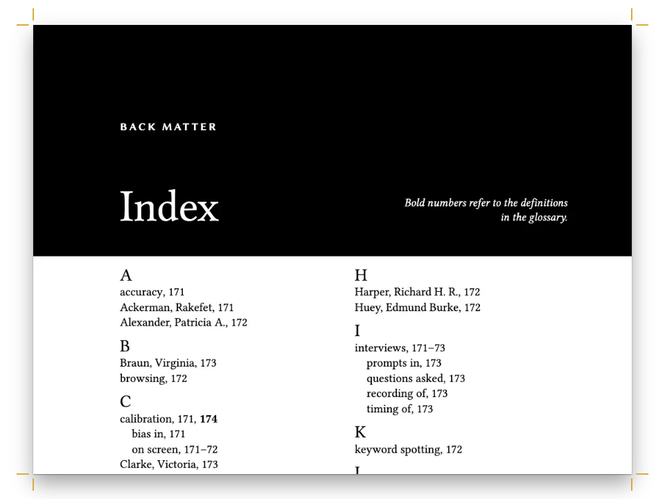
スマイス提督の『Sailor’s Word-Book』(1867年)の新版から、AからCまでの4ページを150 × 200 mmのページに組みます。項目は8 ptのAlegreyaで両端そろえの2段に組み、細い罫で段を分けます。見出し語は紺の太字で、2行目以降は1 em下げます。文字の区切りは段の中で始まり、真鍮色の罫の上に4行ぶんの紺の頭文字を置きます。項目は改ページせずに続きます。小口には、どのページにもつめ見出し全体、22個のつめを淡い色で刷ります。いまの文字のつめは紺で、ほかより3.2 mm幅が広く、文字が進むごとに1段ずつ下がります。スペイン語版はスマイスの英語の見出し語を残し、項目を訳しています。
このレシピが答える質問
- 小口にツメ(文字や章ごとにページの下へずれていくタブ)を付けるには?
- 参考文献や用語集を組むには(ぶら下げインデント、小さめの文字)?
- 本文や囲みの中で、キーワード(太字やイタリック)に色を付けるには?
- 柱を設定するには(左ページに書名、右ページに章タイトル、ノンブルは小口側)?
- 章扉や白ページで柱を隠したり、空白の偶数ページを部の色で塗ったりするには?
手短な答え
// 22 tabs share the 44 lines of the text block, two lines each; letters with few words
// share a tab, as in most thumb-indexed dictionaries.
const TABS = ['A', 'B', 'C', 'D', 'E', 'F', 'G', 'H', 'I', 'J', 'K', 'L', 'M', 'N', 'O', 'P',
  'QR', 'S', 'T', 'UV', 'W', 'XYZ'];
const STEP = 2 * LEAD * PT; // mm: 7.34
const EDGE = { odd: 'top-right', even: 'top-left' }; // the fore-edge: right on a recto
// A cell of the index, `width` mm inside the trim and 3 mm past it, so that only its
// inner corners show their rounding; its label is centred on the part inside the trim.
const cell = (id, label, i, parity, width, fill, ink, size) => {
  const y = mm(TOP + i * STEP + 0.3); // a 0.6 mm gap between neighbours
  const at = (x, w) => ({ anchor: { to: 'page', edge: EDGE[parity] }, offset: { x: mm(x), y },
    size: { width: mm(w), height: mm(STEP - 0.6) } });
  return [
    { kind: 'box', id, parity, style: { backgroundColor: col(fill), borderRadius: mm(1.2) },
      placement: at(parity === 'odd' ? 3 : -3, width + 3) },
    { kind: 'text', id: `${id}-label`, parity, content: label, fontFamily: LABEL, fontWeight: 700,
      fontSize: pt(size), lineHeight: 1, color: col(ink), align: 'center',
      verticalAlign: 'middle', placement: at(0, width) },
  ];
};
const sides = (make) => ['odd', 'even'].flatMap(make);
// Every page prints the whole index, pale, in the book's header (hook-up in config()).
const ladder = sides((p) => TABS.flatMap((label, i) =>
  cell(`index-${i}-${p}`, label, i, p, 5.8, 'tint', 'slate', 7.5)));
// The section's own tab goes in its footer, which paints after the header: it lies over
// its pale cell. Elements anchored to 'page' can sit anywhere, whichever slot holds them.
const letterStyles = () => TABS.flatMap((label, i) => [...label].map((letter) => ({
  id: letter,
  // '# B {style="B"}' opens the section of B: its pages take this footer, and a page
  // where A ends and B begins takes B's (gotcha: section-last-wins).
  footer: { elements: [...footer.elements,
    ...sides((p) => cell(`tab-${p}`, label, i, p, 9, 'navy', 'paper', 8.5))] },
})));
材料
- 機能
- 裁ち落としの帯とツメ節ごとの柱太字・イタリックとその色見出しスタイルデザインした章扉デザイン要素の基準位置ページデザインの画像見出しの属性段落スタイル参考文献と用語集ページの役割ごとの柱柱とノンブル段間罫段末そろえウィドウ、オーファン、ラントハイフネーションと文書の言語セマンティックカラーパレット用紙の色見開きの余白リソースとしての図と表
- 種類
- Alegreya, Alegreya SC, Alegreya Sans SC (SIL OFL 1.1)
- 素材
- なし:画像はすべてコードで描画
作り方
#1 · 文字ごとに、つめを持つ見出しスタイルを作る
コードは前の手短な答えにあります。TABSには22個のつめを並べ、使用頻度の低い文字は1つのつめを共有します(QR、UV、XYZ)。どのつめも本文2行(7.34 mm)の高さで、合わせると版面の44行を埋めます。本全体のheaderが、すべてのページに柱と淡い索引を印刷します。ループは文字ごとに見出しスタイルを作り、そのfooterがその文字の紺のつめを前の文字より1段下に加えます(見出しスタイル)。フッターはヘッダーの後に描かれるので、つめは淡いセルの上に重なり、設定には索引が文字ごとではなく1回だけ入ります。セルはparityごとに1回ずつ、計2回書き、スロット自身のコンテナーではなくページの外側の端に固定します。このコンテナーは版面と同じ幅の余白にすぎず、一方、つめは小口まで届き、44行すべてにわたって並ぶ必要があります。ページのフッターはそのページで始まる最後の節のものになるので、2ページ目はAで始まりながらBのつめを示します。
#2 · 柱を1ページ目に出さない
const HEAD = 11; // mm from the trim's top to the heads' top
const head = (id, content, parity, edge, x, extra) => ({ kind: 'text', id, content, parity,
  pages: 'body', fontFamily: LABEL, fontSize: pt(8), fontWeight: 500, letterSpacing: pt(1),
  color: col('muted'),
  placement: { anchor: { to: 'page', edge }, offset: { x: mm(x), y: mm(HEAD) } }, ...extra });
const folio = { fontWeight: 700, color: col('ink'), letterSpacing: pt(0) };
const runningHeads = [
  head('verso-folio', '{pageNumber}', 'even', 'top-left', OUTER, folio),
  head('verso-title', '{title}', 'even', 'top-left', OUTER + 8),
  head('recto-letter', t({ en: 'Letter {chapterTitle}', es: 'Letra {chapterTitle}' }), 'odd',
    'top-right', -(OUTER + 8)),
  head('recto-folio', '{pageNumber}', 'odd', 'top-right', -OUTER, folio),
];
// The first page drops its folio to the foot, under the text block.
const footer = { elements: [head('drop-folio', '{pageNumber}', 'all', 'top', 0, {
  ...folio, pages: 'opener',
  placement: { anchor: { to: 'container', edge: 'top' }, offset: { y: mm(6) } } })] };
柱はページに固定したテキスト要素で、parityとpages: 'body'で絞り込みます(テキスト要素)。1ページ目の題名は両方の段にまたがるので、1ページ目は章扉の扱いになります。柱はこのページを飛ばし、ノンブルはフッターから来ます。フッターはpages: 'opener'を指定した要素で、版面の6 mm下に刷られます。奇数ページでは{chapterTitle}が、そのページまでで最後のレベル1見出しの文字、Letter Cを刷ります。{firstMark.<key>}と{lastMark.<key>}を使えば、そのページの最初と最後の見出し語を刷れます。多くの辞書が柱に入れる語です。このレシピは文字のままにしています。つめが示すのも文字だからです。
#3 · 見出し語だけに色を付ける
// Bold and italic default to the engine's blue: the body sets them to ink, and only the
// entry style prints its bold, the headwords, in navy.
const BODY = 8; // pt: a reference size, about 50 characters to the 60 mm column
const bodyText = { fontFamily: TEXT, fontSize: pt(BODY), lineHeight: pt(LEAD), color: col('ink'),
  boldColor: col('ink'), italicColor: col('ink'), firstLineIndent: mm(0),
  minWordSpacing: 0.7, maxWordSpacing: 1.7,
  maxJustifyTracking: 10, // up to 1 % of tracking before a line's spaces pass 1.7
  hyphenateAcrossColumns: false, // no word is divided over a column or a page
  maxRuntTracking: 0 }; // a short last line stays: tracking it away crushes a 60 mm line
const paragraphStyles = [
  { id: 'entry', hangingIndent: em(1), boldColor: col('navy') }, // :::paragraphs{style="entry"}
  { id: 'colophon', fontSize: pt(7), color: col('muted'), textAlign: 'center',
    marginTop: pt(LEAD) },
];
各項目は:::paragraphs{style="entry"}ブロックの1つの段落で、2行目以降を1 em下げます(段落スタイル)。本文のboldColorは1ページ目の「Note.」を墨のままにし、項目スタイルのboldColorは見出し語を紺で刷ります。段落スタイルにはitalicColorがないため、イタリックの下位項目は本文の墨のままです。
#4 · 段の中に4行どりの頭文字を落とす
// Its cap line meets the first body line's and it stands on the fourth baseline. Cap
// heights measured on the glyph H: 0.652 em in Alegreya SC 900, 0.646 em in Alegreya.
const DROP = 4; // body lines the letter spans
const LETTER = ((DROP - 1) * LEAD + 0.646 * BODY) / 0.652; // pt: 55.8
// A design line sets its baseline 0.8 of its height below its top; a body line does too.
const letterHead = { enabled: true, slot: { elements: [
  { kind: 'text', id: 'letter', content: '{titleText}', fontFamily: DISPLAY, fontWeight: 900,
    fontSize: pt(LETTER), lineHeight: 1, color: col('navy'), align: 'left',
    placement: { anchor: { to: 'container', edge: 'top-left' },
      offset: { y: pt((DROP - 0.2) * LEAD - 0.8 * LETTER) } } },
  { kind: 'rule', id: 'hairline', direction: 'horizontal', thickness: pt(0.6), color: col('brass'),
    placement: { anchor: { to: 'container', edge: 'top-left' },
      offset: { y: pt((DROP + 0.55) * LEAD) }, size: { width: 'fill' } } },
] } };
LETTERの55.8 ptは、Alegreya SC 900のキャピタル(高さ0.652 em)が4本目のベースラインに立ち、本文1行目のキャップラインに届くサイズです。文字と真鍮色の罫は5行目の中で終わり、見出しブロックは次のグリッド線まで下に吸着するので、各見出しは5行どりになり、その下の項目はグリッドに乗ったままです。3ページ目では、第2段の頭のCが第1段の最初の4行と高さをそろえています。レベル1はbreakBefore: { enabled: false }を指定して、レベル1見出しが既定で持つ改ページを切ります。文字のスタイルはそれを継承するので、BとCは段の途中から始まります。
#5 · 題名を両方の段にまたがせる
const centred = (id, content, family, size, lineHeight, y, width, extra) => ({ kind: 'text', id,
  content, fontFamily: family, fontSize: pt(size), lineHeight, color: col('navy'), align: 'center',
  overflow: 'wrap', ...extra, placement: { anchor: { to: 'container', edge: 'top' },
    offset: { y: mm(y) }, size: { width: width ? mm(width) : 'fill' } } });
const rule = (id, y, thickness) => ({ kind: 'rule', id, direction: 'horizontal',
  thickness: pt(thickness), color: col('navy'), placement: { anchor: { to: 'container',
    edge: 'top-left' }, offset: { y: mm(y) }, size: { width: 'fill' } } });
const titleBand = { enabled: true, slot: { elements: [
  { kind: 'image', id: 'anchor', resourceId: 'anchor', placement: {
    anchor: { to: 'container', edge: 'top' }, size: { width: 'auto', height: mm(18) } } },
  centred('name', '{titleText}', DISPLAY, 22, 1.1, 20, 0, { fontWeight: 900 }),
  centred('subtitle', '{attr.subtitle}', TEXT, 9, 1.25, 29.5, 92, { italic: true,
    color: col('ink') }),
  centred('byline', '{attr.byline}', LABEL, 7, 1.2, 38.8, 0, { fontWeight: 500,
    letterSpacing: pt(1.2), color: col('muted') }),
  rule('thick', 43.6, 1.2),
  rule('thin', 45, 0.4),
] } };
// '# The Sailor’s Word-Book {style="title" subtitle="…" byline="…"}' opens page 1.
const titleStyle = { id: 'title', span: 'page', advancedDesign: titleBand };
題名のスタイルはページ幅にまたがる帯があり、帯には錨、書名、見出しの属性から取る副題と著者名、二重罫が入ります(幅と詳細デザイン)。細い罫は版面の上端から45.1 mm下で終わるので、帯はグリッド13行、47.7 mmに吸着します。段間罫は帯の下、2つの段の本文が始まる行から始まります。
レシピの全体
// ═══ Postext Cookbook · Nº 046 · Dictionary with a moving thumb index ═══════════════
// https://postext.dev/en/cookbook/dictionary-thumb-index
// Code: MIT · Text: W. H. Smyth, 1867 (PD); Spanish translation CC BY 4.0 · Pictures: code
// Fonts: Alegreya, Alegreya SC, Alegreya Sans SC (SIL OFL 1.1) · Needs postext ≥ 1.65.0
import {
  buildDocumentWithFonts, renderPageToCanvas, registerResourceImage,
} from 'https://esm.sh/postext';

const LANG = 'en'; // @lang: the language of the sample document ('en' | 'es')
const RECIPE = 'dictionary-thumb-index';

// ─── 1 · Design ─────────────────────────────────────────────────────────────
// #region palette: ink and navy on a warm paper, brass for the rules and the rope
const palette = {
  ink: '#1b1f24', // text
  navy: '#1f3a5f', // headwords, letters and tabs
  brass: '#a4834f', // hairlines and the rope of the vignette
  rule: '#cfccc3', // the column rule
  tint: '#e4e9f0', // the pale cells of the index
  slate: '#56657b', // their letters
  muted: '#62666b', // running heads
  paper: '#fbfaf6', // the page, and the letter reversed out of each tab
};
const col = (id) => ({ hex: palette[id], model: 'hex', paletteId: id });
const colorPalette = Object.entries(palette)
  .map(([id, hex]) => ({ id, name: id, value: { hex, model: 'hex' } }));
// #endregion
const TEXT = 'Alegreya', DISPLAY = 'Alegreya SC', LABEL = 'Alegreya Sans SC';
const PT = 25.4 / 72; // mm in a point
const LEAD = 10.4; // pt: the body's leading, the grid every column is set on
const LINES = 44; // lines in a full column
const TOP = 18, INNER = 12, OUTER = 14; // mm; the foot margin makes the block whole lines
const BOTTOM = 200 - TOP - LINES * LEAD * PT;

// #region answer: one heading style per letter, each with its tab one step down the fore-edge
// 22 tabs share the 44 lines of the text block, two lines each; letters with few words
// share a tab, as in most thumb-indexed dictionaries.
const TABS = ['A', 'B', 'C', 'D', 'E', 'F', 'G', 'H', 'I', 'J', 'K', 'L', 'M', 'N', 'O', 'P',
  'QR', 'S', 'T', 'UV', 'W', 'XYZ'];
const STEP = 2 * LEAD * PT; // mm: 7.34
const EDGE = { odd: 'top-right', even: 'top-left' }; // the fore-edge: right on a recto
// A cell of the index, `width` mm inside the trim and 3 mm past it, so that only its
// inner corners show their rounding; its label is centred on the part inside the trim.
const cell = (id, label, i, parity, width, fill, ink, size) => {
  const y = mm(TOP + i * STEP + 0.3); // a 0.6 mm gap between neighbours
  const at = (x, w) => ({ anchor: { to: 'page', edge: EDGE[parity] }, offset: { x: mm(x), y },
    size: { width: mm(w), height: mm(STEP - 0.6) } });
  return [
組み立てたscript.jsはそのまま動きます。任意のページのモジュールスクリプトに貼り付けるか、レシピをCodePenで開いてください。 GitHub上のレシピのフォルダー ↗ (新しいタブで開きます)
アレンジ
#いまの文字のつめだけを刷る
印刷物のつめ見出しは、たいていいまの文字のつめだけを示します。ヘッダーからladderを外しても、紺のつめはAからCへ下がっていきます。
-  header: { elements: [...runningHeads, ...ladder] }, // the same on every page
+ header: { elements: [...runningHeads] }, // the same on every pageよくあるつまずき
つまずき
ページのヘッダーは、そのページで始まる最後の節のものになる
1つのページで2つの見出しスタイルが始まると、そのページのヘッダー、フッター、パレットは後のほうのものになります。区切りの白ページは前の章に、奇数・偶数合わせの白ページは後の章に属します。 節ごとの柱 →
つまずき
見出しスタイルはその階層の改ページを受け継ぐ
headingStylesの項目は、指定しなかったフィールドをすべて見出しの階層から受け継ぎ、breakBeforeも例外ではありません。:::pagebreakのあとのH1に付けた目次や奥付のスタイルはparity 'odd'を受け継ぎ、白ページの後ろに置かれます。こうしたスタイルにはbreakBefore: { enabled: false }を指定してください。 見出しスタイル →
つまずき
ヘッダーとフッターの要素は本文の上に描かれる
ヘッダーとフッターの要素はページの上に重ねて描かれ、本文の領域はそのための場所を空けません。要素は余白の中に収めてください。その場所を確保するのは余白です。 柱とノンブル →
つまずき
コンテナー基準の負のオフセットでは何も描かれない
幅が自動のデザインのテキストはコンテナーの中に制限されるため、コンテナーからの負のオフセットで外に押し出されると何も描かれません。こうした要素はページか裁ち落としに固定してmm単位のオフセットを明示するか、幅を固定してください。 デザイン要素の基準位置 →
- 60 mmの段には約50字が入り、スマイスの英語は言い換えられません。語間スペースだけで組むと、両端そろえの英語218行のうち18行(8 %)でスペースが通常の1.7倍を超えて広がり、Cross-treesの1行目は行長まで届きませんでした。原稿を段に合わせて訳したスペイン語では2 %未満です。
maxJustifyTracking: 10を指定すると、スペースがこの限度を超える前に、行が最大1 %まで字間を広げます。キャプチャーでは英語217行のうち25行、スペイン語223行のうち9行で字間が広がり、1.7倍を超える行はありません。英語は、組みが最も悪かった5項目(Aground、Aloft、Belay、Cockpit、Crow’s nest)をほかの項目に差し替える前は17 %でした。組みのよい項目を選ぶか、段を広げてください。
クレジット
- 本文
- The Sailor’s Word-Book (London: Blackie and Son, 1867), entries from A, B and C · W. H. Smyth; Sir Edward Belcher · パブリックドメイン
- Spanish translation, editor’s note and colophon · Postext Cookbook · オリジナル
- フォント
- Alegreya (SIL OFL 1.1) · Alegreya SC (SIL OFL 1.1) · Alegreya Sans SC (SIL OFL 1.1)