简单来说
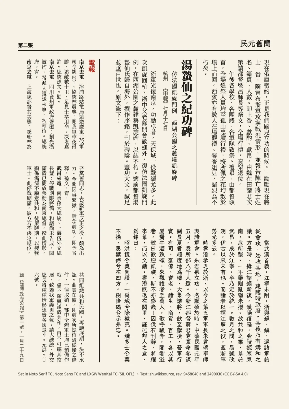
1912年一份中文报纸的两版,竖排印刷。版面像当年的报纸那样分成上下几栏,中间用线隔开。
成品一览
这是1912年、民国元年一份中文报纸的两张,那时报纸仍然竖排。文字取自上海《申报》:孙中山在西湖出席公宴,陈其美起身反对一篇演说,随后又起身致歉;浙江为攻克南京阵亡的将士举行追祭;杭州为凯旋的军队建立纪念碑。临时政府公报创刊号上的四则电报排在一个框里。正文分两栏(欄),每栏25字,中间隔一条栏线;电报分三栏。朱红色的报头和贯穿版面全高的头条标题开启第一张。Newspaper front page用横排做了同样的版面。
这道食谱解答
- 怎样把中文报纸版面排成竖排、分成几栏并用线隔开?
- 怎样让章标题横跨页面,下面的正文分两栏排?
- Postext能排三栏或更多栏,或者让文字绕图排吗?
- 怎样按字数设定版心,每行多少字、每页多少行?
简短回答
// On a vertical page two columns are two tiers (欄), stacked and filled from the upper right:
// the gutter is the gap between them, the column rule a rule across the page.
const layout = {
  layoutType: 'double', writingMode: 'vertical-rl', // binding 'auto' becomes 'right'
  gutterWidth: pt(2 * BODY),
  columnRule: { enabled: true, color: col('ink'), lineWidth: pt(0.75) },
};
// The grid counts characters down a tier and lines across the page: 25 × 29.
const cjk = { grid: { enabled: true, charsPerLine: CHARS, linesPerPage: 29 } };
// The body stays in two tiers. The telegrams take three inside a page-span box floated to
// the foot of the flow, the left of the sheet, with the fences
//   :::callout{type="wires" span="page" placement="bottom" title="電報"} and :::columns{count=3}
const wires = { id: 'wires', backgroundEnabled: false,
  stripe: { enabled: true, side: 'top', width: pt(1.5), color: col('ink') }, // on its right
  padding: { top: pt(6), right: pt(0), bottom: pt(0), left: pt(0) },
  columnGap: pt((HEIGHT - 3 * 18 * 9) / 2), // three tiers of 18 characters of 9 pt
  titleStyle: { fontFamily: HEI, fontSize: pt(12), fontWeight: 700, color: col('accent') },
  body: { fontFamily: SONG, fontSize: pt(9), lineHeight: pt(13.5), textAlign: 'justify',
    firstLineIndent: pt(0), boldFontWeight: 700 } };
用料
做法
#1 · 把两栏变成上下两栏
代码见上文的简短回答。设了writingMode: 'vertical-rl'之后,页面相当于把横排页面转了四分之一圈,所以layoutType: 'double'会把两栏上下叠放,先读上栏,原来的栏线也就成了横贯页面、隔开两栏的一条线(竖排)。字符网格把每栏设为25个五號(10.5 pt)字,这是报纸一栏的较长规格,整页设为29行;它把栏间距取整为两个字宽,并放大页边距,让各栏居于其中(字符网格)。
正文保持两栏,只有电报需要三栏,所以把电报放进一个框:span="page"让框与版心等高,placement="bottom"把它浮动到文字流的末尾,在竖排页面上就是左边缘,:::columns{count=3}再把它切成三栏。columnGap取的是版心的546 pt减去三栏、每栏18个9 pt字之后剩下的部分,所以每栏都容纳整数个字。
#2 · 把报头和头条标题放进同一个设计
// A page-span heading always opens a page (gotcha: page-span-heading-new-page), so the lead
// story's H1 carries the masthead in its own design, above its headline.
const MAST = 6.5 * LEAD; // the masthead's block, across the page
const block = (id, inset, style) => ({ kind: 'box', id, style,
  placement: at(inset, inset, { size: { width: pt(HEIGHT - 2 * inset),
    height: pt(MAST - 2 * inset) } }) });
const BAND = 13 * LEAD; // the whole design: masthead, headline, deck
const front = { enabled: true, minHeight: pt(BAND), slot: { elements: [
    block('field', 0, { backgroundColor: col('accent') }), // the name reversed out of it
    block('frame', 3.5, { borderColor: col('paper'), borderWidth: pt(0.75) }),
    text('name', '{title}', KAI, 700, 64, 'paper', { lineHeight: 1, letterSpacing: pt(6),
      placement: at(22, 13) }),
    text('kicker', '{subtitle}', HEI, 700, 12, 'paper', { placement: at(24, 82) }),
    text('sources', '錄{author}', HEI, 400, 8.5, 'paper', { placement: at(150, 84) }),
    text('issue', '{attr.issue}', HEI, 700, 12, 'paper', { placement: at(330, 33) }), // the year
    text('edition', '{attr.edition}', HEI, 400, 8.5, 'paper', { placement: at(330, 84) }),
    text('sheet', '第{pageNumber}張', HEI, 700, 10, 'accent', { placement: at(HEIGHT - 58, 80),
      box: { backgroundColor: col('paper'), padding: { top: pt(3), right: pt(3),
        bottom: pt(3), left: pt(3) } } }),
    // The headline down both tiers, centred; the dateline heads the deck's line.
    text('head', '{titleText}', SONG, 900, 44, 'ink', { align: 'center', lineHeight: 1.1,
      placement: at(0, MAST + 12, fill) }),
    text('deck', '{attr.deck}', KAI, 400, 15, 'ink', { align: 'center',
      placement: below('head', 6, fill) }),
    text('dateline', '{attr.dateline}', HEI, 700, 9, 'muted', { placement: below('head', 10) }),
    { kind: 'rule', id: 'foot', direction: 'horizontal', thickness: pt(0.75),
      color: col('ink'), placement: at(0, BAND - 3, fill) },
] } };
头条的标题必须在报头之下跨越两栏。带span: 'page'的标题会作为章首页排在页面开头,所以在报头之后再放一个这样的标题,它就会自己另起一页。因此本页的H1就是头条,它的标题样式在标题上方画出报头:一块6.5行深的朱红色块,报名反白印在里面,下面是出版信息,即民国纪年和干支纪年,以及“今日出紙兩張”;然后是44 pt的Noto Serif TC 900标题。在文字流中,这个设计的宽度就是版心在纸面上的高度,所以size: { width: 'fill' }配合align: 'center',让标题在两栏范围内居中。设计深13行,是网格线的整数倍,所以它后面的正文从网格的一行开始。
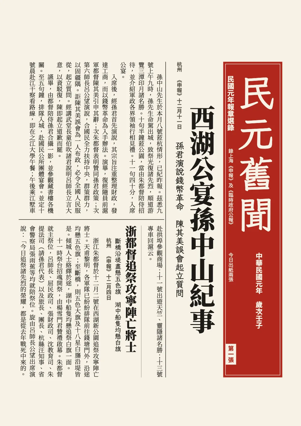
#3 · 每篇报道用一个标题设计开头
const storyHead = { enabled: true, minHeight: pt(4 * LEAD), slot: { elements: [ // 4 lines
  { kind: 'rule', id: 'rule', direction: 'horizontal', thickness: pt(0.5), color: col('rule'),
    placement: at(0, 0, fill) },
  text('head', '{titleText}', SONG, 900, 20, 'ink', { placement: at(0, 6) }),
  text('deck', '{attr.deck}', KAI, 400, 11, 'ink', { // two characters down the tier
    placement: below('head', 4, { offset: { x: pt(2 * BODY), y: pt(4) } }) }),
  text('dateline', '{attr.dateline}', HEI, 700, 9, 'muted', { placement: below('deck', 4) }),
] } };
栏内的标题设计位于它所在的那一栏里。它的线在文字流中是direction: 'horizontal',所以在纸面上沿着这一栏竖向延伸,成为两篇报道之间的一条细线。标题从这一栏的顶端开始,副题低两格,电头给出地点、报纸和报道刊出的日期。minHeight让每个标题都占四行,所以每个标题下面的正文都从网格上开始。
#4 · 给第二张加报眉,在底部署名
// The header's frame is the margin above the tiers; the footer's, the margin below them.
const above = (y, extra = {}) => ({ anchor: { to: 'container', edge: 'top-left' },
  offset: { x: pt(0), y: mm(HEAD - y) }, ...extra });
const header = { elements: [
  text('title', '{title}', KAI, 700, 14, 'ink', { align: 'right', placement: above(13, fill) }),
  text('sheet', '第{pageNumber}張', HEI, 700, 9, 'ink', { placement: above(10.8) }),
  { kind: 'rule', id: 'rule', thickness: pt(1.5), color: col('ink'), placement: above(6, fill) },
].map((element) => ({ ...element, pages: 'body' })) }; // page 1 has the masthead instead
const footer = { elements: [text('colophon', '{attr.colophon}', HEI, 400, 7, 'muted', {
  pages: 'body', placement: at(0, 17, fill) })] }; // 6 mm under the tiers
按照clreq的说明,竖排页面上的书眉仍然横排。页眉的框是各栏上方的页边距;网格会放大这段页边距,HEAD重复网格的计算结果,让那条线位于第一个字上方6 mm处。pages: 'body'把第1页留给报头。版权说明是H1的一个属性,所以英文版和西班牙文版在同样的中文页面下各自印出自己的一行。
#5 · 每种字体只加载它要排的文字
const pick = (pattern) => (markdown.match(pattern) ?? []).join('');
const attrs = (...keys) => pick(new RegExp(`[{ ](?:${keys.join('|')})="[^"]*"`, 'g'));
const voices = [ // family, weights, the text it sets, and whether it runs down a column
  [SONG, ['400'], markdown, true], // the text
  [SONG, ['700', '900'], pick(/^#+ [^{\n]*|\*\*[^*]+\*\*/gm), false], // heads, labels
  [HEI, ['400', '700'], pick(/^(?:subtitle|author): .*$|style="source"\}[^:]*/gm) // masthead,
    + attrs('dateline', 'issue', 'edition', 'title', 'colophon') + '錄第一二張', true], // datelines
  [KAI, ['400'], attrs('deck') + pick(/style="inscription"\}[^:]*/g), true], // decks, the stele
  [KAI, ['700'], pick(/^title: .*$/m), false], // the paper's name
];
Fontsource把这些字体的每个字重拆成大约一百个文件提供,loadCjkFonts只取文本用到的那些。Noto Serif TC 400拿到全部样文;它的700和900只拿标题和电报的标签,Noto Sans TC拿报头信息、电头和版权说明,LXGW WenKai TC拿副题、碑文和报名。给某个字体的文字太少,截图检查就会失败(C12),并列出它从别的字体借来的字。
完整食谱
// ═══ Postext Cookbook · Nº 084 · A vertical newspaper page in tiers ═══════════════
// https://postext.dev/en/cookbook/vertical-newspaper-tiers
// Code: MIT · Text: Shenbao, 1912 (PD); gazette, stele report: zh.wikisource (CC BY-SA 4.0)
// Fonts: Noto Serif TC, Noto Sans TC, LXGW WenKai TC (SIL OFL 1.1) · Needs postext ≥ 1.46.2
import {
  buildDocument, withLoadedFonts, renderPageToCanvas, loadVerticalAlternates,
} from 'https://esm.sh/postext';
import { renderToPdf, decompressWoff2 } from 'https://esm.sh/postext-pdf';

const LANG = 'en'; // @lang: the language of the colophon; the news is Chinese in both editions
const RECIPE = 'vertical-newspaper-tiers';

// ─── 1 · Design ─────────────────────────────────────────────────────────────
// #region palette: newsprint, ink and the vermilion of the masthead
const palette = {
  ink: '#1c1a17', // text, the rules between tiers
  accent: '#b0281c', // the one accent: the masthead block, the telegrams' flag
  rule: '#8f887c', // the hairline before each story
  muted: '#5e574e', // datelines, sources, the colophon
  paper: '#f7f2e6', // newsprint, and the masthead's type reversed out of the vermilion
};
const col = (id) => ({ hex: palette[id], model: 'hex', paletteId: id });
const colorPalette = [
  ...Object.entries(palette).map(([id, hex]) => ({ id, name: id, value: { hex, model: 'hex' } })),
  { id: 'main-color', name: 'ink (defaults)', value: { hex: palette.ink, model: 'hex' } },
];
// #endregion

const [SONG, HEI, KAI] = ['Noto Serif TC', 'Noto Sans TC', 'LXGW WenKai TC']; // 宋, 黑, 楷
const BODY = 10.5; // pt: 五號, the body size of the papers of 1912
const LEAD = 15.75; // pt: the line pitch across the page, 1.5 em
const CHARS = 25; // characters down a tier: a newspaper column, 17 to 25
const HEIGHT = 2 * CHARS * BODY + 2 * BODY; // pt: two tiers and a gutter of two ems
const TRIM = { w: 184, h: 260 }; // mm, 16開
const MARGIN = { top: 30, bottom: 22, side: 11 }; // mm, minimums: the grid centres the tiers
// The grid grows the margins evenly, so the tiers start HEAD mm below the top edge.
const HEAD = MARGIN.top + (TRIM.h - MARGIN.top - MARGIN.bottom - (HEIGHT * 25.4) / 72) / 2;

// #region answer: two tiers down the page with a rule between them, three inside a box
// On a vertical page two columns are two tiers (欄), stacked and filled from the upper right:
// the gutter is the gap between them, the column rule a rule across the page.
const layout = {
  layoutType: 'double', writingMode: 'vertical-rl', // binding 'auto' becomes 'right'
  gutterWidth: pt(2 * BODY),
  columnRule: { enabled: true, color: col('ink'), lineWidth: pt(0.75) },
};
// The grid counts characters down a tier and lines across the page: 25 × 29.
const cjk = { grid: { enabled: true, charsPerLine: CHARS, linesPerPage: 29 } };
组合好的script.js可以直接运行:把它粘贴到任何页面的模块脚本中,或在CodePen上打开这道食谱。 GitHub上的食谱文件夹 ↗ (在新标签页中打开)
变化
#让电报分四栏
四栏、每栏14字,放在同样的高度里正好,框也收窄到这些行所需的宽度。
-  columnGap: pt((HEIGHT - 3 * 18 * 9) / 2), // 三栏,每栏18个9 pt字
+ columnGap: pt((HEIGHT - 4 * 14 * 9) / 3), // 四栏,每栏14个9 pt字Markdown里写:::columns{count=4}。
#把报道排成一栏
一栏52字贯穿版心全高,每一行在纸面上都长193 mm。每篇报道的标题现在要占整页的四行,两张也变成三张。
-  layoutType: 'double', writingMode: 'vertical-rl', // binding 'auto' 变为 'right'
+ layoutType: 'single', writingMode: 'vertical-rl', // binding 'auto' 变为 'right'网格里同时设charsPerLine: 2 * CHARS + 2。
常见问题
易错点
通栏标题总是开启新页
标题级别或样式设了span: 'page'的标题,会作为章首页排在页面顶部,不管它有没有breakBefore。放在其他文字之后,或同一页另一个章首页之后,它都会移到下一页,当前页余下部分留空。报头下横跨两栏(或竖排页面两层)的通栏大标题,要放进章首页自己的设计里,与报头并列;或者放进:::callout{span="page"}框中,作为不设span的标题,newspaper-front-page就是这样排通栏标题的。 设计过的章首页 →
易错点
中文字体通过cjk块分片加载
Fontsource把一个中文、日文或韩文字体家族按每个字重约一百个文件提供,每个文件覆盖一段字符范围。loadFonts只获取latin文件,所以屏幕上的汉字来自系统字体,测量不准;fontsourceProvider交给PDF的也是这个latin文件,汉字印出来是空框。列出kit中的cjk块,在loadFonts之后调用loadCjkFonts(FONTS, markdown)(书中用到几种CJK字体时,每种字体调用一次,并传入它所排的文字),并给renderToPdf传fontProvider: cjkPdfProvider:两者都会取用包含文中字符的那些文件。 中日韩字体 →
易错点
用zh-Hans或zh-Hant标记文档,不要用LANG
食谱的版本是en和es,但中文示例在两个版本里都是中文:`locale: LANG`会把它标记为英文或西班牙文,给其中的拉丁文词断词,把图标注为Figure或Figura,并给PDF标上错误的语言。postext 1.30起,这个标记也是文字成形所用的语言(测量、绘制和嵌入都按它进行),所以标记成英文或西班牙文时,中文字体的数字和与拉丁文共用的标点会换成另一套字形,断行的位置也随之改变。自己写出标记:'zh-Hans'(大陆规范:GB断行规则、开明式标点)或'zh-Hant'(台湾:全角居中标点);香港用'zh-HK'。单写'zh'按简体、大陆规范处理。日文示例写'ja'(见gotcha ja-locale-tag)。 中文断行 →
易错点
右装订的书用showBook显示跨页
在右装订的书中(阿拉伯文、希伯来文或波斯文,竖排中文,或page.binding 'right'),第1页仍是奇数页(recto),但它位于书脊左侧,跨页读作[3 | 2]。showPages把所有书都按左装订排列;book块中的showBook(cjk块中也有同一个函数)读取doc.binding,把跨页左右镜像。capture.hero仍按阅读顺序[偶数页, 奇数页]指定跨页:[2, 3]。 右翻书 →
- Fontsource的Noto Serif TC在它某个文件的字符范围里声明了爲,也就是《申报》所用的字形,但这个文件里并没有它的字形:Canvas用一个系统字体画出了它,PDF里则没有这个字(C25)。报道里改用為。
- 维基文库的录文有几处笔误,本页作了更正:公宴报道中己紀应为已紀,倍侍应为陪侍(两处);追祭报道中的勸勵一番現在將土,土应为士,宾语应在一番之前,这里排作勸勵現在將士一番。本页还把四个异体字换成了标准字形:电报中寗作寧,縂作總(三处),决作決(两处),碑文中刋作刊。
- Fontsource提供的LXGW WenKai TC把為画成爲,所以用楷体排的碑文显示的是宋体文字里没有的那个旧字形。
- 框里的三栏是版心的三等分,与正文的两栏对不齐。报纸会给这样的栏目单设一套网格;框右边缘的那条线把两套网格隔开。
致谢
- 文本
- Shenbao (Shanghai), 11 December 1912: the banquet for Sun Yat-sen at West Lake, Hangzhou · Shenbao; transcription by Wikisource editors · 公有领域
- Shenbao (Shanghai), 4 December 1912: the memorial for the Zhejiang soldiers killed at Nanjing · Shenbao; transcription by Wikisource editors · 公有领域
- Shenbao (Shanghai), 17 July 1912: the victory monument at West Lake, with Tang Shouqian's inscription · Shenbao, Tang Shouqian; transcription and punctuation by Wikisource editors, revised for this recipe · CC BY-SA 4.0
- Four telegrams from Linshi zhengfu gongbao (Provisional Government Gazette) no. 1, 29 January 1912 · Provisional Government, Nanjing; transcription and punctuation by Wikisource editors · CC BY-SA 4.0
- Punctuation of the first two reports, the masthead, decks and datelines · Postext Cookbook · CC BY 4.0
- 字体
- Noto Serif TC (SIL OFL 1.1) · Noto Sans TC (SIL OFL 1.1) · LXGW WenKai TC (SIL OFL 1.1)