かんたんな説明
登山道の整備作業員向けの現場マニュアルから、道の排水を扱う章です。見出しを7階層にし、それぞれに違う見た目を与えて、全体の構成が読者に見えるようにする方法がわかります。
できあがり
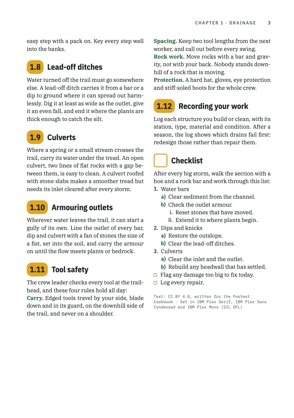
登山道の整備作業員向けの現場マニュアルの第1章『Drainage』を、B5判3ページの2段組みで組みます。本文はIBM Plex Serif、見出しと節番号はIBM Plex Sans Condensed、ラベル、ノンブル、項番号はIBM Plex Monoです。章扉では、章番号を大きな琥珀色のピルに入れ、登山道の高低断面図の上に置きます。断面図では、琥珀色の点が新しい水切りを設ける12か所を示しています。小さなピルが節1.1から1.12に番号を付け、1.10で幅が広がります。見出し1.2.1、1.5.1、1.5.2は、緑の罫線の下に字間を広げたキャピタルで組みます。レベル4から6は番号を付けず、代わりに書体を変えます(セリフのイタリック、緑のコンデンスの太字、等幅のキャピタル)。灰色のイタリックの7番目の階層は道具名を示します。安全規則は緑の追い込みの用語で始まります。中抜きの四角を付けた番号なしのチェックリストが、1.、a)、i.と番号付けしたリストと2つのタスクボックスで章を締めくくります。
このレシピが答える質問
- 見出しに番号(1、1.1、1.1.1)を振り、レベルごとに異なるスタイルにするには?
- タイトルの横に、番号が増えると幅が広がる番号バッジ(9 → 10)を作るには?
- 見出しのレベルが6つを超えるときはどうすればいいですか?
- リストをカスタマイズするには(レベルごとの記号、(a)/(i)の番号、タスクのチェックボックス、グリッドに乗る間隔)?
手短な答え
const H2 = 13.5; // pt: the number and the title share one size and one line height,
const LH = 1.2; // so, under the same top padding, they share one baseline
// Every section head starts on a grid line, so the 3 pt the pill falls short of two lines
// is the gap the grid snap leaves between the pill and the text under it.
const PILL_H = 2 * LEAD - 3, PAD = (PILL_H - H2 * LH) / 2; // pt
const face = { fontFamily: DISPLAY, fontWeight: 700, fontSize: pt(H2), lineHeight: LH };
const pill = { kind: 'text', id: 'pill', content: '{number}', ...face, color: col('ink'),
  box: { backgroundColor: col('signal'), borderRadius: mm(3), // no width: the pill is its
    padding: { top: pt(PAD), bottom: pt(PAD), left: mm(1.8), right: mm(1.8) } }, // number
  placement: at('container', 'top-left') }; // plus its padding
// 'right-of' hangs the title on the pill's right edge and aligns its lines left, so a long
// title wraps beside the number, never under it.
const sectionTitle = (from) => ({ kind: 'text', id: 'title', content: '{titleText}', ...face,
  color: col('ink'), overflow: 'wrap', box: { padding: { top: pt(PAD) } },
  placement: at(`#${from}`, 'right-of', mm(2.2)) });
// The H1 counter, a point, the H2 counter: 1.1 … 1.12 in the pill. h2 joins headings.levels.
const h2 = { level: 2, numberingTemplate: '{1}.{2}',
  advancedDesign: { enabled: true, slot: { elements: [pill, sectionTitle('pill')] } } };
材料
- 機能
- 番号付き見出しページデザインのテキスト・罫・ボックスデザイン要素の基準位置見出しの階層見出しスタイル番号のない章デザインした章扉ページデザインの画像見出しの属性段落スタイル太字・イタリックとその色箇条書きとチェックリスト番号付きリストベースライングリッドウィドウ、オーファン、ラント柱とノンブルページの役割ごとの柱見開きの余白セマンティックカラーパレットリソースとしての図と表
- 併用する機能
- 段抜きの章見出し帯
- 種類
- IBM Plex Serif, IBM Plex Sans Condensed, IBM Plex Mono (SIL OFL 1.1)
- 素材
- なし:画像はすべてコードで描画
作り方
#1 · 番号とともに広がるピルに番号を入れる
コードは上の手短な答えにあります。numberingTemplate: '{1}.{2}'は章と節のカウンターをつないで1.1から1.12にします(レベルごとの上書き)。詳細デザインを指定したレベルは、タイトルの前に番号を印刷しなくなるので、デザインが{number}を自分で置きます。ここでは番号を、塗りと角丸のある幅指定なしのboxを付けたテキスト要素に入れているので、ピルの幅は番号とその内側余白の合計になります。1.9なら10.1 mm、1.10なら12.7 mmです。'right-of'はタイトルをピルの右端に固定し、行を左そろえにします。1.5の長いタイトルが番号の脇で折り返すのはそのためです(要素の配置)。ピルはグリッド2行分より3 pt短く、節の見出しはどれもグリッド線から始まるので、見出しが段の頭に来ても段落の後に来ても、その3 ptがピルとその下の本文の間隔になります。
#2 · 3番目の階層に罫線を引き、字間を広げる
// A rule, a mono number and a tracked title: three elements, so this head is a design.
const small = { fontSize: pt(8.4), lineHeight: LH };
const DROP = 6; // pt: the rule drops this far toward the number, which keeps its grid line
const h3 = { level: 3, numberingTemplate: '{1}.{2}.{3}', // 1.5.1: restarts under every H2
  advancedDesign: { enabled: true, slot: { elements: [
    { kind: 'rule', id: 'rule', direction: 'horizontal', thickness: pt(0.75), color: col('band'),
      placement: { ...at('container', 'top-left', mm(0), pt(DROP)), size: { width: 'fill' } } },
    { kind: 'text', id: 'num', content: '{number}', fontFamily: LABEL, fontWeight: 500, ...small,
      color: col('band'), placement: at('#rule', 'below', mm(0), pt(LEAD - DROP)) },
    { kind: 'text', id: 'title', content: '{titleText}', fontFamily: DISPLAY, fontWeight: 600,
      ...small, letterSpacing: pt(1.35), textTransform: 'uppercase', color: col('ink'),
      overflow: 'wrap', placement: at('#num', 'right-of', mm(2)) },
  ] } } };
レベル3もデザインで描きます。0.75 ptの緑の罫線、IBM Plex Monoの番号、その脇に字間を広げたタイトルです。'{1}.{2}.{3}'の3番目のカウンターは節ごとにリセットされるので、1.2.1も1.5.1も1で終わります。DROPは罫線だけを下げます。番号は罫線のLEAD - DROP下に置くので、DROPがいくつでも、番号とタイトルは見出しの上端からグリッド1行下にとどまります。罫線が上の段落より番号に近いので、見出しの一部として読めます。
#3 · レベル4から6へ段階的に下げる
const headings = { fontFamily: DISPLAY, color: col('ink'), // every head sits on the grid,
  lineHeight: pt(LEAD), marginTop: pt(LEAD), marginBottom: pt(0), // a line above, none below
  levels: [
    // Each chapter opens on a recto.
    { level: 1, span: 'page', breakBefore: { enabled: true, parity: 'odd' },
      numberingTemplate: '{1}', advancedDesign: opener },
    h2, h3,
    // No template below level 3, so no number: each level changes face, colour or case.
    { level: 4, fontFamily: 'IBM Plex Serif', fontWeight: 400, italic: true, fontSize: pt(11) },
    { level: 5, fontSize: pt(9.4), color: col('band') },
    { level: 6, fontFamily: LABEL, fontWeight: 600, fontSize: pt(7.8), textTransform: 'uppercase' },
  ] };
numberingTemplateのないレベルは番号を印刷しないので、レベル4以下の見出しは、代わりに書体、色、大文字小文字で区別します。レベル4はセリフのイタリック、5は緑のディスプレイ書体、6はセミボールドの等幅のキャピタルです。headings自体に設定した行送りと余白はすべてのレベルに及び、各見出しを上に空行1行、下には空行なしでグリッドに載せます。レベル1はparity: 'odd'で、どの章も奇数ページから始めます。
#4 · スタイルで7番目の階層と番号なしの節を作る
const headingStyles = [
  // Markdown stops at ######: '###### Rock bar {style="level7"}' stays level 6 in the
  // outline and is set in lower case, lighter and grey.
  { id: 'level7', fontFamily: DISPLAY, fontWeight: 500, italic: true, fontSize: pt(8.4),
    textTransform: 'none', color: col('muted') },
  // numbered: false: no number, and the H2 counter does not move. An empty {number} would
  // still paint the amber pill, so the style draws a hollow square in its place.
  { id: 'checklist', numbered: false, advancedDesign: { enabled: true, slot: { elements: [
    { kind: 'box', id: 'box', style: { borderColor: col('signal'), borderWidth: pt(1.8),
      borderRadius: mm(1.5) }, placement: { ...at('container', 'top-left'),
      size: { width: pt(PILL_H), height: pt(PILL_H) } } },
    sectionTitle('box'),
  ] } } },
];
const paragraphStyles = [
  // Run-in heads: the bold term opening each rule prints in the accent, not in body ink.
  { id: 'rules', boldColor: col('band'), firstLineIndent: pt(0) },
  { id: 'colophon', fontFamily: LABEL, fontSize: pt(6.8), lineHeight: pt(9),
    color: col('muted'), textAlign: 'left', firstLineIndent: pt(0), marginTop: pt(LEAD) },
];
Markdownは######で終わり、###### *Rock bar*はイタリックになるだけで、もう1つのレベル6です。見出しスタイル'level7'は道具名を、レベル6の600より軽い、ウェイト500の灰色のコンデンスのイタリックで組み、textTransform: 'none'で、本来なら引き継ぐはずのキャピタルを解除します。8.4 ptなので上の等幅のラベルの7.8 ptより大きいものの、それより1段下に読めます(見出しスタイル)。numbered: falseはチェックリストを番号の数から外すので、その後に節を置いても1.13のままです。空の{number}でも琥珀色のピルは塗られるので、このスタイルは専用のデザインを使い、ピルの位置に中抜きの四角を置きます。安全規則の緑の追い込みの用語は、段落スタイルのboldColorから来ています。
#5 · 深さに応じてリストの記号を変える
// Zero margins keep lists on the grid; a '- [ ]' item's bullet becomes taskCheckboxChar, '☐'.
const unorderedLists = { gap: mm(2), marginTop: pt(0), marginBottom: pt(0), color: col('band'),
  levels: [{ level: 2, bulletChar: '–', color: col('sage') }] }; // '•' stays at level 1
// Level 1 keeps the defaults: 'arabic' and a full stop.
const orderedLists = { fontFamily: DISPLAY, color: col('band'), gap: mm(1.6),
  marginTop: pt(0), marginBottom: pt(0), levels: [
    { level: 2, numberFormat: 'lower-alpha', separator: ')' },
    { level: 3, numberFormat: 'lower-roman', color: col('muted') }] };
深さごとに、記号、色、区切りをlevelsから取ります。チェックリストは1.、a)、i.と数え(番号付きリストのレベル別上書き)、行頭記号は緑からセージ色へ薄くなります(箇条書きリストのレベル別上書き)。レベル1は既定の書式'arabic'のままです。チェックリストを締めくくる2つの- [ ]項目は、行頭記号の代わりにtaskCheckboxChar(既定は☐)を、第1階層の行頭記号と同じ緑で印刷します(タスクリストの拡張)。上下の余白を0にしているので、リストはどれもベースライングリッドに載ったままです。
#6 · 章を登山道の断面図で始める
const DEPTH = 96; // mm: the profile's foot, measured from the top of the page
const CLEAR = 6; // mm: the least room between the profile's foot and the text under it
const LEGEND = 7; // mm: how far the legend's top sits above the profile's foot
const big = { ...face, fontSize: pt(54), lineHeight: 1, color: col('ink') };
// The opener reserves height down to the profile's foot; minHeight reaches CLEAR mm past
// it, so the text starts on the first grid line CLEAR mm or more under the picture.
const opener = { enabled: true, minHeight: mm(DEPTH - TOP + CLEAR), slot: { elements: [
  { kind: 'image', id: 'profile', resourceId: 'profile',
    placement: { ...at('page', 'top-left'), size: { width: 'fill' } } },
  { kind: 'text', id: 'num', content: '{number}', ...big, box: { backgroundColor: col('signal'),
    borderRadius: mm(4), padding: { top: pt(4), bottom: pt(4), left: mm(4), right: mm(4) } },
    placement: at('container', 'top-left') },
  { kind: 'text', id: 'title', content: '{titleText}', ...big, box: { padding: { top: pt(4) } },
    placement: at('#num', 'right-of', mm(4)) },
  { kind: 'text', id: 'lead', content: '{attr.lead}', fontFamily: 'IBM Plex Serif', italic: true,
    fontSize: pt(11.5), lineHeight: 1.3, color: col('ink'), align: 'left', overflow: 'wrap',
    placement: { ...at('#num', 'below', mm(0), mm(5)), size: { width: mm(100) } } },
  // The legend is design text over the picture: each edition words it in its heading.
  { kind: 'text', id: 'legend', content: '{attr.profile}', fontFamily: LABEL, fontWeight: 500,
    fontSize: pt(7), color: col('tint'), placement: at('page', 'top-right', mm(-OUTER),
      mm(DEPTH - LEGEND)) },
] } };
断面図は章扉の画像要素で、ページに固定し、ページと同じ幅にしています。ページ幅の図を天にフロートさせて1ページ目で参照すると、2ページ目の頭に置かれていたはずです(画像要素)。章扉は画像の下端までの高さを確保し、minHeightはそこからさらに6 mm下まで届くので、本文は断面図の6 mm以上下にある最初のグリッド線から始まります。緑の上の凡例はデザインテキストで、見出しのprofile属性から取ります。大きなピルは節のピルの書体と塗りを再利用し、{number}はnumberingTemplate: '{1}'から章自身の番号を印刷します。
レシピの全体
// ═══ Postext Cookbook · Nº 018 · Section heads seven levels deep ═════════════════
// https://postext.dev/en/cookbook/section-heads-field-manual
// Code: MIT · Text: original (CC BY 4.0) · Picture: drawn in code (MIT)
// Fonts: IBM Plex Serif, Sans Condensed, Mono (SIL OFL 1.1) · Needs postext ≥ 1.25.0
import {
  buildDocumentWithFonts, renderPageToCanvas, registerResourceImage,
} from 'https://esm.sh/postext';

const LANG = 'en'; // @lang: the language of the sample document ('en' | 'es')
const RECIPE = 'section-heads-field-manual';

// ─── 1 · Design ─────────────────────────────────────────────────────────────
const palette = { // forest green for structure, a signal amber for numbers
  ink: '#1d2320', // text: a green-black
  band: '#2f6b3f', // the accent: rules, run-in terms, bullets, numbers, folios (6.4:1)
  signal: '#e0a526', // the number pills, with ink on them (7.3:1)
  sage: '#7a9e80', // the second bullet and the profile's upper contours
  tint: '#e9f0e6', // the opener's sky; the legend on the green (5.5:1)
  muted: '#5f6a62', // running heads, level 7, roman list numbers, the colophon (5.6:1)
};
// col(id): a colour linked to its palette entry, in text styles and design slots alike.
const col = (id) => ({ hex: palette[id], model: 'hex', paletteId: id });
// Defaults this config does not restate link to 'main-color', so it points at the accent.
const colorPalette = Object.entries({ ...palette, 'main-color': palette.band })
  .map(([id, hex]) => ({ id, name: id, value: { hex, model: 'hex' } }));
const TRIM = { width: 176, height: 250 }; // mm: ISO B5, a common size for field manuals
const [TOP, INNER, OUTER] = [22, 16, 14]; // mm: margins; the running heads align to OUTER
const LEAD = 13.2; // pt: the body leading, the pitch of the baseline grid
const LINES = 44; // grid lines in the text block, so every full column ends on one baseline
const [DISPLAY, LABEL] = ['IBM Plex Sans Condensed', 'IBM Plex Mono']; // with the serif text
const at = (to, edge, x, y) => ({ anchor: { to, edge }, offset: { x, y } });

// #region answer: section numbers 1.1 … 1.12 in an amber pill that widens with the number
const H2 = 13.5; // pt: the number and the title share one size and one line height,
const LH = 1.2; // so, under the same top padding, they share one baseline
// Every section head starts on a grid line, so the 3 pt the pill falls short of two lines
// is the gap the grid snap leaves between the pill and the text under it.
const PILL_H = 2 * LEAD - 3, PAD = (PILL_H - H2 * LH) / 2; // pt
const face = { fontFamily: DISPLAY, fontWeight: 700, fontSize: pt(H2), lineHeight: LH };
const pill = { kind: 'text', id: 'pill', content: '{number}', ...face, color: col('ink'),
  box: { backgroundColor: col('signal'), borderRadius: mm(3), // no width: the pill is its
    padding: { top: pt(PAD), bottom: pt(PAD), left: mm(1.8), right: mm(1.8) } }, // number
  placement: at('container', 'top-left') }; // plus its padding
// 'right-of' hangs the title on the pill's right edge and aligns its lines left, so a long
// title wraps beside the number, never under it.
const sectionTitle = (from) => ({ kind: 'text', id: 'title', content: '{titleText}', ...face,
  color: col('ink'), overflow: 'wrap', box: { padding: { top: pt(PAD) } },
  placement: at(`#${from}`, 'right-of', mm(2.2)) });
組み立てたscript.jsはそのまま動きます。任意のページのモジュールスクリプトに貼り付けるか、レシピをCodePenで開いてください。 GitHub上のレシピのフォルダー ↗ (新しいタブで開きます)
アレンジ
#ピルから章番号を外す
テンプレートから章のカウンターを外すと、ピルは1から12になり、10で幅が広がります。レベル3は、自分のテンプレートからも{1}を外すまで1.5.1と印刷します。
-const h2 = { level: 2, numberingTemplate: '{1}.{2}',
+const h2 = { level: 2, numberingTemplate: '{2}',#すべてのピルを同じ幅にする
1.10の幅に固定すると、各番号が同じ幅のピルの中央に置かれ、タイトルが1列にそろいます。
-  placement: at('container', 'top-left') }; // plus its padding
+ placement: { ...at('container', 'top-left'), size: { width: mm(12.7) } } };よくあるつまずき
つまずき
'top'のフロートは参照ページの先頭を許さない限り次のページに置かれる
既定では、フロートが自分の参照より上に置かれることはありません。そのため、Nページで参照したページ幅の'top'フロートはN+1ページの頭に置かれます。リソースまたはその種類のdefaultPlacementにplacement.citingPage: trueを設定すると(本全体ならlayout.floatsAtCitingPage、postext 1.25から)、layout.maxTopFraction以内に収まり参照行がそのページに残る場合は代わりにNページの先頭に置かれ、参照より前の本文はその下に送られます。章の最初のページと強制改ページの後のページの先頭には置かれません。その場合は次のページに置かれ、'auto'または'bottom'なら参照したページの下端に入れられます。 図の配置 →
Sandboxの検査 · headingHierarchy
見出し階層の飛び
原因. 見出しのレベルが1つ飛んでいます。たとえばH1の直後にH3が続いています。
対処. 1つ下のレベルを使うか、レベルを飛ばす代わりに、意図したレベルのスタイルを変更してください。 ドキュメント →
- 7番目の階層はスタイル
level7を付けたレベル6の見出しなので、見本の中で、直前の見出しより2レベル以上下がる見出しはありません。「The trench」「Tools for the trench」「STEEL BARS」「Rock bar」は4、5、6、6と並びます。Sandboxの警告「見出し階層の飛び」はそうした飛びを報告するので、この章では出ません。
クレジット
- 本文
- 書き下ろしの文章, CC BY 4.0
- フォント
- IBM Plex Serif (SIL OFL 1.1) · IBM Plex Sans Condensed (SIL OFL 1.1) · IBM Plex Mono (SIL OFL 1.1)