简单来说
一首阿拉伯古典诗,按旧时诗集的方式排印:每联分成并排的两半,两半拉到同样宽,行末在整页上对齐。
成品一览
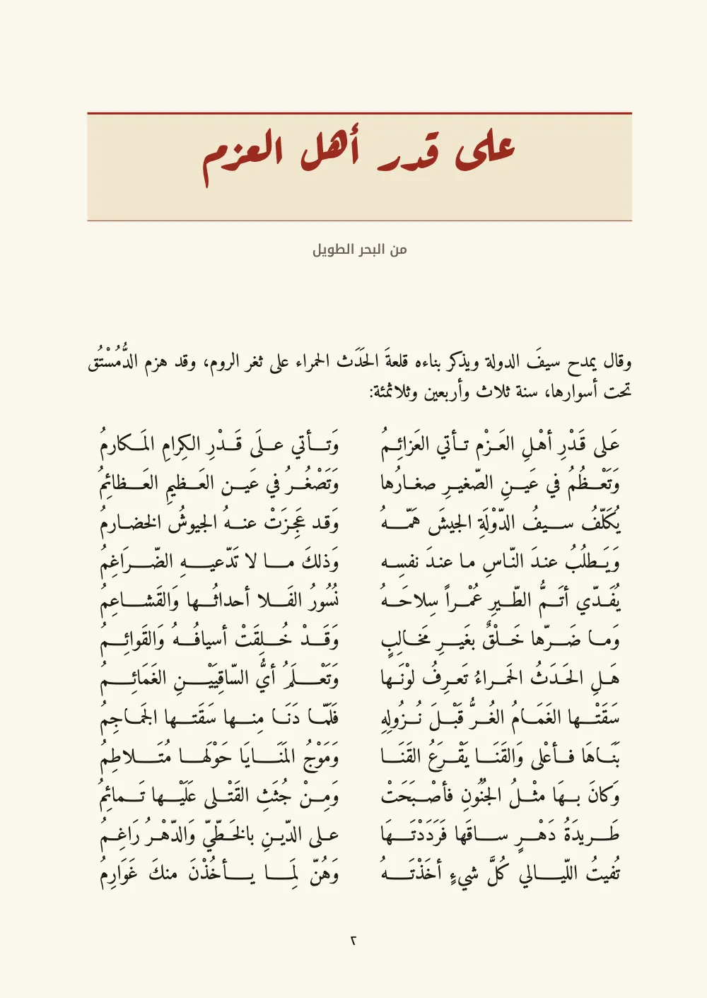
一本诗集(迪万)的四页,收的是穆太奈比的诗,按一百年前开罗印书的样子来排:先是一张扉页,用红色鲁格阿体写“ديوان”;然后是公元954年他在赛福·道莱面前吟诵的那首长诗,上面有一条红线题头。四十六联诗每联占一行,分成两个半行:前半行在右,后半行在左,都用卡希达拉到同一宽度,所以以‑mu收尾的韵脚沿左边排成一条直线。书在右侧装订,页码用阿拉伯-印度数字。只有书末那段版本说明随版本语言变化。唐诗与英译对页排则把中国古典诗排在它自己的字格网格上。
这道食谱解答
- 怎样把古典阿拉伯诗排成每联两个半行?
简短回答
// In the Markdown, a :::verse block takes one bayt a line, the ṣadr and the ʿajuz parted
// by ||:
//   :::verse{style="bayt"}
//   عَلى قَدْرِ أهْلِ العَزْم تأتي العَزائِمُ || وَتأتي علَى قَدْرِ الكِرامِ المَكارمُ
//   :::
// The ṣadr goes on the right, the ʿajuz on the left, both stretched to the width of the
// widest half with a gap of 2 em between them. The style gives the poem its face and a
// leading deep enough for the harakat: 1.9 × the size.
const bayt = { id: 'bayt', fontFamily: NASKH, fontSize: pt(14), lineHeight: pt(26.6),
  color: col('ink'), marginTop: pt(LEAD / 2), marginBottom: pt(LEAD) };
// Justified lines lengthen their words with kashidas (tatweel) before they open the
// spaces wide: 'auto' is the default in an Arabic document, written out here to say so.
// A hemistich may stretch a word twice as far as a line of prose does: 1.2 em.
const bodyKashida = { kashida: 'auto', kashidaPatterns: 'naskh', kashidaMaxLength: 0.6 };
用料
做法
#1 · 一联一行,两个半行等宽
代码见上文的简短回答。在:::verse里每行是一联,用||分开两个半行,所以Markdown读起来就像它所来自的维基文库文本(:::verse)。诗块先测量每个半行,取最宽的半行作为两栏的宽度(不超过版心宽度减去中缝后的一半),再把每个半行填到这个宽度:先加卡希达,再放宽词间距(古典诗歌)。bayt样式用14 pt字号、26.6 pt行距,即字号的1.9倍,这样上下两行的叠音符和齐齿符不会相碰(元音符号)。开本是17 × 24 cm:在14 × 21 cm的开本上,有三分之一的诗联在104 mm版心的一半里放不下,退回到错行排法,前后半行各占一行。
#2 · 鲁格阿体的题头横带
const rule = (id, y, thickness) => ({ kind: 'rule', id, direction: 'horizontal',
  thickness: pt(thickness), color: col('rubric'),
  placement: { anchor: { to: 'container', edge: 'top' }, offset: { y: mm(y) },
    size: { width: 'fill' } } });
const opener = {
  enabled: true, minHeight: mm(46),
  slot: { elements: [
    { kind: 'box', id: 'band', reserve: false, style: { backgroundColor: col('tint') },
      placement: { anchor: { to: 'container', edge: 'top' }, offset: { y: mm(4) },
        size: { width: 'fill', height: mm(26) } } },
    rule('band-top', 4, 1.5), rule('band-foot', 30, 0.5),
    { kind: 'text', id: 'title', content: '{titleText}', fontFamily: RUQAA, fontWeight: 700,
      fontSize: pt(34), lineHeight: 1.1, align: 'center', color: col('rubric'),
      placement: { anchor: { to: 'container', edge: 'top' }, offset: { y: mm(7.5) } } },
    { kind: 'text', id: 'metre', content: '{attr.metre}', fontFamily: KUFI, fontWeight: 500,
      fontSize: pt(9), align: 'center', color: col('muted'),
      placement: { anchor: { to: 'container', edge: 'top' }, offset: { y: mm(35) } } },
  ] },
};
一级标题由它的版面设计来画:一个上下各有一条红线的浅色框,标题用Aref Ruqaa居中排在框上,下面是取自标题属性{metre="من البحر الطويل"}的诗律名。鲁格阿体的展示字不加卡希达,所以标题保持自然宽度(两端对齐与卡希达)。
#3 · 书眉放在纸页的实际两侧
// Running heads stay on the sheet's sides: in a book bound on the right the verso (even)
// is the right-hand page, so its outer edge, where the folio goes, is the right one.
const head = (id, content, parity, edge, x, extra = {}) => ({ kind: 'text', id, content,
  parity, pages: 'body', fontFamily: KUFI, fontWeight: 500, fontSize: pt(8.5),
  color: col('muted'), placement: { anchor: { to: 'page', edge }, offset: { x: mm(x), y: mm(12) } },
  ...extra });
const header = { elements: [
  head('verso-folio', '{pageNumber}', 'even', 'top-right', -OUTER, { color: col('ink') }),
  head('verso-book', '{title}', 'even', 'top-right', -(OUTER + 10)),
  head('recto-rhyme', '{subtitle}', 'odd', 'top-left', OUTER + 10),
  head('recto-folio', '{pageNumber}', 'odd', 'top-left', OUTER, { color: col('ink') }),
] };
const footer = { elements: [head('drop-folio', '{pageNumber}', 'all', 'bottom', 0, {
  pages: 'opener', color: col('ink'),
  placement: { anchor: { to: 'page', edge: 'bottom' }, offset: { y: mm(-12) } } })] };
正文从右向左排,正文里的左和右指起始和末尾。书眉却按纸页的物理方向放置。右侧装订的书,偶数页(verso)位于跨页的右边,所以它的页码在右上,奇数页的在左上:两者都在外侧(页序与右侧装订)。只写locale: 'ar',就定下了文字方向、装订边和阿拉伯-印度数字。
#4 · 正文流里什么也没有的扉页
const at = (y) => ({ anchor: { to: 'page', edge: 'top' }, offset: { y: mm(y) } });
const line = (id, content, y, style) => ({ kind: 'text', id, content, align: 'center',
  overflow: 'wrap', color: col('ink'), placement: at(y), ...style });
const titlePage = {
  id: 'title', span: 'page', runningChapter: false,
  breakBefore: { enabled: true, parity: 'any' },
  header: { elements: [] }, footer: { elements: [] },
  advancedDesign: { enabled: true, slot: { elements: [
    line('diwan', 'ديوان', 52, { fontFamily: RUQAA, fontWeight: 700, fontSize: pt(64),
      lineHeight: 1.2, color: col('rubric') }),
    line('poet', '{titleText}', 84, { fontFamily: NASKH, fontWeight: 700, fontSize: pt(20) }),
    { kind: 'rule', id: 'rule', direction: 'horizontal', thickness: pt(0.75),
      color: col('rubric'), placement: { anchor: { to: 'page', edge: 'top' },
        offset: { y: mm(100) }, size: { width: mm(24) } } },
    line('rhyme', '{attr.rhyme}', 106, { fontFamily: KUFI, fontWeight: 500, fontSize: pt(11),
      color: col('rubric') }),
    line('latin', '{attr.latin}', 150, { fontFamily: NASKH, fontSize: pt(9.5),
      color: col('muted'), italic: true }),
  ] } },
};
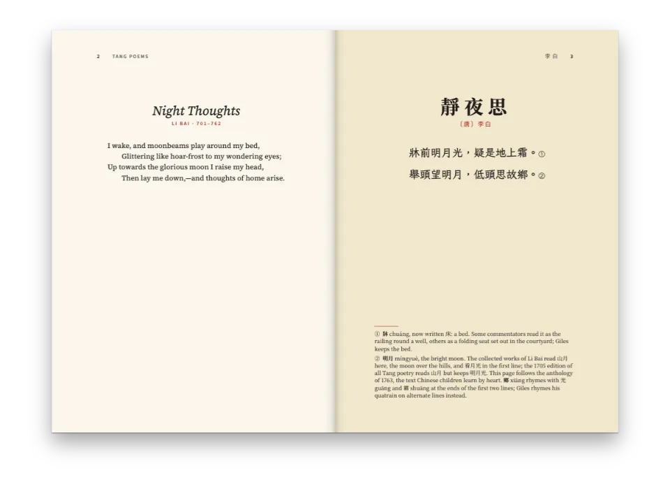
扉页是一个设了span: 'page'的标题样式,配有空的页眉和页脚。它的标题文字是诗人的名字,所以“ديوان”一词是版面设计里的文字,以64 pt排在名字上方;韵部名下面的那行拉丁文取自latin属性,每个版本用自己的语言来写。
完整食谱
// ═══ Postext Cookbook · Nº 110 · A qasida on a diwan page, in two hemistichs ═══════════
// https://postext.dev/en/cookbook/qasida-diwan-page
// Code: MIT · Text: al-Mutanabbī, Dīwān, ar.wikisource (PD) · Pictures: none
// Fonts: Amiri, Aref Ruqaa, Noto Kufi Arabic (SIL OFL 1.1) · Needs postext ≥ 1.28.0
import { buildDocument, withLoadedFonts, renderPageToCanvas } from 'https://esm.sh/postext';
import { renderToPdf, decompressWoff2 } from 'https://esm.sh/postext-pdf';

const LANG = 'en'; // @lang: the language of the sample document ('en' | 'es')
const RECIPE = 'qasida-diwan-page';

// ─── 1 · Design ─────────────────────────────────────────────────────────────
// Black text and red rubrics on a warm paper, as a Cairo diwan of the 1900s prints them.
const palette = {
  ink: '#1f1a16', // text: a warm near-black
  rubric: '#9a2b1f', // the accent: titles, the metre, the headpiece rules
  tint: '#f1e6cf', // the headpiece band
  rule: '#b8a27c', // hairlines
  muted: '#6b6156', // running heads and the note on the text
  paper: '#fbf7ee', // a cream paper
};
const col = (id) => ({ hex: palette[id], model: 'hex', paletteId: id });
const colorPalette = [
  ...Object.entries(palette).map(([id, hex]) => ({ id, name: id, value: { hex, model: 'hex' } })),
  { id: 'main-color', name: 'rubric (defaults)', value: { hex: palette.rubric, model: 'hex' } },
];
const NASKH = 'Amiri'; // the text: a Bulaq Naskh
const RUQAA = 'Aref Ruqaa'; // display: the titles
const KUFI = 'Noto Kufi Arabic'; // labels: metre, running heads, folios
const [SIZE, LEAD] = [13, 21]; // pt: the prose, at 1.6 × for a lightly vocalised headnote
const [OUTER, TOP] = [18, 23]; // mm: a 17 × 24 cm diwan

// #region answer: one bayt a line, both hemistichs stretched to one width
// In the Markdown, a :::verse block takes one bayt a line, the ṣadr and the ʿajuz parted
// by ||:
//   :::verse{style="bayt"}
//   عَلى قَدْرِ أهْلِ العَزْم تأتي العَزائِمُ || وَتأتي علَى قَدْرِ الكِرامِ المَكارمُ
//   :::
// The ṣadr goes on the right, the ʿajuz on the left, both stretched to the width of the
// widest half with a gap of 2 em between them. The style gives the poem its face and a
// leading deep enough for the harakat: 1.9 × the size.
const bayt = { id: 'bayt', fontFamily: NASKH, fontSize: pt(14), lineHeight: pt(26.6),
  color: col('ink'), marginTop: pt(LEAD / 2), marginBottom: pt(LEAD) };
// Justified lines lengthen their words with kashidas (tatweel) before they open the
// spaces wide: 'auto' is the default in an Arabic document, written out here to say so.
// A hemistich may stretch a word twice as far as a line of prose does: 1.2 em.
const bodyKashida = { kashida: 'auto', kashidaPatterns: 'naskh', kashidaMaxLength: 0.6 };
// #endregion
组合好的script.js可以直接运行:把它粘贴到任何页面的模块脚本中,或在CodePen上打开这道食谱。 GitHub上的食谱文件夹 ↗ (在新标签页中打开)
变化
常见问题
易错点
阿拉伯文书标记为'ar',不要用LANG
食谱的版本是en和es,但阿拉伯文示例在两个版本里都是阿拉伯文:`locale: LANG`会让它从左向右排、左装订、页码印成1 2 3,并把图标注为Figure或Figura。postext 1.30起,这个标记也是文字成形所用的语言(测量、绘制和嵌入都按它进行),所以标记成英文或西班牙文时,Markazi Text这样的字体不画尖角引号(« »)和句点的阿拉伯文字形,断行的位置也随之改变。自己写出标记:'ar'(阿拉伯-印度数字,马什里克惯例),或带地区的'ar-EG'、'ar-SA';马格里布版本用欧洲数字,写'ar-MA'、'ar-DZ'或'ar-TN'。只引用阿拉伯文的拉丁文页面保留自己的locale。 从右向左的文字 →
易错点
阿拉伯文字体需要通过arabic块加载其arabic文件
Fontsource把Amiri、Noto Naskh Arabic或Scheherazade New按子集分成多个文件提供,阿拉伯字母在arabic文件里。loadFonts只获取latin(以及latin-ext),所以屏幕上的阿拉伯文来自系统字体,测量不准;fontsourceProvider交给PDF的也是这个latin文件,印出来是空框。列出kit中的arabic块,在loadFonts之后调用loadArabicFonts(FONTS, markdown),并在FONTS中列出页面用于阿拉伯文的每个字重,再给renderToPdf传fontProvider: arabicPdfProvider。 阿拉伯文字体 →
致谢
- 文本
- The qasida ʿAlā qadri ahli l-ʿazmi taʾtī l-ʿazāʾimu, as ar.wikisource gives it (revision 447620), with its vowels · al-Mutanabbī · 公有领域
- The headnote in Arabic, the note on the text and the colophon · Postext Cookbook · 原创
- 字体
- Amiri (SIL OFL 1.1) · Aref Ruqaa (SIL OFL 1.1) · Noto Kufi Arabic (SIL OFL 1.1)