简单来说
一篇古老的阿拉伯故事,字母上下都印着小小的元音符号。行与行隔得足够开,上一行的符号不会撞到下一行。
成品一览
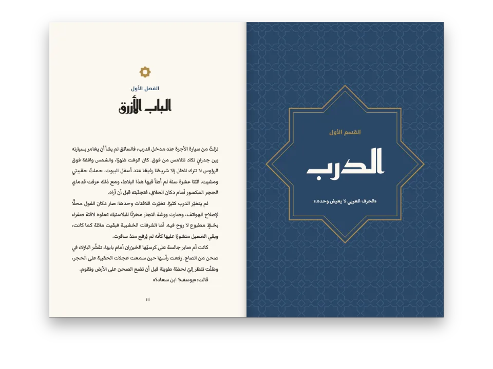
一本阿拉伯古典书的四页,书里每个字母都带着元音:赫迈扎尼的《疯人院玛卡梅》,讲巴士拉疯人院里一个疯子驳倒一位神学家,最后用诗报出自己的名字。全标元音的文字在字母上方叠着开口符和叠音符,下方有齐齿符,这些符号都占用行间的空白。所以页面用Amiri 14 pt、28 pt行距来排,即字号的两倍,别的什么也不加:行距本身就是设计。正文用卡希达两端对齐,右侧首行缩进1.5 em,三段古兰经引文放在印本经书的装饰括号﴿ ﴾里。只有拉丁文标题行和版本说明随版本语言变化。
这道食谱解答
- 全部标注元音的阿拉伯文需要多大行距?
简短回答
// Every letter of this maqāma carries its vowel: fatḥa and shadda over the letters, kasra
// and kasratān under them, often two marks on one letter. The marks sit in the leading,
// which never grows for them, so the leading is chosen for the most vocalised line of the
// book. Unvocalised prose sets well at 1.6 × the size; fully vocalised text needs
// 1.9–2.1 ×: here 14 pt on 28 pt, 2 ×, so a kasra hanging under one line clears a shadda
// standing on the line below. Any closer and the build reports the paragraph
// (arabicMarksExceedLeading) with the leading it would need.
const SIZE = 14; // pt
const LEAD = 2 * SIZE; // pt: 28
const bodyText = {
  fontFamily: NASKH, fontSize: pt(SIZE), lineHeight: pt(LEAD), color: col('ink'),
  boldColor: col('ink'), italicColor: col('ink'), referenceColor: col('ink'),
  // Justified with kashidas, the default in an Arabic book, written out to say so:
  // a line widens at its joins as well as at its spaces.
  textAlign: 'justify', kashida: 'auto', kashidaPatterns: 'naskh',
  firstLineIndent: em(1.5), indentAfterHeading: false, // on the start side, the right
  optimalLineBreaking: true, avoidWidows: true, avoidOrphans: true,
};
用料
- 功能
- 阿拉伯文字体正文字体从右向左的文字以阿拉伯文为文档语言缩进、对齐与段落间距卡希达两端对齐阿拉伯诗体(一联两个半行)右翻书反方向的段落标题层级成品尺寸对称页边距纸张颜色语义调色板在Canvas上绘制页面
- 类型
- Amiri, Aref Ruqaa(SIL OFL 1.1)
- 素材
- 无:所有图片都用代码绘制
做法
#1 · 行距是字号的两倍
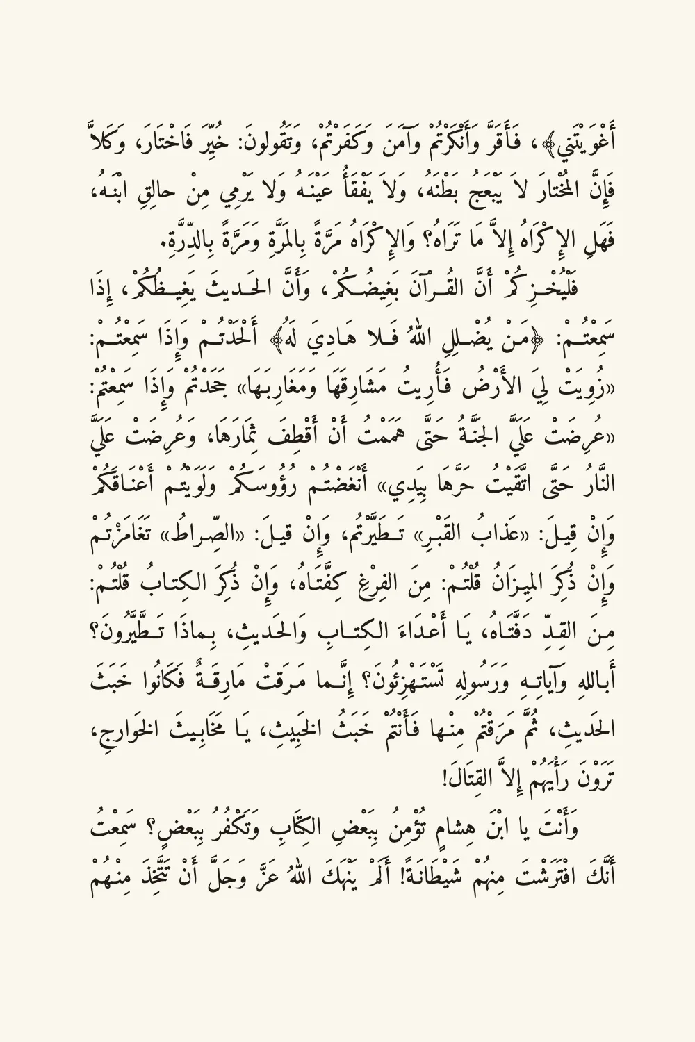
代码见上文的简短回答。行距不会为了给符号腾地方而变大:上一行的齐齿符和下一行的叠音符共用同一段行间空白,所以行距要按全书元音最密的一行来定(元音符号)。在这篇文字上,行距取字号的1.6倍时,有六个段落的符号相碰;1.9倍还剩一个;2倍时一个也没有。排版时会提示:两行相碰时,它会对该段报告arabicMarksExceedLeading,并给出所需的行距(阿拉伯文)。
#2 · 小开本,宽版心
// 166 mm of text block hold seventeen lines on the 28 pt pitch (9.88 mm). The measure is
// 106 mm, about twelve words of vocalised Naskh.
const page = {
  sizePreset: 'custom', width: mm(140), height: mm(210), dpi: 150,
  backgroundColor: col('paper'),
  // mirror: left is the inner margin, at the spine (the right edge of an odd page here)
  margins: { top: mm(22), bottom: mm(22), left: mm(18), right: mm(16), mirror: true },
};
14 × 21 cm的页面,左右页边16和18 mm,留下106 mm的版心,大约十二个标了元音的词,按28 pt的行距排十七行。元音符号让行显得发灰,所以页面保持朴素:没有书眉,奶油色纸,只有一个红色标题。mirror: true把较宽的页边放在书脊一侧,在右侧装订的书里,就是奇数页的右边(页序与右侧装订)。
#3 · 不破坏网格的标题
// The headings carry no design: the title's line box, three lines of the grid deep, lowers
// it on the page (a top margin is dropped at the head of a page), and the levels under it
// keep to the 28 pt pitch, so the text starts on a line of the grid.
const headings = {
  fontFamily: NASKH, color: col('ink'), textAlign: 'center',
  levels: [
    // The maqāma opens on a recto.
    { level: 1, fontFamily: RUQAA, fontWeight: 700, fontSize: pt(32), lineHeight: pt(LEAD * 3),
      color: col('rubric'), marginTop: pt(0), marginBottom: pt(0),
      breakBefore: { enabled: true, parity: 'odd' } },
    { level: 2, fontWeight: 700, fontSize: pt(15), lineHeight: pt(LEAD), color: col('ink'),
      marginTop: pt(0), marginBottom: pt(0) },
    { level: 3, fontWeight: 400, fontSize: pt(10), lineHeight: pt(LEAD), color: col('muted'),
      marginTop: pt(0), marginBottom: pt(LEAD) },
  ],
};
标题没有版面设计:鲁格阿体的标题放在三格网格高的行框里,作者名和拉丁文行各占一行28 pt,所以正文第一行落在网格上。拉丁文行标了{dir=ltr},是从右向左的书里一个从左向右的标题(文档、块与行内方向)。
完整食谱
// ═══ Postext Cookbook · Nº 111 · Fully vocalised classical prose with Qur'anic brackets ═══
// https://postext.dev/en/cookbook/vocalised-classical-prose
// Code: MIT · Text: al-Hamadhānī, Maqāmāt, ar.wikisource (PD) · Pictures: none
// Fonts: Amiri, Aref Ruqaa (SIL OFL 1.1) · Needs postext ≥ 1.28.0
import { buildDocument, withLoadedFonts, renderPageToCanvas } from 'https://esm.sh/postext';

const LANG = 'en'; // @lang: the language of the sample document ('en' | 'es')
const RECIPE = 'vocalised-classical-prose';

// ─── 1 · Design ─────────────────────────────────────────────────────────────
// Black text and a red title on a cream page, as the Beirut and Cairo editions of the
// Maqāmāt print them.
const palette = {
  ink: '#211b17', // text: a warm near-black
  rubric: '#94291d', // the accent: the title
  muted: '#6b6156', // the author's name, the Latin title line, the note on the text
  paper: '#fbf7ee', // a cream paper
};
const col = (id) => ({ hex: palette[id], model: 'hex', paletteId: id });
const colorPalette = [
  ...Object.entries(palette).map(([id, hex]) => ({ id, name: id, value: { hex, model: 'hex' } })),
  { id: 'main-color', name: 'rubric (defaults)', value: { hex: palette.rubric, model: 'hex' } },
];
const NASKH = 'Amiri'; // the text: a Bulaq Naskh, with its own Latin for the note
const RUQAA = 'Aref Ruqaa'; // display: the title

// #region answer: a leading of 2 × the size for text with every vowel written
// Every letter of this maqāma carries its vowel: fatḥa and shadda over the letters, kasra
// and kasratān under them, often two marks on one letter. The marks sit in the leading,
// which never grows for them, so the leading is chosen for the most vocalised line of the
// book. Unvocalised prose sets well at 1.6 × the size; fully vocalised text needs
// 1.9–2.1 ×: here 14 pt on 28 pt, 2 ×, so a kasra hanging under one line clears a shadda
// standing on the line below. Any closer and the build reports the paragraph
// (arabicMarksExceedLeading) with the leading it would need.
const SIZE = 14; // pt
const LEAD = 2 * SIZE; // pt: 28
const bodyText = {
  fontFamily: NASKH, fontSize: pt(SIZE), lineHeight: pt(LEAD), color: col('ink'),
  boldColor: col('ink'), italicColor: col('ink'), referenceColor: col('ink'),
  // Justified with kashidas, the default in an Arabic book, written out to say so:
  // a line widens at its joins as well as at its spaces.
  textAlign: 'justify', kashida: 'auto', kashidaPatterns: 'naskh',
  firstLineIndent: em(1.5), indentAfterHeading: false, // on the start side, the right
  optimalLineBreaking: true, avoidWidows: true, avoidOrphans: true,
};
// #endregion

// #region page: a 14 × 21 cm book page, seventeen lines of 28 pt
组合好的script.js可以直接运行:把它粘贴到任何页面的模块脚本中,或在CodePen上打开这道食谱。 GitHub上的食谱文件夹 ↗ (在新标签页中打开)
变化
#去掉元音,做成阅读版
tashkil: 'strip'在排版时去掉短元音和叠音符,同样的文字就可以用字号1.6倍的行距;'strip-vowels'保留叠音符。
-  textAlign: 'justify', kashida: 'auto', kashidaPatterns: 'naskh',
+ textAlign: 'justify', kashida: 'auto', kashidaPatterns: 'naskh', tashkil: 'strip',#看看警告
把行距设为字号的1.6倍,排版会对六个段落报告arabicMarksExceedLeading,每段都给出所需行距,在这篇文字上最大为1.89 em。
-const LEAD = 2 * SIZE; // pt: 28
+const LEAD = 1.6 * SIZE; // pt: 22.4常见问题
易错点
阿拉伯文书标记为'ar',不要用LANG
食谱的版本是en和es,但阿拉伯文示例在两个版本里都是阿拉伯文:`locale: LANG`会让它从左向右排、左装订、页码印成1 2 3,并把图标注为Figure或Figura。postext 1.30起,这个标记也是文字成形所用的语言(测量、绘制和嵌入都按它进行),所以标记成英文或西班牙文时,Markazi Text这样的字体不画尖角引号(« »)和句点的阿拉伯文字形,断行的位置也随之改变。自己写出标记:'ar'(阿拉伯-印度数字,马什里克惯例),或带地区的'ar-EG'、'ar-SA';马格里布版本用欧洲数字,写'ar-MA'、'ar-DZ'或'ar-TN'。只引用阿拉伯文的拉丁文页面保留自己的locale。 从右向左的文字 →
易错点
阿拉伯文字体需要通过arabic块加载其arabic文件
Fontsource把Amiri、Noto Naskh Arabic或Scheherazade New按子集分成多个文件提供,阿拉伯字母在arabic文件里。loadFonts只获取latin(以及latin-ext),所以屏幕上的阿拉伯文来自系统字体,测量不准;fontsourceProvider交给PDF的也是这个latin文件,印出来是空框。列出kit中的arabic块,在loadFonts之后调用loadArabicFonts(FONTS, markdown),并在FONTS中列出页面用于阿拉伯文的每个字重,再给renderToPdf传fontProvider: arabicPdfProvider。 阿拉伯文字体 →
版面警告 · arabicMarksExceedLeading
元音符号挤到相邻的行
原因. 带元音符号的阿拉伯文段落把元音符号(fatḥa、kasra、shadda、tanwīn等)放在行距之中,而行距不会为它们增高:某行一个词上方的符号碰到上一行正上方那个词下垂的字母或符号时,两行就挨在一起了。
解决. 调大`bodyText.lineHeight`(部分标注元音的文本用1.7–1.85 em,全部标注元音的诗句用1.9–2.1 em),给该段落设一个行距更大的段落样式,或设`bodyText.tashkil: 'strip-vowels'`得到不标元音的版本。 文档 →
致谢
- 文本
- Al-Maqāma al-Māristāniyya, fully vocalised, as ar.wikisource gives it (revision 601165), with twenty typing slips corrected, its paragraphs divided and its Qurʾān quotations set between ﴿ ﴾ · Badīʿ al-Zamān al-Hamadhānī · 公有领域
- The note on the text, the Latin title line and the colophon · Postext Cookbook · 原创
- 字体
- Amiri (SIL OFL 1.1) · Aref Ruqaa (SIL OFL 1.1)