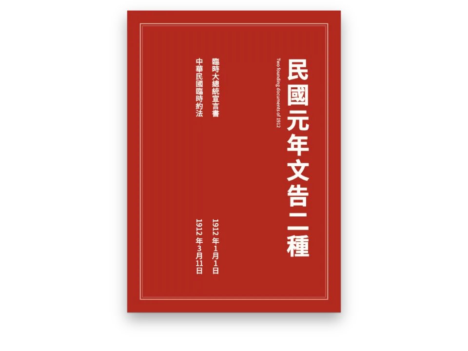
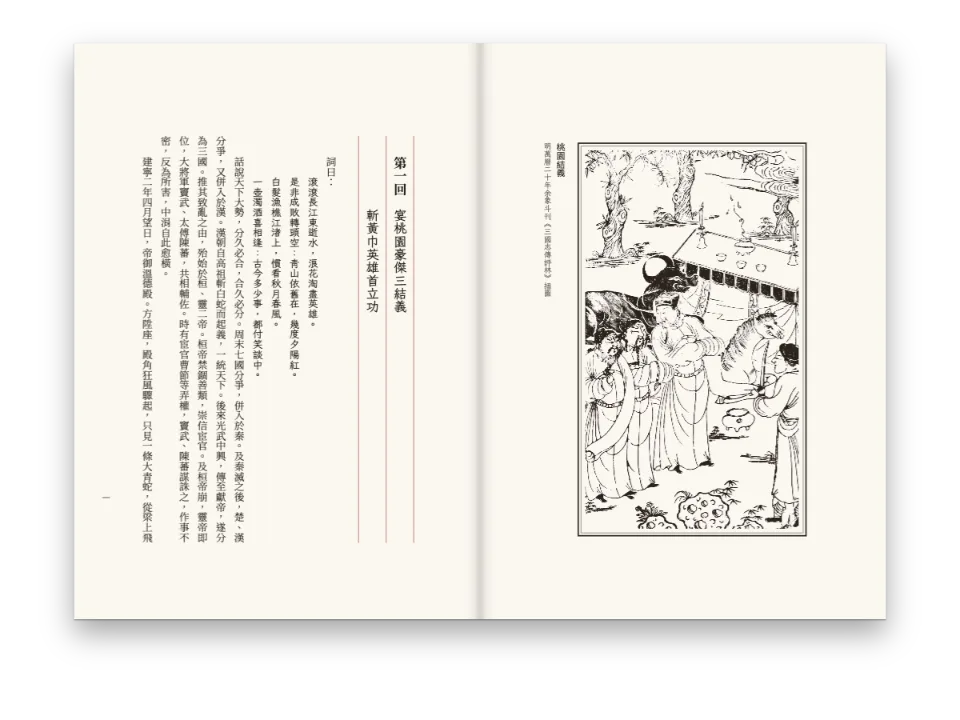
かんたんな説明
1889年の大日本帝国憲法を、官報が刷ったとおりに漢字とカタカナで縦に組み、条文に漢数字で番号を振ります。
できあがり
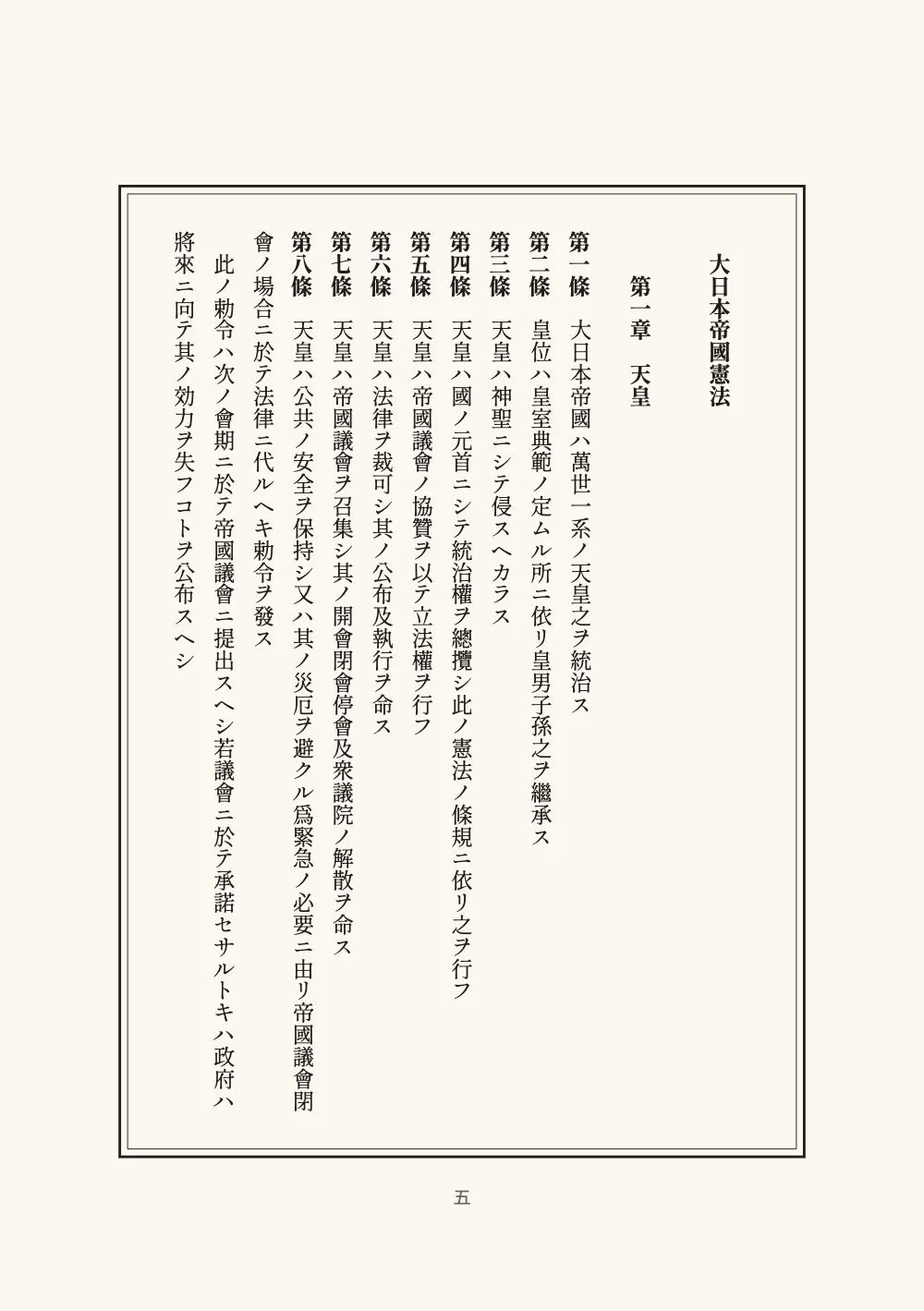
1889年2月11日に官報が刷った形で、大日本帝国憲法を8ページに復刻します。上諭、大臣の副署、最初の2章の32か条を収めます。本文は明治の法令の書き言葉である漢字カタカナ交じり文です。語は漢字が担い、語尾はカタカナが担い、濁点も小書きのかなも句読点もいっさいありません。ページはA5の縦組み・右綴じで、太い罫と細い罫の内側に1行40字×15行の文字グリッドを置きます。条文は漢数字のリストカウンターで第一條から第三十二條まで番号を振り、御璽と副署は官報が置いた位置に置きます。
このレシピが答える質問
- 明治期の漢字カタカナ交じり文を旧字体のまま組み、条文に第一條と番号を振るには?
- 章番号を第一章のように漢数字で振ったり、リストの項目をあいう、イロハで振ったりするには?
- 画面とPDFで、漢字を日本の字形で表示して日本語を組めるフォントは?
手短な答え
const layout = { layoutType: 'single', writingMode: 'vertical-rl' }; // bound on the right
const cjk = { grid: { enabled: true, charsPerLine: CHARS, linesPerPage: LINES } };
// Each article is an item of an ordered list: the counter is japanese-informal (十八, not
// 一十八), the prefix 第 and the separator 條 wrap it, and the turnover lines go back to
// the head of the line, as in the Gazette. numberWidth 'item' starts the text of each
// article one gap after its own label: one full-width space follows 第九條 and 第十一條
// alike, and their texts start a character apart. Chapter two starts its list at 18.
const orderedLists = {
  numberFormat: 'japanese-informal', prefix: '第', separator: '條', gap: em(1),
  numberWidth: 'item',
  indent: em(0), hangingIndent: false, fontFamily: MINCHO, fontWeight: 800,
  color: col('ink'), marginTop: pt(0), marginBottom: pt(0), itemSpacing: pt(0),
};
// The chapters: 第{2:一}章 counts them in the same style, two characters down (字下げ).
const chapter = { level: 2, numberingTemplate: '第{2:一}章', numberSeparator: ' ',
  fontSize: pt(BODY), fontWeight: 800, indent: em(2), lineSpan: 2, // 二行取り
  breakBefore: { enabled: false } };
材料
- 機能
- 仮名、漢字、ローマ字漢数字と仮名の番号縦組み右綴じの本文字グリッド中国語・日本語・韓国語のフォント日本語の改行(禁則処理)行取りの見出し番号付きリスト箇条書きとチェックリストデザインした章扉見出しスタイル見出しの属性段落スタイルページデザインのテキスト・罫・ボックス柱とノンブル用紙の色セマンティックカラーパレットPDFの書き出しPDFに埋め込むフォント
- 種類
- Shippori Mincho B1, Noto Sans JP (SIL OFL 1.1)
- 素材
- なし:画像はすべてコードで描画
作り方
#1 · リストカウンターに第十八條と書かせる
コードは上の手短な答えにあります。条文はそれぞれMarkdownの番号付きリストの項目で、orderedListsがその番号を官報の形にします。numberFormat: 'japanese-informal'は一十八ではなく十八と書き、prefix: '第'とseparator: '條'がそれを囲み、gap: em(1)が原本の全角アキを残します。numberWidth: 'item'は、各条の文字をその条の番号からアキ一つ分だけあけて始めます。第九條も第十一條も後ろは全角一字アキになり、官報と同じく、条文の文字の始まりは一字ずれます。hangingIndent: falseにすると、官報と同じく、折り返した行は本文の下にぶら下がらず行頭に戻ります。第二章はリストを18.から始めるので、カウンターは章をまたいで続きます。章そのものは見出しのテンプレート第{2:一}章によって、同じカウンタースタイルで第一章、第二章と番号が振られます(番号付きリスト)。
#2 · カタカナは官報が書いたとおりに
locale: 'ja'は日本語の規則を設定しますが、どの規則も本文を書き換えません。侵スヘカラスは濁点のないまま(「おかすべからず」と読みます)、行フは歴史的仮名遣いのまま、奪ハルヽはカタカナの踊り字を残します。小書きのかなも句読点もないので、改行はどの2字のあいだでも起こります。それでも禁則処理はヽと々を行頭に置きません。ひらがなを使う現代語の編者の凡例は、2ページで上諭と並んでいるので、日本語の2つの書き方を1ページで見比べられます。
#3 · すべてのページに枠を描く
// Header elements are placed on the sheet, not in the flow, so the frame is drawn in
// plain page millimetres: GAP outside the type area, then 1.4 mm to the thin rule.
const GAP = 6;
const rule = (id, out, thickness) => ({ kind: 'box', id, pages: 'all',
  style: { borderColor: col('ink'), borderWidth: pt(thickness) },
  placement: { anchor: { to: 'page', edge: 'top-left' },
    offset: { x: mm(SIDE - out), y: mm(HEAD - out) },
    size: { width: mm(AREA.across + 2 * out), height: mm(AREA.down + 2 * out) } } });
const header = { elements: [
  rule('outer', GAP + 1.4, 1.2), rule('inner', GAP, 0.4),
  // The folio in kanji, under the frame, in the middle of the page.
  { kind: 'text', id: 'folio', content: '{pageNumber}', pages: 'body', fontFamily: GOTHIC,
    fontSize: pt(8), color: col('muted'), align: 'center',
    placement: { anchor: { to: 'page', edge: 'top-left' },
      offset: { x: mm(0), y: mm(HEAD + AREA.down + GAP + 6) }, size: { width: mm(TRIM.w) } } },
] };
ヘッダーの領域は、縦組みの流れではなく、ページ上のmm単位の座標で描きます。そのため枠は、版面を置くのと同じ数値、上からHEAD、左右の端からSIDEで置いた2つの箱です。余白はグリッドに任せずグリッドから計算するので、版面は細い罫のちょうど6mm内側に収まります。pageNumbering.format: 'japanese-informal'による漢数字のノンブルは、枠の下に置きます。
#4 · 扉は軸に沿って組む
// In the flow frame of a vertical page x runs down the column, y leftward across it.
const at = (down, across) => ({ anchor: { to: 'container', edge: 'top-left' },
  offset: { x: mm(down), y: mm(across) } });
const MID = AREA.across / 2; // mm: the axis of the page, from the right of the type area
const cover = {
  id: 'cover', numbered: false, toc: false, span: 'page', runningChapter: false,
  breakBefore: { enabled: true, parity: 'any' },
  advancedDesign: { enabled: true, slot: { elements: [
    { kind: 'text', id: 'title', content: '{titleText}', fontFamily: MINCHO, fontWeight: 800,
      fontSize: pt(34), lineHeight: 1, letterSpacing: pt(10), color: col('ink'),
      placement: at((AREA.down - (7 * 34 + 6 * 10) * PT) / 2, MID - 34 * PT / 2) }, // centred
    { kind: 'text', id: 'date', content: '{attr.date}', fontFamily: MINCHO, fontSize: pt(11),
      lineHeight: 1, letterSpacing: pt(2), color: col('seal'), placement: at(30, MID + 18) },
    { kind: 'text', id: 'source', content: '{attr.source}', fontFamily: MINCHO,
      fontSize: pt(11), lineHeight: 1, letterSpacing: pt(4), color: col('ink'),
      placement: at(30, MID - 18 - 11 * PT) },
    // The edition's language, turned with the line, at the foot of the type area.
    { kind: 'text', id: 'latin', content: '{attr.latin}', fontFamily: GOTHIC, fontSize: pt(7.5),
      lineHeight: 1.5, color: col('muted'), overflow: 'wrap', align: 'right',
      placement: { ...at(0, AREA.across - 9), size: { width: mm(AREA.down), height: mm(9) } } },
  ] } },
};
縦組みの流れではxが紙の下方向、yが左方向に進むので、題の行は版面の右端からの距離で位置を決めます。アクセント色の日付と官報の名称は、題の両側に軸から18mm離して立てます。
#5 · 書体ごとに、組む文字を読み込ませる
const notes = (markdown.match(/^- .*$/gm) ?? []).join('');
const gothicText = `${notes}凡例上諭一二三四五六七八九十${markdown.match(/latin="([^"]*)"/)[1]}`;
旧字体の國、條、權を備えた明朝体Shippori Mincho B1は、本文と見出しのためのファイルを読み込みます。Noto Sans JPは、編者の凡例、ノンブル、英語の行のためだけに読み込みます。組む文字より少ない文字しか与えられていない書体があると、キャプチャは失敗します(C12)。
レシピの全体
// ═══ Postext Cookbook · Nº 128 · A Meiji proclamation in kanji and katakana ═════════
// https://postext.dev/en/cookbook/katakana-majiri-proclamation
// Code: MIT · Text: Kanpō 1889, ja.wikisource (CC BY-SA 4.0); notes (CC BY 4.0)
// Fonts: Shippori Mincho B1, Noto Sans JP (SIL OFL 1.1) · Needs postext ≥ 1.28.0
// The Meiji Constitution as the Official Gazette printed it: kanji and katakana, vertical.
import {
  buildDocument, withLoadedFonts, renderPageToCanvas, loadVerticalAlternates,
} from 'https://esm.sh/postext';
import { renderToPdf, decompressWoff2 } from 'https://esm.sh/postext-pdf';

const LANG = 'en'; // @lang: the language of the frame; the text is Japanese in both editions
const RECIPE = 'katakana-majiri-proclamation';

// ─── 1 · Design ─────────────────────────────────────────────────────────────
// #region palette: gazette black, one vermilion for the seal, toned paper
const palette = {
  ink: '#211d1a', // the text and the frame
  seal: '#a8321f', // 御名御璽 and the cover's date: the one accent (5.5:1 on the paper)
  muted: '#6b6259', // the editor's notes, the folio, the colophon
  paper: '#fbf8f0',
};
const col = (id) => ({ hex: palette[id], model: 'hex', paletteId: id });
const colorPalette = [
  ...Object.entries(palette).map(([id, hex]) => ({ id, name: id, value: { hex, model: 'hex' } })),
  { id: 'main-color', name: 'seal (defaults)', value: { hex: palette.seal, model: 'hex' } },
];
// #endregion

const MINCHO = 'Shippori Mincho B1'; // 明朝 with Meiji type in its bones, old forms 國 條 權
const GOTHIC = 'Noto Sans JP'; // the editor's voice: notes, folios, colophon
const [BODY, LEAD] = [10, 18]; // pt: line pitch 1.8 em
const [CHARS, LINES] = [40, 15]; // the type area: 40 characters down, 15 lines across
const PT = 25.4 / 72; // mm in a point
const TRIM = { w: 148, h: 210 }; // mm, A5
const AREA = { down: CHARS * BODY * PT, across: LINES * LEAD * PT }; // 141.1 × 95.3 mm
const HEAD = 37; // mm from the top edge to the head of the type area: 天 deeper than 地
const SIDE = (TRIM.w - AREA.across) / 2; // the same margin on both sides of the frame

// #region answer: kanji with katakana, vertical, and articles numbered 第一條 in kanji
const layout = { layoutType: 'single', writingMode: 'vertical-rl' }; // bound on the right
const cjk = { grid: { enabled: true, charsPerLine: CHARS, linesPerPage: LINES } };
// Each article is an item of an ordered list: the counter is japanese-informal (十八, not
// 一十八), the prefix 第 and the separator 條 wrap it, and the turnover lines go back to
// the head of the line, as in the Gazette. numberWidth 'item' starts the text of each
// article one gap after its own label: one full-width space follows 第九條 and 第十一條
// alike, and their texts start a character apart. Chapter two starts its list at 18.
const orderedLists = {
  numberFormat: 'japanese-informal', prefix: '第', separator: '條', gap: em(1),
組み立てたscript.jsはそのまま動きます。任意のページのモジュールスクリプトに貼り付けるか、レシピをCodePenで開いてください。 GitHub上のレシピのフォルダー ↗ (新しいタブで開きます)
アレンジ
#折り返した行を本文の下にそろえる
現代の法令集は、条文の2行目を第の下ではなく、本文の最初の字の下にそろえます。
-  indent: em(0), hangingIndent: false, fontFamily: MINCHO, fontWeight: 800,
+ indent: em(0), hangingIndent: true, fontFamily: MINCHO, fontWeight: 800,#大字で条文に番号を振る
法令や金融の文書には、壱、弐、参と書くものがあります。トークン壱またはスタイルjapanese-formalで、第壱條、第弐條になります。
-  numberFormat: 'japanese-informal', prefix: '第', separator: '條', gap: em(1),
+ numberFormat: 'japanese-formal', prefix: '第', separator: '條', gap: em(1),よくあるつまずき
つまずき
日本語のテキストのタグは'ja'。zh-HansやLANGにしない
レシピの版はenとesですが、日本語のサンプルはどちらの版でも日本語です。`locale: LANG`では英語やスペイン語とタグ付けされ、中国語のタグでは中国語の規則で組まれます(開明式の約物、小書きの仮名が行頭に来てもよい、図の代わりに图、PDFでは中国の字形)。postext 1.30以降、このタグはテキストを組む言語(計測、描画、埋め込みに使う言語)でもあるので、'ja'以外のタグでは日本語の字形ではなく別の字形(中国語のタグでは中国の字形)になり、改行の位置も変わります。'ja'と書いてください。日本の地域(JLReqの改行と約物、ゴマの圏点、ルビの間隔、図と表の表示名)が選ばれ、ハイフネーションが切られます。リントは、zhやkoのタグで仮名を含むテキストをエラーにします。 日本語の改行(禁則処理) →
つまずき
日本語は日本語の書体で組む
Noto Serif SCとTCは仮名を持っていますが、漢字は中国の字形(直、骨、角が異なります)で、仮名も中国のデザインで描きます。本文はNoto Serif JPかShippori Mincho B1、見出しはNoto Sans JPで組み、loadCjkFontsで読み込んでください。Fontsourceの日本語ファイルには変体仮名などの古い仮名(U+1B000–1B16F)がないため、loadCjkFontsはそこで失敗し、PDFには四角が印字されます。現代の仮名で書くか、それを持つ書体をレシピのassetsに同梱してください。Shippori Minchoにはマクロン付きの母音ōとūもないので、ローマ字はラテン文字の書体で組んでください。 仮名、漢字、ローマ字 →
つまずき
中国語の書体はcjkブロックを通じてスライス単位で読み込む
Fontsourceは中国語、日本語、韓国語のファミリーを、ウェイトごとに約100個のファイルとして配信し、各ファイルが文字の範囲を受け持ちます。loadFontsが取得するのはlatinファイルだけなので、画面では漢字がシステムの書体で出て計測が狂い、fontsourceProviderはPDFにそのlatinファイルを渡すため、漢字が空の四角で印字されます。キットのcjkブロックを挙げ、loadFontsのあとにloadCjkFonts(FONTS, markdown)を呼び(本で複数のCJK書体を使うときは、それぞれの書体で組むテキストを渡して書体ごとに1回)、renderToPdfにfontProvider: cjkPdfProviderを渡してください。どちらもテキストの文字を含むファイルを取得します。 中国語・日本語・韓国語のフォント →
- 官報は語尾のカタカナを漢字より小さく組み、大臣の肩書きを均等に割り付けて同じ幅にそろえます(字取り)。Postextはすべての字を本文サイズで組み、均等割りの
jidoriは見出しにしか効かないので、ここの副署は行の下端でそろえているだけです。 - このカウンターは日本語と中国語で意味が違います。
jaの文書ではトークン一と{2:一}はjapanese-informal(百一、十八)を意味し、中国語の文書では中国式(一百零一、十八)を意味します。中国語の読み物の縦組みの中で日付と略語を正立させるでは、第一條を手で入力しています。
クレジット
- 本文
- The Constitution of the Empire of Japan, 11 February 1889: the imperial preamble (上諭) with its countersignatures, chapters 1 and 2, as printed in the Kanpō (Official Gazette) extra of that day · Government of Japan; transcription by Japanese Wikisource editors · CC BY-SA 4.0
- The editor's notes (凡例), written in Japanese for this recipe · Postext Cookbook · CC BY 4.0
- フォント
- Shippori Mincho B1 (SIL OFL 1.1) · Noto Sans JP (SIL OFL 1.1)