かんたんな説明
中国の官公庁風の通知を4ページで組みます。こうした文書の国の規則に従い、赤い表題、番号付きの節、決まった体裁のページ番号を付けます。
できあがり
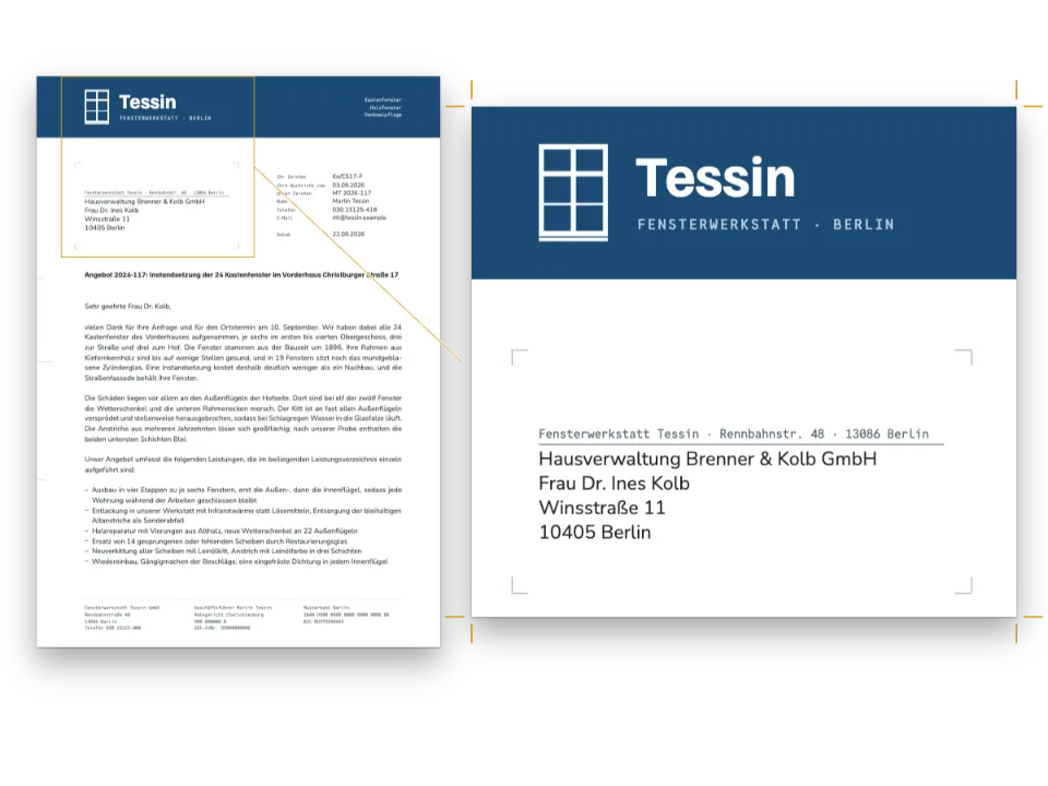
架空の都市、示例市(「Example City」)にある架空の出版者協会の通知を、中国本土の官公庁がGB/T 9704—2012《党政机关公文格式》に従って文書を組むやり方で作ります。A4判4ページで、1行28字、1ページ22行です。1ページ目は赤い発行機関名、赤い罫の上の発文番号、二号で組んだ2行の表題で始まります。見出しは一、(一)1.(1)と番号付けされ、階層ごとに書体が異なります。署名と日付は右寄りに置き、独立したページの附件には、地の罫のあいだに版记が入ります。ノンブルは「— 1 —」の形で、奇数ページでは右、偶数ページでは左に付きます。どの紙葉も天の余白に見本であることを記しています。DIN 5008に従うビジネスレターは、同じ仕事をヨーロッパの規格で行います。
このレシピが答える質問
- 中国の公文書を、赤い発文機関名(紅頭)、グリッド、ノンブルとともにGB/T 9704に従ってレイアウトするには?
- 版面を字数で設定し、1行の字数と1ページの行数を決めるには?
- 章番号を第一回、第二回のように漢数字で振るには?
手短な答え
const cjk = {
  grid: { enabled: true, charsPerLine: CHARS, linesPerPage: LINES }, // 28 ems × 22 lines
  // Every mark takes a whole cell, as on the standard's grid, and never gives any of it up.
  punctuationWidth: 'fullwidth', compressAdjacent: false, trimLineStart: false,
  hangingPunctuation: 'allow', // a , that may not open a line hangs past the 28th cell
  latinSpacing: em(0), // 〔2026〕7号 and 2026年9月28日 set solid, as the standard prints them
};
const page = {
  width: mm(210), height: mm(297), dpi: 150, backgroundColor: col('paper'),
  // With the grid on, margins are minimums. These leave 28 × 22 cells and 0.02 mm to share,
  // so the type area sits 37 mm under the head and 28 mm from the binding edge.
  margins: { top: mm(TOP), bottom: mm(297 - TOP - AREA.h - 0.02), left: mm(INNER),
    right: mm(210 - INNER - AREA.w - 0.02), mirror: true },
};
const bodyText = {
  fontFamily: SONG, fontSize: pt(BODY), lineHeight: pt(LEAD), color: col('ink'),
  boldColor: col('ink'), italicColor: col('ink'), referenceColor: col('ink'),
  textAlign: 'justify', // a short line spreads between its characters, never between words
  firstLineIndent: em(2), indentAfterHeading: true, // 左空二字,回行顶格
};
材料
- 機能
- 文字グリッド中国語の漢数字番号付き見出し中国語の約物の幅中国語の改行字間による両端そろえ中国語と欧文のあいだのアキ中国語・日本語・韓国語のフォント仕上がりサイズ見開きの余白デザインした章扉ページデザインのテキスト・罫・ボックスデザイン要素の基準位置柱とノンブル見出しスタイル見出しの属性タイトル内の改行段落スタイル表スタイルPDFの書き出し
- 種類
- Noto Serif SC, Noto Sans SC, LXGW WenKai TC (SIL OFL 1.1)
- 素材
- なし:画像はすべてコードで描画
作り方
#1 · 字数で数える版面
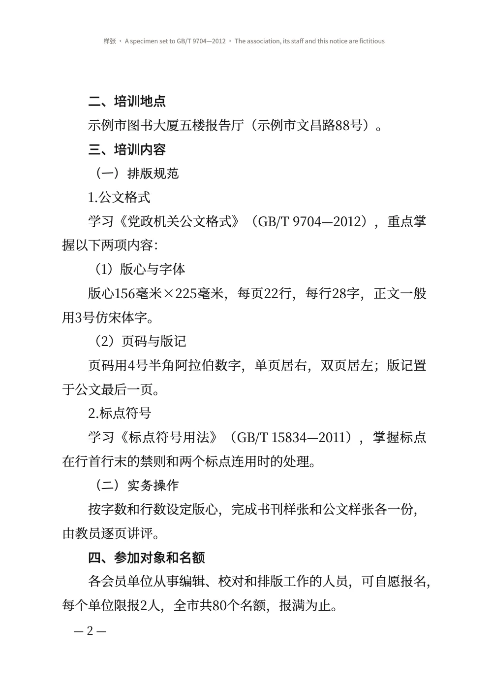
コードは上の手短な答えにあります。GB/T 9704は天の余白を37 mm、のどの余白を28 mmと定め、156 × 225 mmの版面に三号で28字×22行を収めます。cjk.gridは数値をそのまま受け取ります。15.75 ptの全角28字で155.6 mm、29 ptの行22本で225.1 mmになります(文字グリッド)。Wordの三号は16 ptで、これだと行長が158 mmになり、規格の版面より広くなります。15.75 ptは組版の号数表にある値です。文字グリッドを有効にすると、余白は最小値として扱われます。この余白なら残りは0.02 mmなので、版面は規格の定める位置にとどまります。規格は本文に仿宋を指定していますが、FontsourceにはFangsongの書体がないため、本文はNoto Serif SCの宋体で組んでいます(「よくあるつまずき」を参照)。
どの約物も1字分をまるごと占め、詰めることはしないので、中国語の行では文字が規格の描く文字グリッドの列に並びます。アラビア数字は1字分より狭いので、版心156毫米×225毫米のような行では、数字のあとの文字が列のあいだにずれます。読点が29字目に来たときは、hangingPunctuation: 'allow'がそれを余白へぶら下げます。1字を次の行へ追い出して残りの字間を広げることはしません(ぶら下げ)。
#2 · 4階層の見出しを各1行で
// One line each at the body size, nothing above or below: every head stays on the grid.
const level = (n, fontFamily, fontWeight, numberingTemplate) => ({ level: n, fontFamily,
  fontWeight, numberingTemplate, numberSeparator: '', fontSize: pt(BODY), lineHeight: pt(LEAD),
  marginTop: pt(0), marginBottom: pt(0), firstLineIndent: em(2) }); // 空二字,回行顶格
const levels = [
  level(2, HEI, 500, '{2:一}、'), // 一 is the informal numeral in the document's script
  level(3, KAI, 400, '({3:一})'),
  level(4, SONG, 400, '{4}.'),
  level(5, SONG, 400, '({5})'),
];
規格は一、を黑体、(一)を楷体、1.と(1)を本文書体で、いずれも本文と同じ大きさで組むよう定めています。{2:一}はlocaleの文字体系で漢数字(小写数字)を出力します(ノンブル)。本文と同じ大きさと行送りで余白をなくすと、見出しは文字グリッドの1行を占め、その下の本文も文字グリッドからずれません。firstLineIndent: em(2)は各見出しを本文のemで数えて2字分下げ、2行目に折り返した見出しはその行を行頭から始めます。規格のとおりです。番号は字下げのあとに置かれるので、目次とPDFのしおりでは一、の前に空白が入りません(レベルごとの上書き)。
#3 · レターヘッドを1行ずつ
const LINE = LEAD * MM; // 10.23 mm
const lineTop = (n) => (n - 1) * LINE; // mm from the top of the type area to grid line n
const face = (fontFamily, size, fontWeight, colour, lineHeight = LEAD / size) => ({
  fontFamily, fontSize: pt(size), fontWeight, color: col(colour), lineHeight });
// A text y mm down the type area, x mm in from its edge, as wide as the type area.
const text = (id, content, look, y, { edge = 'top-left', x = 0, width = AREA.w, ...more } = {},
) => ({ kind: 'text', id, content, ...look, align: 'center', overflow: 'wrap', ...more,
  placement: { anchor: { to: 'container', edge }, offset: { x: mm(x), y: mm(y) },
    size: { width: width === 'auto' ? 'auto' : mm(width) } } }); // wrap, not '…'
const rule = (id, y, thickness, colour = 'ink', reserve = false) => ({ kind: 'rule', id, reserve,
  direction: 'horizontal', thickness, color: col(colour), placement: { anchor: { to: 'container',
    edge: 'top-left' }, offset: { y: mm(y) }, size: { width: mm(AREA.w) } } });
const PAD = { left: pt(5), right: pt(5) }; // the specimen stamp's: not a GB/T 9704 element
const letterhead = { enabled: true, minHeight: pt(13 * LEAD), slot: { elements: [
  text('copy', '{attr.copy}', face(SONG, BODY, 400, 'ink'), lineTop(1), { align: 'left' }),
  text('stamp', '样 张', face(HEI, BODY, 500, 'red', 1.3), lineTop(1) + 1.5, { edge: 'top-right',
    width: 'auto', box: { borderColor: col('red'), borderWidth: pt(1), padding: PAD } }),
  // The name's ink starts 35 mm down, 0.07 em over its box; at 46 pt it ends in line 5.
  text('issuer', '{attr.issuer}文件', face(SONG, 46, 900, 'red', 1), 35 + 0.07 * 46 * MM),
  // The number two blank lines under the name; the red rule 4 mm under its characters.
  text('number', '{attr.number}', face(SONG, BODY, 400, 'ink'), lineTop(8)),
  rule('red-rule', lineTop(8) + ((LEAD + BODY) / 2) * MM + 4, mm(0.5), 'red', true),
  text('title', '{titleText}', face(SONG, 22, 900, 'ink'), lineTop(12)), // 二号, 2 lines under
] } };
const notice = { level: 1, span: 'page', advancedDesign: letterhead,
  marginTop: pt(0), marginBottom: pt(LEAD), // 空一行: a blank line, then the addressee
  breakBefore: { enabled: true, parity: 'any' } }; // a notice opens on the next page
レターヘッドはH1のデザインで、部数番号、発行機関、発文番号はH1の属性が運びます。設定が便箋を、Markdownが文書を受け持つわけです。lineTop(n)は文字グリッドのn行目の上端を返すので、各要素は規格が数える位置に置かれます。発文番号は発行機関名の2行空けた下、表題は赤い罫の2行空けた下です。46 ptなら機関名の字面は版面の上端から35 mm下から5行目の下端までに収まり、6行目と7行目が空いて、発文番号が8行目に来ます。48 ptにすると6行目まで食い込み、ページの残りが1行下にずれます。見出しの中の\\は表題を关于举办のあとで改行し、短い行を長い行の上に置きます。規格が認める2つの形のうちの台形です(もう1つはひし形)。minHeightが13行、marginBottomがさらに1行を確保するので、宛先は15行目から始まります(幅と詳細デザイン)。
#4 · 版面の下のノンブル
const FOLIO = 14; // pt: 四号
const folio = (id, parity, edge, x) => ({ kind: 'text', id, parity, content: '— {pageNumber} —',
  ...face(SONG, FOLIO, 400, 'ink', 1), align: edge.endsWith('left') ? 'left' : 'right',
  overflow: 'clip', placement: { anchor: { to: 'container', edge }, // the type area's foot
    offset: { x: pt(x), y: mm(7 - (FOLIO / 2) * MM) } } }); // the dashes 7 mm down
const footer = { elements: [folio('recto', 'odd', 'top-right', -FOLIO),
  folio('verso', 'even', 'top-left', FOLIO)] };
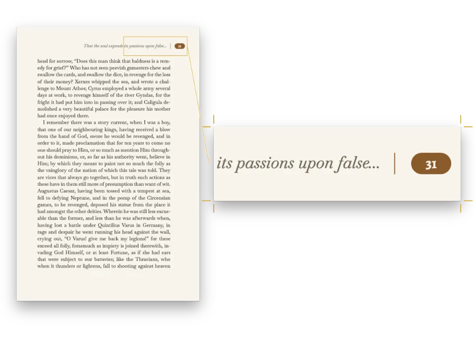
const header = { elements: [{ kind: 'text', id: 'specimen', content: '{subtitle}', // 样张 …
  ...face(HEI, 7.5, 400, 'muted', 1.2), align: 'center', overflow: 'wrap',
  placement: { anchor: { to: 'container', edge: 'top' }, offset: { y: mm(16) } } }] };
フッターでは、コンテナーの上端が版面の下端なので、offset.yは本文から下へ向かって測ります(柱とノンブル)。ダッシュ付きのノンブルはその7 mm下、外側の端から四号の1字分内側に置かれます。parityが奇数ページのノンブルを右に、偶数ページのノンブルを左に置きます。天の余白にはフロントマターの{subtitle}を印刷します。この1行と版记の下の奥付だけが、英語版とスペイン語版で異なる部分です。
#5 · 附件と版记
const IMPRINT = AREA.h - 2 * LINE; // mm: two rows of the grid, ending on the type area's foot
const small = face(SONG, FOLIO, 400, 'ink', LEAD / FOLIO); // 四号
const inset = { x: FOLIO * MM, width: AREA.w - 2 * FOLIO * MM, reserve: false }; // 左右各空一字
const annex = {
  id: 'annex', numbered: false, toc: false, breakBefore: { enabled: true, parity: 'any' },
  span: 'page', marginTop: pt(0), marginBottom: pt(0), // line 4 is the table's float gap
  advancedDesign: { enabled: true, minHeight: pt(3 * LEAD), slot: { elements: [
    text('label', '{attr.label}', face(HEI, BODY, 500, 'ink'), lineTop(1), { align: 'left' }),
    text('title', '{titleText}', face(SONG, 22, 900, 'ink'), lineTop(3)),
    // reserve: false keeps the 版记 out of the room the heading takes: the table goes on.
    rule('imprint-top', IMPRINT, mm(0.35)),
    text('cc', '抄送:{attr.cc}', small, IMPRINT, { ...inset, align: 'left' }),
    rule('imprint-mid', IMPRINT + LINE, mm(0.25)),
    text('office', '{attr.office}', small, IMPRINT + LINE, { ...inset, align: 'left' }),
    text('printed', '{attr.printed}', small, IMPRINT + LINE, { ...inset, align: 'right' }),
    rule('imprint-foot', AREA.h - 0.35 / 2, mm(0.35)),
    text('colophon', '{attr.colophon}', face(HEI, 7, 400, 'muted'), AREA.h + 16, inset),
  ] } },
};
附件の見出しには専用のスタイルを使います。改ページし、1行目に附件、3行目に表題を置き、確保した3行の下には余白を付けません。空いた4行目は、インラインのリソースがどれもその上に保つフロートの間隔です(レイアウトのinlineResourceGap)。そのため表の上罫は5行目に乗ります。版记も同じデザインの一部で、版面の下端で終わる文字グリッドの2行に描かれます。その要素はreserve: falseなので、見出しが占める領域を広げず、表がその下まで押し下げられることもありません。規格は版记を附件のあと、最後のページに置くよう定めています。附件が1ページなら、それは附件のページです。附件が長くなる場合は、その最後のページにある見出しで版记を描く必要があります。
#6 · 署名のブロック
const paragraphStyles = [
  { id: 'flush', firstLineIndent: pt(0) }, // 主送机关:居左顶格
  { id: 'annexes', marginTop: pt(LEAD) }, // 附件说明:正文下空一行,左空二字
  // The date, 6.9 ems, starts two cells right of the name and ends two short: 右空二字.
  { id: 'signature', indent: em(17), firstLineIndent: pt(0), marginTop: pt(LEAD) },
  { id: 'date', indent: em(19), firstLineIndent: pt(0) },
];
印章のない通知では、発行機関名を右端から2字内側に置き、その下に日付を、さらに2字右から始めて組みます。日付が機関名より長いときは、日付を右端の2字手前で終え、機関名は2字の段差を保つように左へずれます。ここでの日付は全角6.9字で、機関名の7字よりわずかに短いので、規則を字義どおりに読むと日付は機関名の2字右から始まり、余白から0.14字の位置で終わります。ここでは規則の目的、つまり日付が端まで届かないことを優先し、2つ目の場合を採ります。日付は右端の2字分強手前で終わります。indentは両方の行を全角単位で、余白から17字と19字の位置に置きます(段落スタイル)。
レシピの全体
// ═══ Postext Cookbook · Nº 082 · A Chinese official document to GB/T 9704 ═════════
// https://postext.dev/en/cookbook/chinese-official-document
// Code: MIT · Text: a fictitious notice written for the recipe (CC BY 4.0) · Pictures: none
// Fonts: Noto Serif SC, Noto Sans SC, LXGW WenKai TC (SIL OFL 1.1) · Needs postext ≥ 1.25.0
import {
  buildDocument, withLoadedFonts, renderPageToCanvas, parseTSV, mergeCells,
} from 'https://esm.sh/postext';
import { renderToPdf, decompressWoff2 } from 'https://esm.sh/postext-pdf';

const LANG = 'en'; // @lang: the language of the sample document ('en' | 'es')
const RECIPE = 'chinese-official-document';

// ─── 1 · Design ─────────────────────────────────────────────────────────────
// GB/T 9704 prints everything black but the letterhead: the issuer's name and a rule in red.
const palette = { ink: '#161616', red: '#d2161e', muted: '#8a8580', paper: '#ffffff' };
const col = (id) => ({ hex: palette[id], model: 'hex', paletteId: id });
const colorPalette = Object.entries({ ...palette, 'main-color': palette.red })
  .map(([id, hex]) => ({ id, name: id, value: { hex, model: 'hex' } }));
const SONG = 'Noto Serif SC'; // 宋: the text (in place of 仿宋, see the write-up) and 小标宋
const HEI = 'Noto Sans SC'; // 黑: the 一、 heads, the annex label, the specimen stamp
const KAI = 'LXGW WenKai TC'; // 楷: the (一) heads
const MM = 25.4 / 72; // mm per pt
const [BODY, LEAD, CHARS, LINES] = [15.75, 29, 28, 22]; // 三号 on 29 pt lines, 28 × 22 of them
const AREA = { w: CHARS * BODY * MM, h: LINES * LEAD * MM }; // 155.6 × 225.1 mm: the 版心
const [TOP, INNER] = [37, 28]; // mm: 天头 and 订口, the head and binding margins

// #region answer: A4, 28 characters × 22 lines of 三号, full-width marks on the grid
const cjk = {
  grid: { enabled: true, charsPerLine: CHARS, linesPerPage: LINES }, // 28 ems × 22 lines
  // Every mark takes a whole cell, as on the standard's grid, and never gives any of it up.
  punctuationWidth: 'fullwidth', compressAdjacent: false, trimLineStart: false,
  hangingPunctuation: 'allow', // a , that may not open a line hangs past the 28th cell
  latinSpacing: em(0), // 〔2026〕7号 and 2026年9月28日 set solid, as the standard prints them
};
const page = {
  width: mm(210), height: mm(297), dpi: 150, backgroundColor: col('paper'),
  // With the grid on, margins are minimums. These leave 28 × 22 cells and 0.02 mm to share,
  // so the type area sits 37 mm under the head and 28 mm from the binding edge.
  margins: { top: mm(TOP), bottom: mm(297 - TOP - AREA.h - 0.02), left: mm(INNER),
    right: mm(210 - INNER - AREA.w - 0.02), mirror: true },
};
const bodyText = {
  fontFamily: SONG, fontSize: pt(BODY), lineHeight: pt(LEAD), color: col('ink'),
  boldColor: col('ink'), italicColor: col('ink'), referenceColor: col('ink'),
  textAlign: 'justify', // a short line spreads between its characters, never between words
  firstLineIndent: em(2), indentAfterHeading: true, // 左空二字,回行顶格
};
// #endregion
組み立てたscript.jsはそのまま動きます。任意のページのモジュールスクリプトに貼り付けるか、レシピをCodePenで開いてください。 GitHub上のレシピのフォルダー ↗ (新しいタブで開きます)
アレンジ
#隣り合う約物を詰める
),や》(のような組み合わせを、たいていの書籍と同じく2字分ではなく1.5字分で組みます。そのあとの文字は文字グリッドの列から外れます。
-  punctuationWidth: 'fullwidth', compressAdjacent: false, trimLineStart: false,
+ punctuationWidth: 'fullwidth', compressAdjacent: true, trimLineStart: true,#ページを組むあいだ字詰めを表示する
Canvasは28 × 22の文字グリッドの各マスに灰色の正方形を描きます。PDFでは、renderToPdfにcharacterGrid: trueを渡さないかぎり表示されません。
-  grid: { enabled: true, charsPerLine: CHARS, linesPerPage: LINES },
+ grid: { enabled: true, charsPerLine: CHARS, linesPerPage: LINES, show: true },よくあるつまずき
つまずき
Fontsourceには仿宋の書体がない
GB/T 9704や中国本土の多くの書式は、本文を仿宋で組みます。毛筆の細くやや右上がりの線で描いた宋体です。Fontsourceの中国語ファミリーに仿宋はないため、レシピは手持ちの宋体であるNoto Serif SCで組み、その旨を書いています。ライセンスを持つ仿宋の書体は自分のフォントとして加えてください。そのファイルをFontFaceで登録し、bodyText.fontFamilyにファミリー名を書き、そのバイト列を返すfontProviderをrenderToPdfに渡します。 中国語・日本語・韓国語のフォント →
つまずき
中国語の書体はcjkブロックを通じてスライス単位で読み込む
Fontsourceは中国語、日本語、韓国語のファミリーを、ウェイトごとに約100個のファイルとして配信し、各ファイルが文字の範囲を受け持ちます。loadFontsが取得するのはlatinファイルだけなので、画面では漢字がシステムの書体で出て計測が狂い、fontsourceProviderはPDFにそのlatinファイルを渡すため、漢字が空の四角で印字されます。キットのcjkブロックを挙げ、loadFontsのあとにloadCjkFonts(FONTS, markdown)を呼び(本で複数のCJK書体を使うときは、それぞれの書体で組むテキストを渡して書体ごとに1回)、renderToPdfにfontProvider: cjkPdfProviderを渡してください。どちらもテキストの文字を含むファイルを取得します。 中国語・日本語・韓国語のフォント →
つまずき
文書のタグはLANGではなくzh-Hansかzh-Hantにする
レシピの版はenとesですが、中国語のサンプルはどちらの版でも中国語です。`locale: LANG`では英語やスペイン語とタグ付けされ、ラテン文字の語がハイフネーションされ、図にFigureやFiguraの表示名が付き、PDFの言語も誤ります。postext 1.30以降、このタグはテキストを組む言語(計測、描画、埋め込みに使う言語)でもあるので、英語やスペイン語のタグでは、中国語のフォントの数字と、ラテン文字のテキストと共通の約物が別の字形になり、改行の位置も変わります。タグは自分で書いてください。'zh-Hans'(中国本土の慣習:GBの改行規則、開明式の約物)または'zh-Hant'(台湾:全角で中央に置く約物)、香港なら'zh-HK'です。単なる'zh'は簡体字、本土として読まれます。日本語のサンプルには'ja'を使います(つまずき「ja-locale-tag」)。 中国語の改行 →
レイアウト警告 · cjkGridClamped
大きすぎる文字グリッド
原因. `cjk.grid`が求める1行の字数またはページあたりの行数が、本文のサイズと行送りではページの余白の内側に収まらないため、収まる最大の値でグリッドを組みます。
対処. `charsPerLine`または`linesPerPage`を下げる、余白を狭める(余白は最小値です)、または`bodyText.fontSize`や`lineHeight`を小さくしてください。 ドキュメント →
- 両端そろえの行は、余った幅を漢字と行内のスペースに分配し、スペースが取り分以上を受け取ります。2ページでは、GB/T 15834の中のスペースが、その上の行のGB/T 9704の中のスペースの2倍近くまで開きました。原稿では両方の番号をノーブレークスペース(U+00A0)で書いています。これで番号は1つのまとまりとして扱われ、余った幅は漢字のあいだに配られます。
クレジット
- 本文
- A notice from a fictitious publishers’ association, written for the recipe in the form GB/T 9704—2012 sets out · Postext Cookbook · CC BY 4.0
- フォント
- Noto Serif SC (SIL OFL 1.1) · Noto Sans SC (SIL OFL 1.1) · LXGW WenKai TC (SIL OFL 1.1)