かんたんな説明
唐代の中国の詩を集めた小さな本で、向かいのページに古い英訳が入ります。中国語の詩の各行は、それを訳した英語の行と同じ高さに並びます。
できあがり
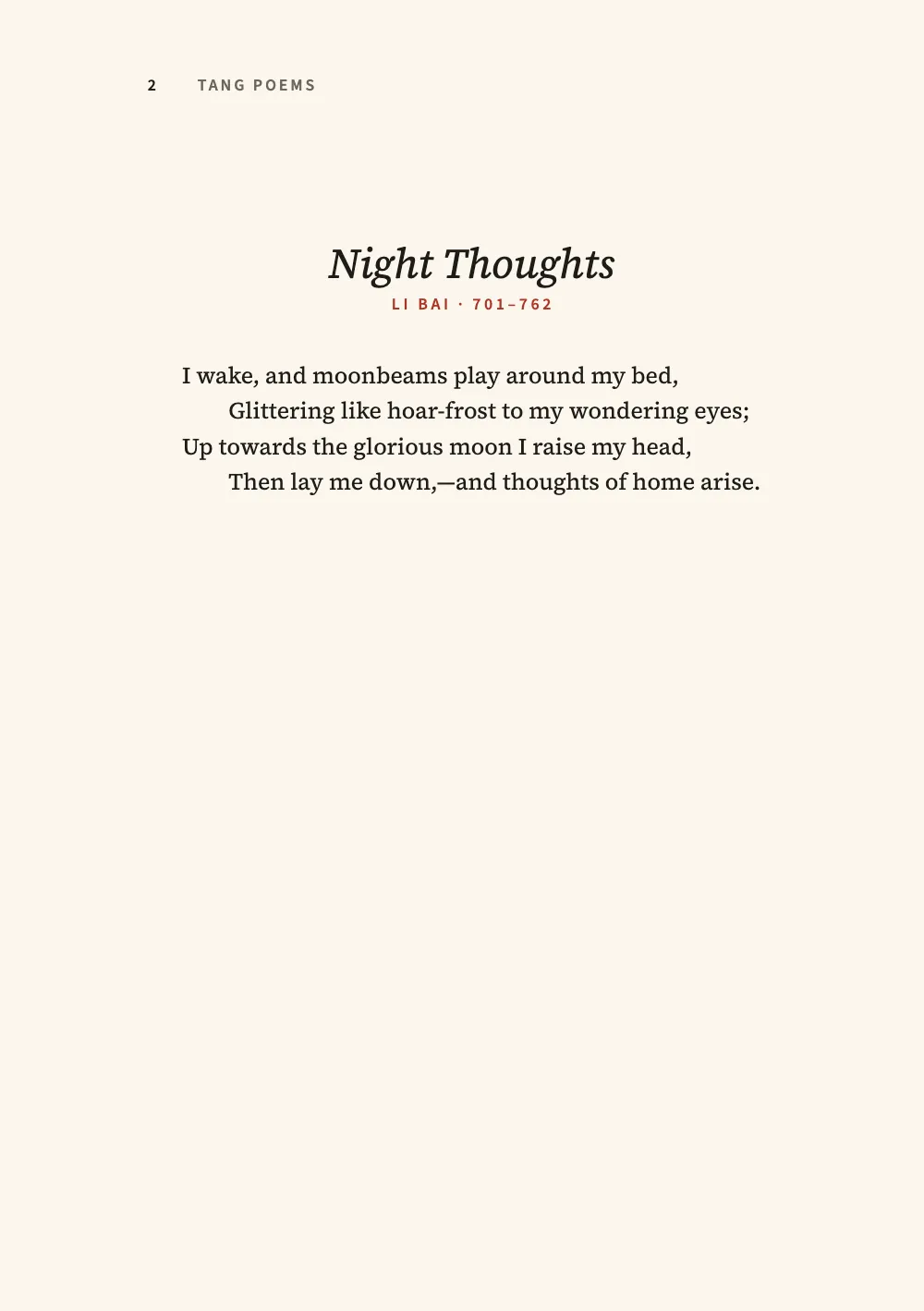
唐詩を集めた小さな対訳本を、古典の対訳版の組み方で組みます。中国語は右ページに、古い紙のような色を付けた丁に置き、その向かいの左ページにハーバート・A・ジャイルズによる1901年の押韻の英訳を置きます。李白、杜甫、王維の4篇の詩がそれぞれ見開きを占め、各言語で表題が付き、詩人の名前が添えられます。中国語は筆の運びを写した楷書体のLXGW WenKaiで、詩句2句を1行に組みます。こうすると各行が、それを訳した英語の2行と同じ高さに並びます。読み手の言語による注釈は、中国語のページの下に置きます。対訳の詩を連ごとにそろえるはスペイン語の詩とその英訳を1ページに並べて組みますが、ここでは言語ごとに1ページを使います。
このレシピが答える質問
- 詩とその翻訳を見開きに向かい合わせで組み、原文を常に奇数ページに置くには?
- 詩を組むには(1行に1詩行、連の間のアキ、折り返した行のぶら下げインデント、ハイフネーションなし)?
- 脚注を付けるには?
- 改ページや改段を強制し、すべての章を右ページから始めるには?
手短な答え
const SINK = 6; // lines of LEAD under both titles, so the two poems start on the same line
const at = (y) => ({ anchor: { to: 'container', edge: 'top' }, offset: { y: mm(y) } });
// A title whose foot is 23 mm down at any size, and the poet's line under it at 24 mm.
const titled = (size, title, poet, under = []) => ({
  enabled: true, minHeight: pt(SINK * LEAD),
  slot: { elements: [...under,
    { kind: 'text', id: 'title', content: '{titleText}', fontSize: pt(size), lineHeight: 1.2,
      align: 'center', overflow: 'wrap', color: col('ink'),
      placement: at(23 - (size * 1.2 * 25.4) / 72), ...title },
    { kind: 'text', id: 'poet', align: 'center', overflow: 'wrap', color: col('seal'),
      placement: at(24), ...poet },
  ] },
});
// Each style breaks to its own side of the spread (gotcha: style-inherits-break).
const english = { id: 'en', breakBefore: { enabled: true, parity: 'even' }, // a verso
  advancedDesign: titled(19, { fontFamily: ROMAN, italic: true },
    { content: '{attr.kicker}', fontFamily: LABEL, fontSize: pt(7.5), fontWeight: 600,
      letterSpacing: pt(1.5), textTransform: 'uppercase' }) };
// The original on a tinted leaf: span 'page' lets the tint reach past the text column.
const chinese = { id: 'zh', span: 'page', breakBefore: { enabled: true, parity: 'odd' },
  advancedDesign: titled(28, { fontFamily: SERIF, fontWeight: 700, letterSpacing: pt(7) },
    { content: '{attr.poet}', fontFamily: HEI, fontSize: pt(9), letterSpacing: pt(1.5) },
    [{ kind: 'box', id: 'leaf', reserve: false, style: { backgroundColor: col('leaf') },
      placement: { anchor: { to: 'page', edge: 'top-left' },
        size: { width: 'fill', height: 'fill' } } }]) };
材料
- 機能
- 奇数ページから始まる章見出しスタイル脚注行ごとの詩段落スタイル文字グリッド中国語・日本語・韓国語のフォント中国語の改行デザインした章扉見出しの属性ページデザインのテキスト・罫・ボックス表紙、扉、奥付柱とノンブル節ごとの柱見開きの余白用紙の色セマンティックカラーパレット明示的な縦のアキPDFの書き出しPDFに埋め込むフォント
- 併用する機能
- ページの役割ごとの柱
- 種類
- Noto Serif TC, LXGW WenKai TC, Noto Sans TC, Source Serif 4, Source Sans 3 (SIL OFL 1.1)
- 素材
- なし:画像はすべてコードで描画
作り方
#1 · 見開きの左右それぞれに見出しスタイルを
コードは上の手短な答えにあります。各詩は第1レベルの見出し2つでできています。ジャイルズの訳詩を収めた# Night Thoughts {style="en" …}と、詩を収めた# 靜夜思 {style="zh" …}です。enのスタイルは次の偶数ページへ、zhのスタイルはそれと向かい合う次の奇数ページへ改ページします。各詩が1ページに収まっているあいだは白ページは入りません。英訳がページからあふれると、原文は白の偶数ページをはさんで次の奇数ページへ押し出されます(前で改ページ)。どちらのデザインもグリッドの6行分を確保するので、英語と中国語は同じ行から始まります。中国語のスタイルにはspan: 'page'を指定します。最初の要素であるページ大のボックスが色の付いた丁で、段の中に置いたデザインは段の下端で止まってしまうからです(幅と詳細デザイン)。
#2 · 中国語の1行に英語の2行
// Each English poem is a :::verse block: a line of verse a line of Markdown, Giles's indents
// as two leading spaces (two ems: bodyText.verse.indentStep), a blank line between stanzas.
// The block is centred on its longest line in the 103.7 mm measure, so a short poem and a
// long one both sit in the middle.
const verse = { id: 'verse', fontFamily: ROMAN, fontSize: pt(BODY), lineHeight: pt(LEAD) };
const shi = { id: 'shi', fontFamily: KAI, fontSize: pt(SHI), lineHeight: pt(2 * LEAD),
  textAlign: 'left', firstLineIndent: pt(0), // two lines of verse to a row: 2 × LEAD
  // Five characters and a full-width mark, twice: 12 ems, centred in the 28 of the grid.
  // A fixed left edge, and the note numbers after each row's 。: every character keeps its column.
  indent: pt((CHARS * BODY - 12 * SHI) / 2) };
中国語の行送りは英語の2倍で、16 ptに対して32 ptです。五言の句を2つ並べた1行が、ジャイルズがそれを訳した2行の対句と向かい合います。4〜5ページの月の詩では、英語の連のあいだの空行と中国語の連のあいだの:::space{lines=1}がそれぞれ1行空けるので、3つの連が見開きをまたいで同じ高さにそろいます。中国語の行は51 pt字下げして始まります。これでグリッドの28字分の中で12字分が中央に来ます。各注の合印は行の。のあと、12字分の外に置きます。行の中に置くと、それより後ろの字がすべて0.6 em右へずれ、下の行とそろわなくなります。英語の各詩は1つの:::verseブロックで、いちばん長い行を基準に中央に置かれるので、字下げを測る必要はありません。ジャイルズは1行おきに字下げしています。Markdownはその2つのスペースを残し、bodyText.verse.indentStepがそれを2 emの字下げにします。
#3 · 中国語のページの下に注釈
const footnotes = { placement: 'column', numbering: 'page', // the page foot; ① again on each page
  numberFormat: 'circled-decimal', markerSize: em(0.6), fontSize: pt(8), lineHeight: pt(11),
  color: col('ink'), textAlign: 'left', spaceAbove: pt(LEAD), spaceBelowRule: pt(5),
  spaceBetween: pt(3), separator: { width: 0.12, lineWidth: pt(0.6), color: col('seal') },
  wordBreak: 'keep-all' }; // a reading a note quotes (山月, 看月光) is never broken
注釈は脚注で、1行に1つです。疑是地上霜。[^bed]が詩の1行目を閉じ、そのあとに[^bed]: …が続きます。番号はもう語の横にないので、注は注釈する語を太字で示します。番号は中国の本が注に振るのと同じ形(页下注)で、ベースラインに置いた丸数字を、ページごとに①から数え直します(numberFormat: 'circled-decimal'、numbering: 'page')。詩の中の合印は詩の文字の0.6倍、markerSize: em(0.6)で、注の文字に近い大きさです。ページの下では、各注は注の文字と同じ大きさの①で始まります(脚注)。注は本文の書体で組まれます。注釈には漢字とピンインが混ざるので、この本の本文の書体はNoto Serif TCです。Noto Serif TCのラテン文字はSource Serifに由来するので、英語のページもSource Serif 4で組んでいます。注は版の言語で書きます。偶数ページの柱と本文についての注記とあわせて、スペイン語版で変わるのはこの部分です。
#4 · 柱はそのページの言語で
const head = (id, content, parity, edge, x, style) => ({ kind: 'text', id, content, parity,
  pages: 'opener', // every poem page opens with its title; a blank page stays bare
  fontFamily: LABEL, fontSize: pt(7.5), fontWeight: 600, color: col('muted'),
  placement: { anchor: { to: 'page', edge }, offset: { x: mm(x), y: mm(12) } }, ...style });
const header = { elements: [
  head('verso-folio', '{pageNumber}', 'even', 'top-left', EDGE, { color: col('ink') }),
  head('verso-book', '{subtitle}', 'even', 'top-left', EDGE + 8,
    { letterSpacing: pt(1.2), textTransform: 'uppercase' }),
  head('recto-poet', '{attr.name}', 'odd', 'top-right', -(EDGE + 8),
    { fontFamily: HEI, fontWeight: 400, fontSize: pt(8), letterSpacing: pt(3) }),
  head('recto-folio', '{pageNumber}', 'odd', 'top-right', -EDGE, { color: col('ink') }),
] };
この本はどのページも見出しで始まるので、どのページも章扉で、柱にはpages: 'opener'を指定します。改ページで加わった白ページには柱が付かず、扉のページは自分の空のヘッダーで柱を消します。偶数ページはフロントマターのsubtitleから本の表題を取り、各版がそれぞれの言語でそれを書きます。奇数ページは中国語の見出しのname属性から詩人の名前を取ります(柱とノンブル)。
#5 · 月の上の扉
const onPage = (y, size) => ({ anchor: { to: 'page', edge: 'top' }, offset: { y: mm(y) },
  ...(size ? { size: { width: mm(size), height: mm(size) } } : {}) });
const [MOON_Y, MOON, HAN] = [36, 78, 60]; // mm: the moon's top and width; pt: the title
const UNDER = MOON_Y + MOON; // mm: the English lines start under the moon
const line = (id, content, y, style) => ({ kind: 'text', id, content, align: 'center',
  overflow: 'wrap', color: col('ink'), placement: onPage(y), ...style });
const titlePage = { id: 'title', span: 'page', runningChapter: false,
  header: { elements: [] }, footer: { elements: [] },
  advancedDesign: { enabled: true, slot: { elements: [
    { kind: 'box', id: 'moon', placement: onPage(MOON_Y, MOON),
      style: { backgroundColor: col('moon'), borderRadius: mm(MOON / 2) } },
    line('han', '{titleText}', MOON_Y + MOON / 2 - (HAN * 25.4) / 144, { fontFamily: SERIF,
      fontWeight: 900, fontSize: pt(HAN), letterSpacing: pt(HAN / 4), lineHeight: 1 }),
    line('en', '{attr.en}', UNDER + 10, { fontFamily: LABEL, fontSize: pt(10), fontWeight: 600,
      letterSpacing: pt(3), textTransform: 'uppercase', color: col('seal') }),
    line('poets', '{attr.poets}', UNDER + 19, { fontFamily: ROMAN, fontSize: pt(12) }),
    line('giles', '{attr.english}', UNDER + 26, { fontFamily: ROMAN, fontSize: pt(11),
      italic: true }),
    // A seal reading 明月, the bright moon of three of the four poems, set down its square.
    { kind: 'box', id: 'seal', placement: onPage(170, 13),
      style: { backgroundColor: col('seal'), borderRadius: mm(1) } },
    line('seal-text', '明月', 170, { placement: onPage(170, 13), writingMode: 'vertical-rl',
      fontFamily: KAI, fontSize: pt(14), lineHeight: 1, color: col('paper'),
      verticalAlign: 'middle' }),
  ] } },
};
扉のページも見出しスタイルで、runningChapter: falseにして章の名前を出しません。月は角の半径を1辺の半分にしたデザインのボックスで、唐詩は計算でその中央に置きます。月の中心から表題の高さの半分を引いた位置です。印はwritingMode: 'vertical-rl'で明月を組み、印章を彫るときのように2字を縦に重ねます。
#6 · 中国語の各書体は、組む文字だけを読み込む
const grab = (re) => (markdown.match(re) ?? []).join('');
// Each poem to its closing `:::` (not the `:::space` between stanzas), then the note numbers.
const poems = grab(/:::paragraphs\{style="shi"\}[\s\S]*?\n:::(?=\n|$)/g) + '①②③④⑤⑥⑦⑧⑨⑩';
await loadFonts(FONTS, markdown);
await Promise.all([
  loadCjkFonts({ [SERIF]: ['400'] }, markdown + poems), // the notes and their ①, the heading blocks
  loadCjkFonts({ [SERIF]: ['700'] }, grab(/^# \S+(?= \{style="zh")|\*\*[^*]+\*\*/gm)),
  loadCjkFonts({ [SERIF]: ['900'] }, grab(/^# \S+(?= \{style="title")/gm)),
  loadCjkFonts({ [KAI]: ['400'] }, `${poems}明月`),
  loadCjkFonts({ [HEI]: ['400'] }, grab(/(?<=(?:poet|name)=")[^"]*/g)),
]);
Fontsourceは中国語の各書体を文字の範囲でおよそ100のファイルに分けていて、loadCjkFontsは文字に必要なファイルだけを取得します(中国語・日本語・韓国語のフォント)。楷書体は詩と印を、黒体は詩人の行と名前を、宋体の太字は4つの表題と注の見出し語を、そのブラックのウェイトは扉の2字を組みます。
レシピの全体
// ═══ Postext Cookbook · Nº 083 · Tang poems facing their English verse ═══════════════
// https://postext.dev/en/cookbook/tang-poems-facing-english
// Code: MIT · Text: Tang poems, zh.wikisource; H. A. Giles, 1901, Project Gutenberg (PD)
// Fonts: Noto Serif TC, LXGW WenKai TC, Noto Sans TC, Source Serif 4 (OFL) · Needs postext ≥ 1.28.0
import { buildDocument, withLoadedFonts, renderPageToCanvas } from 'https://esm.sh/postext';
import { renderToPdf, decompressWoff2 } from 'https://esm.sh/postext-pdf';

const LANG = 'en'; // @lang: the language of the sample document ('en' | 'es')
const RECIPE = 'tang-poems-facing-english';

// ─── 1 · Design ─────────────────────────────────────────────────────────────
// Ink and seal red on a cream paper, and a pale moon for the title page.
const palette = {
  ink: '#1f1b18', // text: a warm near-black
  seal: '#ad3526', // the accent: vermilion seal paste, for the poets, the rules and the seal
  moon: '#eadcb4', // the title page's moon
  leaf: '#f2e8cf', // the recto's tint, under the Chinese
  muted: '#6d655c', // running heads and the colophon
  paper: '#faf6ed', // a cream paper
};
const col = (id) => ({ hex: palette[id], model: 'hex', paletteId: id });
const colorPalette = [
  ...Object.entries(palette).map(([id, hex]) => ({ id, name: id, value: { hex, model: 'hex' } })),
  { id: 'main-color', name: 'seal (defaults)', value: { hex: palette.seal, model: 'hex' } },
];
const SERIF = 'Noto Serif TC'; // 明: the Chinese titles and the notes
const KAI = 'LXGW WenKai TC'; // 楷: the poems
const HEI = 'Noto Sans TC'; // 黑: the poet lines and the recto's running head
const ROMAN = 'Source Serif 4'; // the English: the Latin that Noto Serif TC is built on
const LABEL = 'Source Sans 3'; // English labels and folios
const [BODY, LEAD, SHI] = [10.5, 16, 16]; // pt: 五号 on a 16 pt pitch; the poems' size
const [CHARS, LINES] = [28, 30]; // the character grid: 28 ems by 30 lines
const TRIM = { width: 148, height: 210 }; // mm: 25開, a Taiwan trade trim
const [INNER, OUTER] = [18, 21]; // mm: minimum sides; the grid centres its measure between them
const MEASURE = (CHARS * BODY * 25.4) / 72; // 103.7 mm: 28 ems of 五号
const EDGE = OUTER + (TRIM.width - INNER - OUTER - MEASURE) / 2; // 23.6 mm: the outer text edge

// #region answer: the English opens the next verso, the Chinese the recto that faces it
const SINK = 6; // lines of LEAD under both titles, so the two poems start on the same line
const at = (y) => ({ anchor: { to: 'container', edge: 'top' }, offset: { y: mm(y) } });
// A title whose foot is 23 mm down at any size, and the poet's line under it at 24 mm.
const titled = (size, title, poet, under = []) => ({
  enabled: true, minHeight: pt(SINK * LEAD),
  slot: { elements: [...under,
    { kind: 'text', id: 'title', content: '{titleText}', fontSize: pt(size), lineHeight: 1.2,
      align: 'center', overflow: 'wrap', color: col('ink'),
      placement: at(23 - (size * 1.2 * 25.4) / 72), ...title },
    { kind: 'text', id: 'poet', align: 'center', overflow: 'wrap', color: col('seal'),
組み立てたscript.jsはそのまま動きます。任意のページのモジュールスクリプトに貼り付けるか、レシピをCodePenで開いてください。 GitHub上のレシピのフォルダー ↗ (新しいタブで開きます)
アレンジ
#原文を偶数ページに置く
ローブ古典叢書(Loeb Classical Library)や多くの中英対訳の読本は、原文を左に置きます。2つの見出しスタイルと、本の表題と詩人の名前を出す2つの柱の奇偶を入れ替え、Markdownでは中国語の見出しと詩を英語の前に書きます。
-const english = { id: 'en', breakBefore: { enabled: true, parity: 'even' }, // a verso
+const english = { id: 'en', breakBefore: { enabled: true, parity: 'odd' }, // a recto
-const chinese = { id: 'zh', span: 'page', breakBefore: { enabled: true, parity: 'odd' },
+const chinese = { id: 'zh', span: 'page', breakBefore: { enabled: true, parity: 'even' },
-  head('verso-book', '{subtitle}', 'even', 'top-left', EDGE + 8,
+  head('verso-book', '{subtitle}', 'odd', 'top-right', -(EDGE + 8),
-  head('recto-poet', '{attr.name}', 'odd', 'top-right', -(EDGE + 8),
+ head('recto-poet', '{attr.name}', 'even', 'top-left', EDGE + 8,#注釈を詩のすぐ下に置く
中国の注釈付きの詩選(注釋本)は、注を各詩のあとに印刷します。ここでは各詩がそれぞれ1章なので、章末の注で同じことができます。
-const footnotes = { placement: 'column', numbering: 'page', // the page foot; ① again on each page
+const footnotes = { placement: 'chapterEnd', chapterEndAlign: 'text',よくあるつまずき
つまずき
見出しスタイルはその階層の改ページを受け継ぐ
headingStylesの項目は、指定しなかったフィールドをすべて見出しの階層から受け継ぎ、breakBeforeも例外ではありません。:::pagebreakのあとのH1に付けた目次や奥付のスタイルはparity 'odd'を受け継ぎ、白ページの後ろに置かれます。こうしたスタイルにはbreakBefore: { enabled: false }を指定してください。 見出しスタイル →
つまずき
1ページは奇数ページ。ページは物理的な番号で計画する
1ページは右ページで、2ページが最初の偶数ページです。見開きは物理的なページ番号で計画してください。偶数ページの章扉は、その次の奇数ページと向かい合います。 改ページと改段 →
つまずき
中国語の書体はcjkブロックを通じてスライス単位で読み込む
Fontsourceは中国語、日本語、韓国語のファミリーを、ウェイトごとに約100個のファイルとして配信し、各ファイルが文字の範囲を受け持ちます。loadFontsが取得するのはlatinファイルだけなので、画面では漢字がシステムの書体で出て計測が狂い、fontsourceProviderはPDFにそのlatinファイルを渡すため、漢字が空の四角で印字されます。キットのcjkブロックを挙げ、loadFontsのあとにloadCjkFonts(FONTS, markdown)を呼び(本で複数のCJK書体を使うときは、それぞれの書体で組むテキストを渡して書体ごとに1回)、renderToPdfにfontProvider: cjkPdfProviderを渡してください。どちらもテキストの文字を含むファイルを取得します。 中国語・日本語・韓国語のフォント →
つまずき
文書のタグはLANGではなくzh-Hansかzh-Hantにする
レシピの版はenとesですが、中国語のサンプルはどちらの版でも中国語です。`locale: LANG`では英語やスペイン語とタグ付けされ、ラテン文字の語がハイフネーションされ、図にFigureやFiguraの表示名が付き、PDFの言語も誤ります。postext 1.30以降、このタグはテキストを組む言語(計測、描画、埋め込みに使う言語)でもあるので、英語やスペイン語のタグでは、中国語のフォントの数字と、ラテン文字のテキストと共通の約物が別の字形になり、改行の位置も変わります。タグは自分で書いてください。'zh-Hans'(中国本土の慣習:GBの改行規則、開明式の約物)または'zh-Hant'(台湾:全角で中央に置く約物)、香港なら'zh-HK'です。単なる'zh'は簡体字、本土として読まれます。日本語のサンプルには'ja'を使います(つまずき「ja-locale-tag」)。 中国語の改行 →
つまずき
中国語の書体は、ラテン文字のテキストでも引用符とアポストロフィを全角で組む
Noto Serif TCなどの繁体字中国語の書体は、‘ ’ “ ”を中国語のテキストでの使い方どおり1 em幅で描き、その書体で組んだラテン文字の語もそのグリフになります。Li Bai’sはアポストロフィのあとに広い空きができ、英語の引用は前後に1 em分の空白を伴って始まり、終わります。CJKの書体にはイタリックもなく、画面で擬似的に作った傾きはPDFでは立体で印字されます。中国語とラテン系の言語を1つの書体で混ぜるテキスト(本文の書体を使う脚注や、ピンイン付きの語釈)は、アポストロフィ、曲がった引用符、イタリックを使わないほうが読みやすくなります。« »とLatin-1の記号は幅を保ちます。ラテン文字のテキストが独立しているところでは、段落スタイルでラテン文字の書体を与えてください。 中国語・日本語・韓国語のフォント →
クレジット
- 本文
- Three Tang poems in traditional characters, Li Bai’s 靜夜思 and 月下獨酌 and Wang Wei’s 竹里館, as Three Hundred Tang Poems (1763) gives them · Li Bai, Wang Wei · パブリックドメイン
- Du Fu’s 絕句, the second of his 絕句二首, as the Complete Tang Poems (1705, juan 228) prints it · Du Fu · パブリックドメイン
- The English verse translations, from A History of Chinese Literature (1901), Project Gutenberg eBook 43711 · Herbert A. Giles · パブリックドメイン
- The notes, the English titles, the note on the text and the colophon · Postext Cookbook · オリジナル
- フォント
- Noto Serif TC (SIL OFL 1.1) · LXGW WenKai TC (SIL OFL 1.1) · Noto Sans TC (SIL OFL 1.1) · Source Serif 4 (SIL OFL 1.1) · Source Sans 3 (SIL OFL 1.1)