かんたんな説明
雑誌の天気のページを、同じテキストから2回作ります。1組の設定から、段組みの印刷版と、画面で読むための暗い1段の版を作る方法を示します。
できあがり
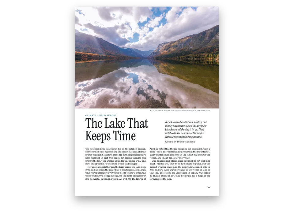
小さな雑誌の秋のセクション『Notes on Weather』を、同じMarkdownから2回組みます。紙では225 × 297 mmの号です。雨のような青の部扉、淡い霧色の帯の下で始まる3つの記事、両端そろえの2段、雨量計と風配図の図、霧に包まれた谷の写真で構成されます。画面では、Newsreaderで組んだ左そろえ(行末不ぞろい)の1段で、ほぼ黒の地に淡い灰色の文字です。読者が選択してコピーできるHTMLのテキストで、部扉も霧色の帯もノンブルもありません。ペインは雨量計の位置で開き、雨量計はペインの高さに合わせて縮められ、夜の配色で描かれます。その横には雨量計が載っている印刷ページがあります。上へスクロールするとRainの章扉が現れ、ペインの角をドラッグすると、テキストが新しい大きさで組み直されます。画面のデザインは、印刷用の設定の中のhtmlViewer.overridesにある9つのキーです。
このレシピが答える質問
- 同じ文書を、画面幅に応じてスクロールで読めるHTML表示にするには?
- 1つの設定から、画面版に印刷版より簡素なデザインを与えるには?
手短な答え
// config() stores it as htmlViewer: { overrides: screenOverrides() }; canvas and PDF ignore it.
const screenOverrides = () => ({
  colorPalette: paletteOf(night), // arrays are replaced whole: the night values
  parts: { page: false }, // no divider page; the part still names the notes after it
  // 96 dpi: the mm and pt inherited from print render at their CSS size.
  page: { dpi: 96, margins: { top: px(40), bottom: px(40), mirror: false } },
  layout: { layoutType: 'single', // one column
    fitFiguresToPage: true }, // tall figures shrink to the pane; off by default, as in print
  bodyText: { fontSize: px(17), lineHeight: px(27), textAlign: 'left' }, // ragged for reading
  // Heading levels merge on `level`: the print level keeps everything not restated here.
  headings: { levels: [{ level: 1, span: 'column', breakBefore: { enabled: false },
    marginTop: px(40), marginBottom: px(26),
    advancedDesign: { minHeight: px(0), slot: { elements: screenOpener } } }] }, // no band air
  footer: { elements: [] }, // a scrolling page runs no folios (print's header is empty already)
  captionStyle: { fontSize: px(13), gap: px(10) },
  paragraphStyles: [{ ...colophon, fontSize: px(13), lineHeight: px(20) }], // restated whole
});
// The host owns the page size: the pane's, in CSS pixels (gotcha: viewer-settings-sandbox-only).
// Wide panes get wider margins, so the measure stops at MEASURE.
const MEASURE = 470; // px: about 65 characters of Newsreader at 17 px
const MIN_SIDE = 34; // px: the side margins of a narrow pane
function screenConfig({ width, height }) {
  const merged = applyHtmlViewerOverrides(config()); // print + overrides, a fresh object
  const side = px(Math.max(MIN_SIDE, (width - MEASURE) / 2));
  return { ...merged, page: { ...merged.page, width: px(width), height: px(height),
    margins: { ...merged.page.margins, left: side, right: side } } };
}
材料
- 機能
- 画面用の簡素なデザインHTMLの読書版ページに収める図デザインした章扉部扉段抜きの章見出し帯見出しの属性図の配置セマンティックカラーパレットページの役割ごとの柱1段組みと2段組み用紙の色キャンバス上のページリソースとしての図と表「図」と「表」を文書の言語で独自のリソースの種類図を配置する参照段落スタイル
- 種類
- Newsreader, Gloock, Reddit Sans (SIL OFL 1.1)
- 素材
valley-1610.jpg- Radiation fog in a valley at dawn (Figure 2) (Generated With Diffusion Models, オリジナル)
- The rain gauge, the wind rose and the part page's rain, drawn in code in both palettes (Ignacio Ferro, CC BY 4.0)
作り方
#1 · 色の名前は1組、値は2組
const day = { ink: '#1b222b', rain: '#3d6f9e', slate: '#2d3a4a', fog: '#e9edf1',
  rule: '#c8d0d8', muted: '#5f6a76', paper: '#ffffff' };
const night = { ink: '#e6e8eb', rain: '#9cc3e6', slate: '#56657a', fog: '#1b2129',
  rule: '#2e3742', muted: '#98a2ae', paper: '#111418' };
const paletteOf = (values) => // main-color: the engine's defaults follow the rain blue
  Object.entries({ ...values, 'main-color': values.rain })
    .map(([id, hex]) => ({ id, name: id, value: { hex, model: 'hex' } }));
// Every colour names its palette entry: text, captions, the openers' design elements and the
// reference colour follow whichever palette the config carries. The hex is the day value.
const col = (id) => ({ hex: day[id], model: 'hex', paletteId: id });
設定の中のすべての色はパレットのidを指し、その横に書いた16進値は昼の配色の予備にすぎません。そのため画面版は配列を1つ置き換えるだけで夜の配色に切り替わります。手短な答えにある上書きは、オブジェクトをキーごとに、見出しの階層をlevelごとにマージし、それ以外の配列はcolorPaletteも含めてまるごと置き換えます。main-colorはパレットの一部なので、それを使うエンジンの既定値も変わります。新しいパレットは、リンクされた色のすべてに届きます。本文、キャプション、章扉のデザイン要素、参照の色です。
#2 · 章扉は、紙では帯、画面では言葉
const text = (id, content, fontFamily, style) => ({ kind: 'text', id, content, fontFamily,
  color: col('ink'), align: 'left', ...style,
  overflow: 'wrap' }); // titles break onto more lines
const kicker = text('kicker', '{partTitle} · {attr.kicker}', 'Reddit Sans',
  { fontWeight: 600, textTransform: 'uppercase', color: col('rain') });
const title = text('title', '{titleText}', 'Gloock');
const lead = text('lead', '{attr.lead}', 'Newsreader', { italic: true, hyphenate: true });
const at = (to, edge, y, x = px(0)) => ({ anchor: { to, edge }, offset: { x, y } });
const under = (id, y, width) => ({ ...at(`#${id}`, 'below', y), size: { width } });
const band = (y, height) => ({ ...at('bleed', 'top-left', y), size: { width: 'fill', height } });
const fromTop = (y, x) => at('container', 'top-left', y, x);
// minHeight sets the reservation: the band's foot below the top margin, plus AIR. The band hangs
// from the bleed and counts too, but ends higher (gotcha: opener-reserves-anchored).
const printOpener = { enabled: true, minHeight: mm(BAND - TOP + AIR), slot: { elements: [
  { kind: 'box', id: 'band', style: { backgroundColor: col('fog') },
    placement: band(mm(0), mm(BAND)) },
  { kind: 'rule', id: 'horizon', direction: 'horizontal', thickness: pt(2), color: col('rain'),
    placement: band(mm(BAND - 0.7), pt(2)) }, // 2 pt is 0.7 mm: the rule ends at the band's foot
  { ...kicker, fontSize: pt(8), letterSpacing: pt(1.8), placement: fromTop(mm(12)) },
  { ...title, fontSize: pt(54), lineHeight: 1.04, placement: under('kicker', mm(2.5), mm(150)) },
  { ...lead, fontSize: pt(11.5), lineHeight: 1.36, placement: under('title', mm(4), mm(118)) },
] } };
const screenOpener = [
  { ...kicker, fontSize: px(12), letterSpacing: px(2.6), placement: fromTop(px(4)) },
  { ...title, fontSize: px(48), lineHeight: 1.05, placement: under('kicker', px(6), 'fill') },
  { ...lead, fontSize: px(18), lineHeight: 1.45, color: col('muted'),
    placement: under('title', px(10), 'fill') },
];
肩書き、題、リードの要素は一度だけ定義して両方のデザインに展開するので、2つの版は同じ見出し属性{attr.kicker}、{attr.lead}と部の{partTitle}を表示します。紙では第1階層の見出しは改ページして両段に渡り、そのデザインが塗り足しから霧色の帯を垂らします。minHeightは、天の余白から下の帯の深さにAIR、つまり帯と1行目のあいだの9 mmを加えた分を確保します。印刷版の題を54 ptで組むのは、どれも短い1語で、そのページで唯一の大きな文字だからです。画面では同じ階層を、帯もアキもない段内の見出しとして組みます。上書きはlevelごとにマージされるので、改めて指定しなかった見出しの設定はすべて印刷版のまま残ります。
#3 · 紙にしかない部扉
const onField = { color: col('paper'), lineHeight: 1 };
const parts = {
  margins: { top: mm(212), left: mm(24), right: mm(40) }, // the fence's list sits low
  bodyStyle: { fontSize: pt(13), lineHeight: pt(19), color: col('paper'),
    numberColor: col('paper') },
  design: { elements: [
    { kind: 'box', id: 'field', style: { backgroundColor: col('rain') },
      placement: band(mm(0), 'fill') },
    { kind: 'image', id: 'strokes', resourceId: 'rain', placement: band(mm(0), 'fill') },
    text('series', '{title}', 'Reddit Sans', { ...onField, fontWeight: 600, fontSize: pt(9),
      letterSpacing: pt(2.4), textTransform: 'uppercase', placement: fromTop(mm(30), mm(24)) }),
    text('numeral', '{number}', 'Gloock', { ...onField, fontSize: pt(190),
      placement: under('series', mm(10), mm(150)) }),
    text('name', '{titleText}', 'Gloock', { ...onField, fontSize: pt(60),
      placement: under('numeral', mm(-6), mm(150)) }),
  ] },
};
印刷版では:::partが雨のような青の部扉を開きます。四方を裁ち落としにした箱、文字を避ける雨の線の画像要素、:::partの属性から取った数字と題、白抜きの記事一覧です。画面の上書きはparts.page: falseを指定するので、ページは開かず一覧も組まれません。それでも部は後に続く記事に番号と題を与え、画面の肩書きも印刷版と同じく「Autumn · Note 1」になります。
#4 · どの図も2回描く
// The valley is a photograph, one JPEG in assets/ that both editions share, at its pixels.
const photo = { kind: 'bitmap', svg: undefined,
  bitmap: { fileId: 'valley-1610.jpg', format: 'jpeg', width: 1610, height: 690 } };
const figure = (id, edition, [width, height], placement, caption, alt) => ({ id,
  typeId: 'figure', kind: 'svg', createdAt: 0, updatedAt: 0, placement,
  svg: { fileId: `${id}-${edition}.svg`, width, height },
  caption: caption && t(caption), altText: alt && t(alt) }); // the HTML edition's <img alt>
const figures = (edition) => [
  figure('gauge', edition, [900, 1260], { position: 'auto', span: 'column' }, {
    en: 'The rain gauge in section: the funnel feeds a tube with a tenth of its area.',
    es: 'El pluviómetro en sección: el embudo vierte en un tubo con la décima parte de su área.',
  }, {
    en: 'Rain falls on a funnel set in a can sunk in the lawn; the funnel drains into a narrow '
      + 'tube, half full, beside a graduated measuring stick.',
    es: 'La lluvia cae en un embudo sobre un vaso hundido en el césped; el embudo vierte en un '
      + 'tubo estrecho, medio lleno, junto a una regla graduada.' }),
  { ...figure('valley', edition, [1610, 690], { position: 'bottom', span: 'page' }, {
    en: 'Radiation fog at dawn: cold air drains off the hills overnight and fills the valley.',
    es: 'Niebla de irradiación al amanecer: el aire frío baja de las lomas y llena el valle.',
  }, {
    en: 'A valley between wooded hills lies under layers of fog at sunrise, with a church '
      + 'tower, trees and a river showing through it, seen from a fenced bank.',
    es: 'Un valle entre lomas boscosas yace bajo la niebla al amanecer; asoman la torre de '
      + 'una iglesia, árboles y un río, vistos desde un ribazo con una cerca.' }), ...photo },
  figure('rose', edition, [900, 900], { position: 'top', span: 'column' }, {
    en: 'Where a year of morning winds came from at the garden station: west and south-west.',
    es: 'De dónde vino el viento de un año de mañanas en el jardín: del oeste y del suroeste.',
  }, {
    en: 'A wind rose of sixteen petals on three rings; the longest petals point west and '
      + 'south-west, the shortest east.',
    es: 'Una rosa de los vientos de dieciséis pétalos sobre tres anillos; los más largos '
      + 'apuntan al oeste y al suroeste, los más cortos al este.' }),
  figure('rain', 'field', [2250, 2970]), // drawn by the part design, never cited: unnumbered
];
パレットを入れ替えてもSVGの色は変わらないので、各図はパレットごとに1つずつ作ります。谷は写真で、2つの版で1つのJPEGを共有します。figures(edition)は両方の版に同じリソースを作り、それぞれがその版のファイルを指します。印刷版ではgauge-day.svg、画面版ではgauge-night.svgです。id、キャプション、代替テキスト、配置は変わらないので、Markdownの:refはどちらの版でも同じ図と番号に解決されます。画面版では代替テキストが各<img alt>に入り、スクリーンリーダーがそこから読み取ります。
#5 · 画面版を組み込む
const FOLDED = 200; // px: a pane narrower or shorter than this is hidden or squeezed; skip it
if (!pane.clientHeight) { // no style.css: a height, and a corner to drag the pane smaller, but
  // not under 400 px, where an opener can take a whole page and push its text to the next
  pane.style.cssText = 'height:580px;min-height:400px;min-width:240px;overflow:auto;resize:both';
}
pane.style.background = night.paper; // the pane's own ground, beside the pages and the scrollbar
const shadow = pane.attachShadow({ mode: 'open' }); // the page's selectors cannot reach in, and
// the edition's root resets the text properties it would inherit (letter-spacing…) by itself
const inShadow = `<style>::selection{background:${night.rain}55}</style>`; // the night blue
let size = '';
function showScreen() {
  const [width, height] = [pane.clientWidth, pane.clientHeight];
  if (`${width}×${height}` === size || width < FOLDED || height < FOLDED) return; // same, or folded
  const first = !size; // the first build opens on Figure 1's page, like the print proof
  size = `${width}×${height}`;
  const screenDoc = buildDocument({ markdown, resources: figures('night') },
    screenConfig({ width, height }));
  const place = pane.scrollTop / pane.scrollHeight; // the reader's place, kept across rebuilds
  shadow.innerHTML = inShadow + renderToHtml(screenDoc,
    { mode: 'single', padding: 0, resourceImageUrl: imageUrl });
  const fig = first && screenDoc.pages.find((page) => holds(page, 'gauge')); // 'single' mode
  pane.scrollTop = fig ? fig.index * height : place * pane.scrollHeight; // stacks pane-tall pages
  screenLabel.textContent =
    `${t({ en: 'Screen', es: 'Pantalla' })} · HTML · ${width} × ${height} px`;
}
showScreen();
let timer = 0; // debounced; its first call, on observe(), finds the size unchanged
new ResizeObserver(() => { clearTimeout(timer); timer = setTimeout(showScreen, 150); })
  .observe(pane);
画面のページはどれもペインと同じ高さなので、fitFiguresToPageが雨量計をキャプションといっしょに1ページに収まるまで縮めます(レイアウト)。CSSが前提とする96 dpiでは、印刷版から受け継いだミリメートルとポイントが公称の大きさで描かれます(HTMLビューアーの統合)。CodePenのサンプルは、renderToHtmlが絶対配置で出力する行をShadow DOMに書き込みます。そこならページのセレクターは届きません。letter-spacingのような継承プロパティはこの境界を越えて入ってきますが、版のルート要素が自分でリセットします。エンジンはそれらなしで行を計測しているからです。HTMLのページは塗らなければ透明なので、page.backgroundColorがパレットから夜の紙色を取ります。ResizeObserverは150 ms待ち、ペインの幅か高さが変わったときだけ、新しく作ったconfig()から組み直します。組み直したあと、ペインは高さに対して同じ割合の位置までスクロールを戻します。
レシピの全体
// ═══ Postext Cookbook · Nº 011 · One source, print and screen editions ═══════════
// https://postext.dev/en/cookbook/print-and-screen-editions
// Code: MIT · Text: original (CC BY 4.0) · Drawings: code (CC BY 4.0) · Photo: diffusion models
// Fonts: Newsreader, Gloock, Reddit Sans (SIL OFL 1.1) · Needs postext ≥ 1.25.0
import {
  buildDocument, prepareFonts, withLoadedFonts, renderPageToCanvas, renderToHtml,
  applyHtmlViewerOverrides, registerResourceImage, defaultResourceTypes,
} from 'https://esm.sh/postext';

const LANG = 'en'; // @lang: the language of the sample document ('en' | 'es')
const RECIPE = 'print-and-screen-editions';

// ─── 1 · Design ─────────────────────────────────────────────────────────────
// #region palette: one set of colour ids, two sets of values: day for paper, night for screens
const day = { ink: '#1b222b', rain: '#3d6f9e', slate: '#2d3a4a', fog: '#e9edf1',
  rule: '#c8d0d8', muted: '#5f6a76', paper: '#ffffff' };
const night = { ink: '#e6e8eb', rain: '#9cc3e6', slate: '#56657a', fog: '#1b2129',
  rule: '#2e3742', muted: '#98a2ae', paper: '#111418' };
const paletteOf = (values) => // main-color: the engine's defaults follow the rain blue
  Object.entries({ ...values, 'main-color': values.rain })
    .map(([id, hex]) => ({ id, name: id, value: { hex, model: 'hex' } }));
// Every colour names its palette entry: text, captions, the openers' design elements and the
// reference colour follow whichever palette the config carries. The hex is the day value.
const col = (id) => ({ hex: day[id], model: 'hex', paletteId: id });
// #endregion
const px = (value) => ({ value, unit: 'px' }); // screen sizes, written as CSS pixels
const [TOP, BAND, AIR] = [22, 86, 9]; // mm: top margin, the fog band's depth, air under it

// #region opener: print opens each note under a fog band; the screen keeps the words only
const text = (id, content, fontFamily, style) => ({ kind: 'text', id, content, fontFamily,
  color: col('ink'), align: 'left', ...style,
  overflow: 'wrap' }); // titles break onto more lines
const kicker = text('kicker', '{partTitle} · {attr.kicker}', 'Reddit Sans',
  { fontWeight: 600, textTransform: 'uppercase', color: col('rain') });
const title = text('title', '{titleText}', 'Gloock');
const lead = text('lead', '{attr.lead}', 'Newsreader', { italic: true, hyphenate: true });
const at = (to, edge, y, x = px(0)) => ({ anchor: { to, edge }, offset: { x, y } });
const under = (id, y, width) => ({ ...at(`#${id}`, 'below', y), size: { width } });
const band = (y, height) => ({ ...at('bleed', 'top-left', y), size: { width: 'fill', height } });
const fromTop = (y, x) => at('container', 'top-left', y, x);
// minHeight sets the reservation: the band's foot below the top margin, plus AIR. The band hangs
// from the bleed and counts too, but ends higher (gotcha: opener-reserves-anchored).
const printOpener = { enabled: true, minHeight: mm(BAND - TOP + AIR), slot: { elements: [
  { kind: 'box', id: 'band', style: { backgroundColor: col('fog') },
    placement: band(mm(0), mm(BAND)) },
  { kind: 'rule', id: 'horizon', direction: 'horizontal', thickness: pt(2), color: col('rain'),
    placement: band(mm(BAND - 0.7), pt(2)) }, // 2 pt is 0.7 mm: the rule ends at the band's foot
  { ...kicker, fontSize: pt(8), letterSpacing: pt(1.8), placement: fromTop(mm(12)) },
<section id="editions">
  <figure class="edition"><canvas id="proof" role="img"></canvas><figcaption></figcaption></figure>
  <figure class="edition screen"><div id="screen" role="region" tabindex="0"></div><figcaption></figcaption></figure>
</section>
<main id="pages"></main>
/* The reading room: the printed page and the screen edition side by side, on a fog-grey desk. */
#editions {
  display: flex; justify-content: center; align-items: center; gap: 32px;
  box-sizing: border-box; min-height: min(75vw, 100vh); padding: 28px;
  background: #dde3e9;
}
.edition { margin: 0; display: flex; flex-direction: column; gap: 14px; }
.edition figcaption {
  font: 600 11px/1 system-ui, sans-serif; letter-spacing: .16em; text-transform: uppercase;
  color: #4f5a66;
}
#proof {
  aspect-ratio: 225 / 297;
  display: block; height: min(580px, calc(100vh - 188px)); background: #fff;
  box-shadow: 0 1px 2px rgb(20 30 40 / .25), 0 20px 40px -18px rgb(20 30 40 / .5);
}
.screen { flex: 0 1 580px; min-width: 0; }
/* The pane the edition fills: its size is the page size, so resizing it re-lays the text.
   Drag its corner to try. Its background is the night paper, set by the script. At least
   400 px tall: in a shorter pane an opener can take a whole page and push its text to
   the next. */
#screen {
  height: min(580px, calc(100vh - 188px)); overflow-y: auto; scrollbar-gutter: stable;
  resize: both; min-width: 240px; min-height: 400px; max-width: 100%;
  border-radius: 10px; box-shadow: 0 0 0 7px #1c2129, 0 26px 48px -20px rgb(10 14 20 / .7);
  scrollbar-width: thin; scrollbar-color: #2e3742 transparent;
}
@media (max-width: 760px) {
  #editions { flex-direction: column; min-height: 0; padding: 24px 16px; }
  #proof { height: auto; width: min(420px, 100%); }
  .screen { flex: none; width: 100%; }
  #screen { height: 72vh; }
}
組み立てたscript.jsはそのまま動きます。任意のページのモジュールスクリプトに貼り付けるか、レシピをCodePenで開いてください。 GitHub上のレシピのフォルダー ↗ (新しいタブで開きます)
アレンジ
#昼の配色で読む
夜のパレットを外し、ペインと図に昼の値を使います。画面版は白いページ、濃いインキ、昼の図で表示されます。
-  colorPalette: paletteOf(night), // arrays are replaced whole: the night values
   parts: { page: false }, // no divider page; the part still names the notes after it
@@
-pane.style.background = night.paper; // the pane's own ground, beside the pages and the scrollbar
+pane.style.background = day.paper; // the pane's own ground, beside the pages and the scrollbar
@@
-  const screenDoc = buildDocument({ markdown, resources: figures('night') },
+ const screenDoc = buildDocument({ markdown, resources: figures('day') },#印刷版の章扉に色帯と章番号を付ける
彩度の高い帯と大きな章番号を組んだ、より重厚な印刷版の章扉については裁ち落としの帯を敷いた章扉を参照してください。画面の上書きはそのまま使えます。
よくあるつまずき
つまずき
HTML出力には段間罫、グリッド、トンボがなく、背景は透明
renderToHtmlは段間罫、ベースライングリッド、トンボを描かず、背景を渡さない限りページは透明です。暗いページの上では、暗い文字が暗い背景に重なります。 HTMLの読書版 →
つまずき
htmlViewerの設定にはSandboxにしかないものがある
htmlViewer.maxCharsPerLine、columnGap、optimalLineBreakingを読むのはSandboxのビューアーで、renderToHtmlではありません。自分のページでは、ページの大きさを自分で決め、modeとcolumnGapをrenderToHtmlに渡してください。上書きはapplyHtmlViewerOverridesで適用されます。 HTMLの読書版 →
つまずき
章扉はページに固定した要素のうち最も下のものまで高さを確保する
詳細デザインの章扉は、最も下にある要素までの高さを確保します。見出しより下にあるページや裁ち落としに固定した要素もこれに含まれるため、ページの下端に置いた装飾があると本文が次のページへ押し出されます。こうした要素にはreserve: falseを与えてください(postext 1.5から)。固定した位置に描かれ、高さは何も確保しません。帯そのものに従う要素(帯の下端に固定したものや、高さが'fill'のもの)が帯の高さを決めることはありません。 デザインした章扉 →
- ペインの高さは400 px以上に保ってください(CodePenのサンプルの
min-height)。高さが約350 px未満の狭いペインでは、画面の章扉がページの内容領域より高くなります。すると章扉だけで1ページを使い、記事の最初の段落は次のページから始まります。 - 組む前にペインに大きさを与えてください。非表示になったり、flexの行で押しつぶされたりして幅のないペインは、幅0のページになります。そのため
showScreen()は、幅か高さがFOLDEDの200 pxに満たないペインを飛ばします。
クレジット
- 本文
- 書き下ろしの文章, CC BY 4.0
- 画像
- Radiation fog in a valley at dawn (Figure 2) · Generated With Diffusion Models · オリジナル
- The rain gauge, the wind rose and the part page's rain, drawn in code in both palettes · Ignacio Ferro · CC BY 4.0
- フォント
- Newsreader (SIL OFL 1.1) · Gloock (SIL OFL 1.1) · Reddit Sans (SIL OFL 1.1)